
Brights and bolds normally scare the living daylights out of me but not this time. I decided to just pile on anything colourful that I could find sitting on my desk without planning anything or thinking about any design.
The inspiration is derived from Australian scrappers Leeann Pearce and Chantal Vandenberg whom I have NOT tried to lift or copy, they create vibrant bold happiness with delightful pinches of whimsey and fun. It's their love of colour that sparked off my mojo.
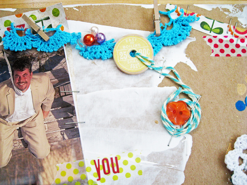
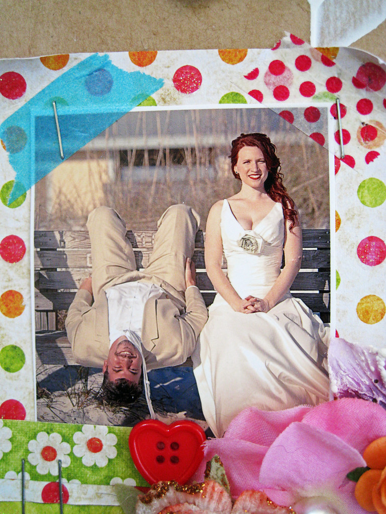
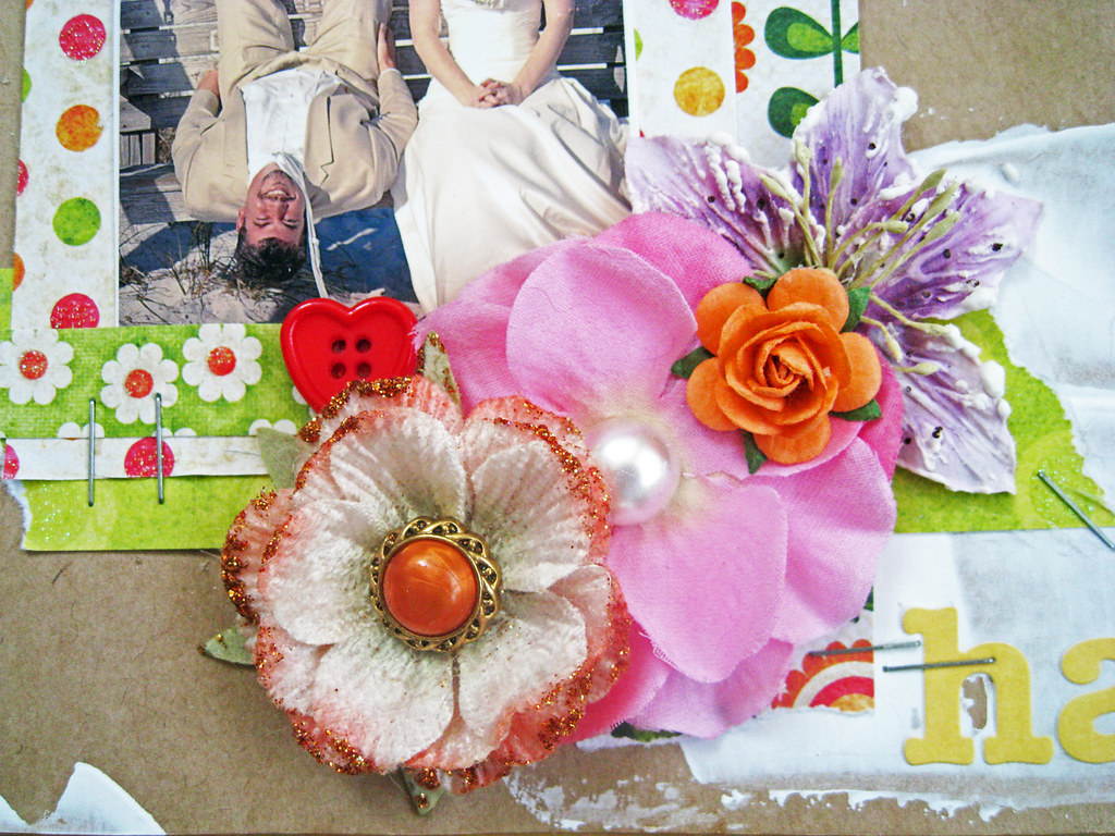
So no more talking, here's the page that I've called "You Colour Me Happy". And what more suitable than use a photo of the most colourful person that I've ever come across, my scrappy pal Rebekah in Florida, and her darling hubby Mr E on their wedding day.
This is the last of the photos that I have had the joy of scrapping for them, the pile of pages will be shipped off to the US anytime soon.
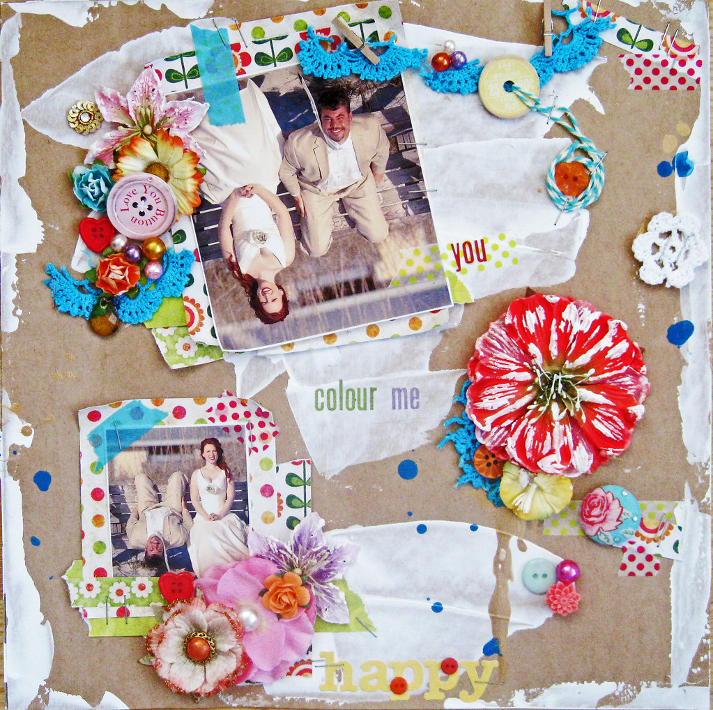


There we are, a page full of colour combinations that I would normally never put together. Makes me feel like Pippi Longstocking, spontaneous and fun! :)
Have a great start to the week! I'll be back on Tuesday with my page for CSI case file # 31.
Cheerio! xoxo Eila


ÅÅ...denne var fargerrik og HERLIG !!! Litt uvant å se slikt fra deg - men fantastisk!!! LOVE IT !!!!
ReplyDeletehaha vilken FANTASTISKT rolig sida! Tycker du ska vara så där spontan utan plan fler gånger ;). Gillar denna massor! Finns hur mycket kul detaljer som helst att kika på. Gillar det upp och ned vända fotot! Hejja Pippi ;D
ReplyDeleteKramiz Maja
Wow Eila!!! amazing love the upside down photo and the vibrant flowers tape and all the little details ...my! you should do this more often it's fantastic ...
ReplyDeletehave a great week...thinking of you
Lindy xoxo
What a fabulous page - love the upside down photo and all the wonderful bright colors!
ReplyDeleteThis is just awesome .. I admire your courage to jump off the deep end and just have a ball! Love the cut up crochet doily and the mix of colorful flowers!
ReplyDeleteWell you certainly stepped out of your comfort zone in style, what an amazing layout. I really, really like the upside down photograph, certainly adds some character to the layout - draws the eye! Wonderful...
ReplyDeletewowsers!! This is stunning - and yours alone!! Love, love, love it!!
ReplyDeletexoxo
Eila, I tried to send you an email regarding the pencils I made on my blog post ... but it bounced back? Can you contact me through my blog with the right email address, so I can forward it to you please... thanks xx
ReplyDeleteLove the fact that you are not obsessed with being consistent and your signature style thingy - the bane of most DT members! YAY to artistic freedom :)))))))))))))
ReplyDeletethis is fantastic!! I do love experimenting so good for u!
ReplyDeleteThis looks fabulous! sometimes it is good to just let the hair down and have fun creating with no boundaries.. beautiful colors and the photos are fabulous!
ReplyDeleteDu frågade om de små rullade spetsblommorna... Det är primas och de finns/ har funnits hos Mollys Scrapbooking och Scrapgalen.
ReplyDeleteKramiz
Wonderful colours and details! :)
ReplyDeleteSo not you but so so awesome. And so clever. Love the randomness and the COLOUR looks fabulous. Well done on a fab page.
ReplyDeleteHahahaha this is not your style but it looks so cool love it and a great job you did.
ReplyDeletebyeeeee,Lean
Good on you Eila. It does take courage to step way out of ones comfort zone. So different. You have done an amazing job. Fabulous.
ReplyDeleteCheers Di xo
This is fantastic Eila, I just love the colors and all of your attention to detail. Really glorious page. sigh, I'm just going to keep looking at it for awhile.
ReplyDeleteOh Eila! This is AWESOME!!! I love it soooo much! It shouts "fun", "happy" and "carefree"!!! I think you have done such a fantastic job, jumping out of your comfort zone and I think you should do it more often because this is truly unique!!! So it goes without saying really, but I'm still sayin'! that this is my new fave! Love it to bits! Your colours have been mixed so well - I just love it. Okay I'll be quiet now, LOL! BTW - thanks for mentioning li'l ol' me. :) Okay really stopping now! xo
ReplyDeletewow! how much fun is this!! you have done amazing things with all our wedding pictures!!! of course i love the insane amounts of vibrate color & this is one of my favorite photos.. i hadn't even scrapped it yet cause i wasn't sure just what to do with it. its only framed in our bathroom at the moment in a frame that says "a day at the beach... priceless" anywho, love how you did the upside down photo and can't wait to see all the pictures/layouts in person!! yay! i will have them all framed i'm sure! ♥
ReplyDeletemaybe i'll get some time soon to post what's been going on over here - nursery photos & such. thankx for all the sweet comments about the mixed canvas i did for Jr's room! had a blast doing that and really thinking i may go more that route when i get back to crafting when Jr gets a schedule going. it was very rewarding and i get to see it all the time hanging on the wall!
take care.. and i'll stay in touch the best i can over the next 6 months.. but it will (i'm sure) seem like i've fallen off the earth for a while ~R
Absolutely LOVE this page Eila! I can see why everyone is raving about it!! It is indeed bright but not in a garish way because you have toned it down with gesso and used a craft base. There is a very definite colour scheme I can see coming through here, with turquoise being dominant, followed by red as an accent colour and the other brights as subsidiary colours. This is a beautifully free artistic page yet also controlled with a great eye for colour and design. More please!!!
ReplyDelete