Tuesday 30 August 2011

TCR #73 Cover Girl and Taking a Dog Nap for Les Papiers de Pandore


Hello dear friends near and far!

I am sorry for being late uploading my page for the TCR palette #73, things sort of unexpectedly got in the way the passed weekend ... again. As you can see, there are two shades of orange in the palette - chaaallenging says Mrs Sandberg! I think the inspirational photo is kind of cool though, reminds me of the 1960's/70's and as somebody on the DT said; it looks like something Austin Powers would dig!


The lady in the photo is my ex-MIL. Boy was I happy to find the Crate Lemon Grass papers at the bottom of my stash. Groovy baby! as Austin puts it :))

#73 Cover Girl 4000px-main

I think Crate makes the most fabulous papers ever, but as they don't exactly lend themselves to my beloved fussy cutting, my page is very clean.

#73_Cover Girl 4000px-2

My ex-FIL was Marketing & Sales Director at a well-known Swedish company in the food sector and he used his wife in some of their campaigns. Don't you just love the feel to the photo!

#73_Cover Girl 4000px-3

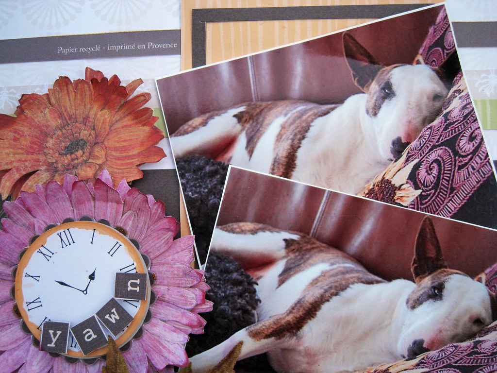
It is also time to share a page that I made for Les Papiers de Pandore. I've called it "Taking a Dog Nap".

Taking a Dog Nap 4000px-main

So here's one of my friend K's dogs, this is Doris. The other one, is called Buster. He's a terrier. My friend lives on the Swedish countryside with lots of woods and wildlife just around the corner, so she takes long walks with Doris and Buster. Anyone can get a bit tired after having been out in the fresh air and exercized a little bit too much .... ha ha that never happens to me though as I am very lazy! but poor Doris got so tired she had to take a little nap in the sofa. Doesn't she just look cool with her funny little face, resting so adorably on her blanket, which by coincidence has the colours of the new papers.

Taking a Dog Nap 4000px-2

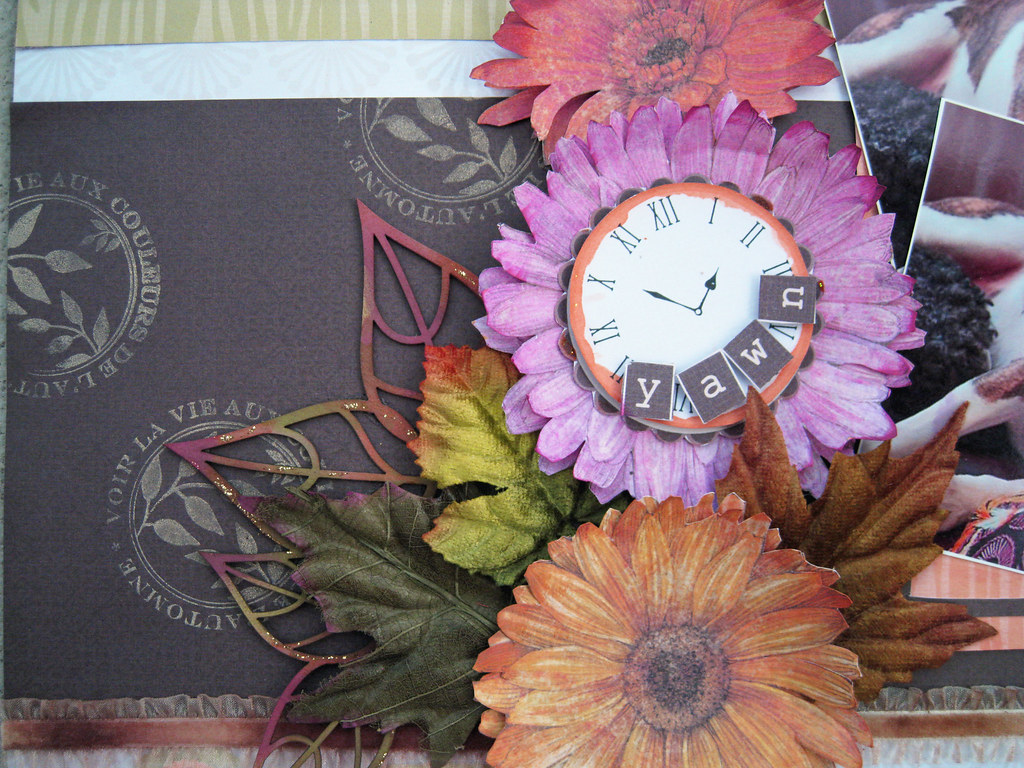
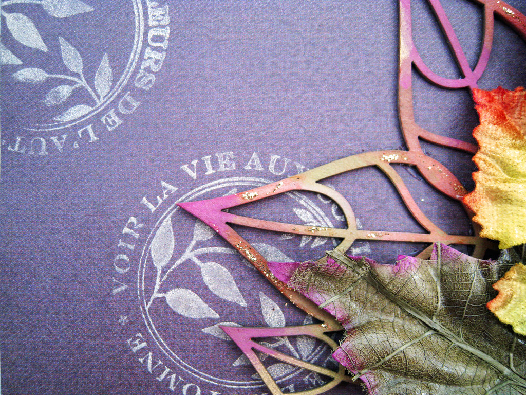
And what do you spy - fussy cutting! the blooms are cut out from the K & Co Tim Coffey Cottage Garden collection. The chippie  leaves from Imaginarium Design peeking out under the Prima leaf were chalked in Burnt Sienna + Dark Moss + Olive + Amber Clay + Berryliscious and Gold.

Taking a Dog Nap 4000px-3

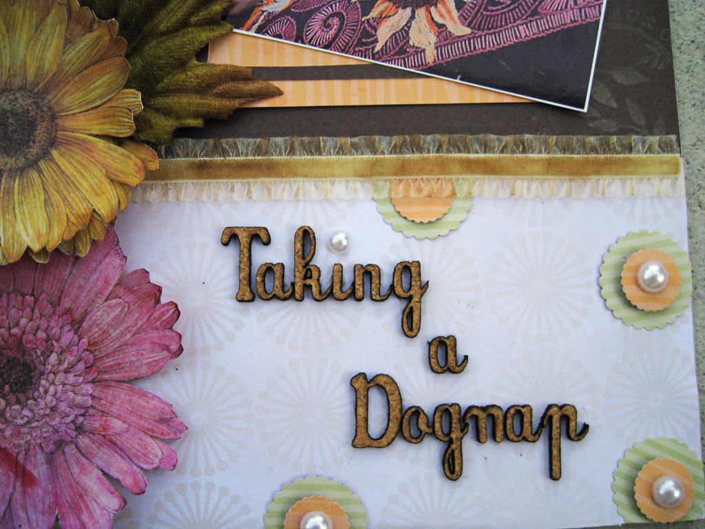
The alphas are from French online store Emélliscrap and are in cork, which gives a very nice and rough country feel to them IRL. They also go so well with the leather sofa in the photo. The velvet ruffled ribbon that runs across the page is from Prima, I have misted it in Tattered Angels Sand and Suede + chalked randomly in Chestnut Roan.
Taking a Dog Nap 4000px-4

I also stamped with ink in yellow ochra on the centre piece of brown paper to add interest but somehow it comes across like .. well, almost white?!

Taking a Dog Nap 4000px-5

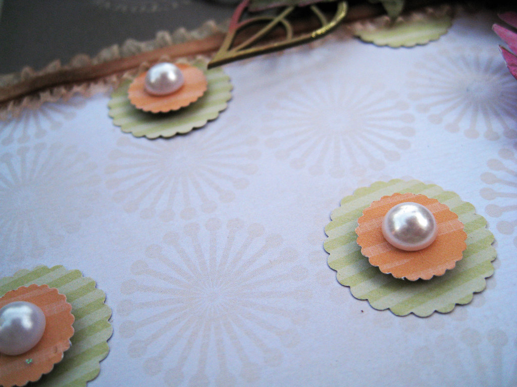
Some stacked scalloped circles and a big pearl plonked down in the middle.

Taking a Dog Nap 4000px-6


Taking a Dog Nap 4000px-7

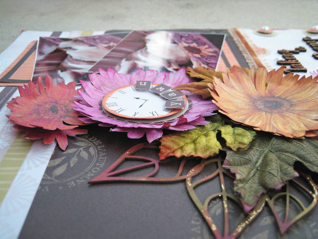
And there you have them both!

I am so so looking forward to this upcoming Saturday which is a milestone in my scrappy life. Ingvild Bolme is coming to Sweden for a workshop and I'm going there! After having exchanged a great many emails over the passed year, I will meet my sweet scrappy friend Bente Fagerberg IRL! I have also caught in the Swedish scrappy chat rooms that it will be a crowd of well-known Swedish names meeting up for the workshop, and I'm thrilled to bits to meet them all.

Yes, the camera has fresh batteries and a new memory chip! we sure are going to click away to commemorate this occasion!

Have a fantastic rest of the week folks! thanks for having a peek and any lovely comment you leave!

xoxoxox Eila

Wednesday 24 August 2011

The sequel to TCR #72

Autumn really has made its entrance in Stockholm, when I pulled up the blinds this morning I was met with a milky white wall outside the window. Fog!! That really is too early. An old Swedish saying is when the rowan tree has an abundance of berries, the winter will be long and hard. In that case, we are in for another perma frost. Yuk!

Last Friday I promised to share the sequel to my #72 Mamma and without further do, here it is. As the page is for the book I'm making for her, the title is in Swedish; "Svunnen tid". I've used the title before, but it pretty much captures what it's all about; Bygone Days.

As you can see, the photo of my MIL was taken at the same studio shoot as the previous one.

72B_Svunnen tid 4000px-main

The backing paper is from Swedish Pion Design. I've used the same TA  Glimmer Mist in Sand and Suede as on my other page to keep both backgrounds together. I've also masked/misted a big clock face in TA Patina.

72B_Svunnen tid 4000px-2

The tag and the butterfly are cut out from a Pion Design paper. The tag and the strip of muslin are dyed in very strong coffee. Two strips of lace, one left natural and the other one dyed in TA Patina. The same ink in Champagne poured out in a rivulet. Here you can also see the script on the backing paper a bit closer.

72B_Svunnen tid 4000px-3


72B_Svunnen tid 4000px-4

The golden/teal fabric brad is from Danish Tilda. The tape measure is also cut out from a paper from Pion Design. I pulled out the centres of two gardenias and replaced the stamens with new fabric flowers centres from Australian online store Maxine's Mélange. That's the "fuzzy" brown&white.

72B_Svunnen tid 4000px-5

In the same cluster is a Prima bloom and a key from my stash, cannot for the world remember which brand it is. I made the little metal embellishment by cutting out a section with the birds from a Pion Design paper and glueing it onto the trinket and adding liquid pearls around the border. Some mother of pearl buttons from Danish Tilda finishes the cluster together with a coffee-dyed tag tied with a dito strip of muslin.

72B_Svunnen tid 4000px-6

I bought the zink wreath at local craft store Panduro quite a while ago. Here I have dabbed acrylic paint in Sky, Patina and Brown on it to give it an additional weathered look.

72B_Svunnen tid 4000px-7

On the left a torn piece of Gessoed cardboard and another strip of coffee dyed muslin tied around the zink wreath.

And that's it! now I had really better get going with my morning preparations, time to leave for work soon! Have a great rest of the week and thanks so very very much for having a peek!

Toodeli pip! xoxoxox Eila


Friday 19 August 2011

TCR #72 Mamma and two cards for Les Papiers de Pandore

Hello dear friends near and far, once again it's Friday which means release time over at TCR and CCG. The 15 August challenge was also released some days ago at UOAS, and as always the DT have created stunning pages.

Here is the palette with Deep Dusty Pink, Light Minty Teal, Pale Lilac Grey, Pastel Olive Green.


These colours were initially really challenging for me. However, Julie Wink's amazing class "Layered Layouts" at Miss Art's Papercrafting School set my mojo moving in the right direction and once I had started, the page more or less scrapped itself. I actually also made a sequel to my page while I had the steam up, I'll soon show you this second TCR page ;))

Those of you who haven't discovered Miss Art's yet, boy have you missed something! Headmistress is wonderful Alyssa McGrew and the list of teachers is like that of of Oscar nominees - truly star spangled! You will be taken directly to the school if you click  HERE

So after a rather longwinded intro, this is my take on TCR palette #72:

72_Mamma 4000px-main

The lady in the photo is my MIL, it was taken in the mid 1950's.

72_Mamma 4000px-2

The backing paper is by Danish Tilda. I started by washing it in a thin coat of Gesso and misting it in TA Golden Walnut and Suede. I also flicked on some drops of the same mists. Then some script stamping on the left.

The butterflies travelling over the page are cut out from a paper by Swedish Pion Design.

72_Mamma 4000px-3

The chippie frame is from French online store Embélliscrap, I chalked it first in Chestnut Roan, then in Glacier Ice. Under it is a dotted paper from Tilda that I cut in the same shape as the frame.

72_Mamma 4000px-4

The mauvish flowers are snipped off from a Prima carnation vine, the brown rose, lace and pearls are from my stash. IRL the lace and pearls almost hover in mid-air, took quite a bit of work with my glue gun to get the effect.

72_Mamma 4000px-5

Some torn muslin tucked in under the layers and some liquid ink in champagne poured in rivulets. I think the pebbles with the bird and rose are Basic Grey Curio.

72_Mamma 4000px-6

Another close up of the layers. Some more cut-outs from Pion Design and something little from the K&Co Flora & Fauna ephemera pack.

I had a couple of birthday cards up on the blog of Les Papiers de Pandore on Wednesday 17th, sorry for the delay in posting it here. Julie uses a different blog motor than Blogspot and it seems that the twine are not compatible why photos on her blog simply don't show on mine. Really annoying.

First a typcial Eila card with lace and a flower.

BirthdayCard 1-4000px main

The white lacey layer under the flower is German scrap from Australian online store Maxine's Melange. It comes in a long strip but I cut out sections and layered them under and around the Prima silk bloom.

Have to admit I've totally forgotten if the chippie flourish is from Maxine's or Imaginarium Designs, that's really bad of me.

Birthday CArd 1-4000px 3

And the other card:

Birthday Card 2-4000px main

The chippie cup and pot are from KaiserCraft. I misted some muslin in TA Sunflower and tucked in under the pot. Then some torn out threads from the muslin that I misted in TA Sand and Suede and placed above the cup to mimic steam. The resin apple pin is from Leean Pearce's Chip Chop Shop.

Birthday Card 2-4000px 2

Tack så mycket för besöket! as we say in my lingo when we thank people for their much appreciated visit. So lovely to have had you for a peek, thank you warmly and hope to see you again!

Wish you all a wonderful weekend! xoxoxo Eila


Sunday 14 August 2011

Made the Once Upon A Sketch 1 August challenge by the skin of my teeth

Have been thinking about playing at OUAS ever since they launched their challenge on 1 August. Thinking doesn't get you far though, so it took me only hours before they closed their site for me to actually get down to making a layout.

It is admittedly rather late to upload the sketch in the 50th minute of the twelfth hour, but it is only fair to give you a chance to see it and the journalling criteria.


Journalling Criteria: Finish this line "A PERFECT DAY IS....." . Your journalling has to be at least 2 lines long, and with the theme of a whatever a perfect day for you is or a perfect day that you have had already e.g. a birthday, a holiday, a childhood memory, a wedding day, graduation day etc. Your journalling can be ANY type : handwritten, typed, etc...

You MUST combine our journalling criteria with this sketch...

With barely hours to go, here is what I came up with;

OUAS 15AUG2011 400px-main

I wrote the journalling as if it were my MIL who said it; "A perfect day is when my son comes to see me, his watch doesn't have any hands". Now don't we all feel guilty when we visit our old parents or relatives, and time always seems to be the crucial factor for when we have to leave. For them, the visit is always too short.

The photo was taken last summer (2010) and is of my husband and his mother now aged 86. My DH is the only child of rather elderly parents and my MIL is widowed since a few years back. Despite having friends living very close to her and a very active senior citizen life, she still misses her own husband of course and life tends to be very slow. We live quite a distance away from where she lives, which makes it difficult for us to visit her as often as we would like.

OUAS 1AUG2011 4000px-2

The backing paper is Fancy Pants "Lilac House". I've misted it in TA Glimmermist Suede and Walnut Gold.

Here I have also cut out and punched out strips from some Authentique papers. I am trying to diminish my stash of Prima flowers so that I can buy some more from the new line to be released any day now. The mini flourish is from French online store Embélliscrap and painted in Shimmerz Choc-o-lot brown before Stickled in Faded Jeans.

OUAS 1AUG2011 4000px-3

The clock is also bought from the French online store Embélliscrap and has no hands as you can see. That's to symbolize the wish my MIL has, that time would cease to be important. It is also painted in the same Shimmerz brown before chalked in Blush Rose and Glacier Ice and then brushed in Stickles Faded Jeans here and there. Liquid pearls in white around the clock face.

OUAS 1AUG2011 4000px-4

Here you can see the strips of paper and the green WP lace better. The script and teal roses are also Prima.

The green foam thickers are American Crafts and all the other ones are also from Authentique.

Just a quick post this Sunday afternoon. The rains have subsided in Stockholm and a pale sun can be seen between the clouds. DH has just gone out to our bakery around the block for some scrummy buttery cinnamon rolls, almost time for a coffee break!

Thanks for popping in and having a peek! Enjoy the rest of your weekend and have a great start to the week.

xoxoxox Eila

Friday 12 August 2011

TCR #71A Beach Hunk and #71B Little Monkey

Another week has flashed by and it's Friday again, which means release time both over at TCR and CCG.

Hottest Pink, Pale Baby Blue, Lightest Grey and Deep Baby Blue - colours that make my mouth water even if the Hottest Pink made me think more than twice! Here's the palette:


Beach hunks come in many different shapes and forms, often we think of them as really tanned and tall. Well, they say a picture says more than a thousand words ...

71_Beach Hunk 4000px-main

The papers are K&Co Around The World. I cut out the beach cabana and some other smaller details and mounted them on sticky pads for some height.

To get the clouds I just smacked out dollops of the "snow paint" I've mentioned several times before with my fingers, looks like Gesso mixed with very fine grained sand. Then I misted lightly with TA Glimmer Chalk in Cornflower before dabbing some Adirondack acrylic paint in Sky Blue. The "sand" is also dabbed in acrylic paint.

71_Beach Hunk 4000px-2

The "waves" I punched out with a circle punch, dollopped on some Gesso for white froth, chalked in silver, and dabbed with SkyBlue acrylic paint before adding droplets of TA Glimmermist in Dragonfly.

I've had a pack of WP ribbon bloomers for quite some time, never knew what to do with them. Now I cut them horizontally in half and then again in smaller pieces that I layered on the waves, and on the hibiscus bloom in the top lefthand corner.

71_Beach Hunk 4000px-3

Here you have a closer view of the amazing Mediterranean!

Often when I love certain colours in a combo, I make a second page highlighting another main colour. My second page #71B Little Monkey has the paler blue as main.

It is very much inspired by the beautiful work of Trudi Harrison and the Blae & Ivy papers by Kaisercraft. Trudi has very sweetly given me her blessing to share my page with you. All credit to Trudi!

71_Little Monkey 4000px-main

Some of you might recognize this giggly little girl, Miss M, from several of my previous layouts. She's the daughter of my DH's cousin.

71_Little Monkey 4000px-2

The papers lend themselves to fabulous fussy cutting, here I've layered quite a bit. I made the flowers myself.

71_Little Monkey 4000px-3

A pale grey chiffon bow peeking out above and white liquid pearls that I have placed in many places on the page.

71_Little Monkey 4000px-4

71_Little Monkey 4000px-5

Well, that's about it! thank you warmly for your visit and for any comment you might want to leave!

Have a fantastic weekend!

xoxoxox Eila

Wednesday 10 August 2011

TCR #70 My iToy and another page for Les Papiers de Pandore

Gosh! this Wednesday is far from fair and summery, the rain just chucks it down and my new pink suede ballerinas look like .... my own fault for not checking the wather forecast this morning.

I am back at work again, feels so nice to meet friends and co-workers after my long a glorious summer hols. Lots of catching up to do, which means lots of coffee has to be drunk and perhaps something sweet gets dunked as well ;))

Will soon have caught up with my visits and commenting.

A new beautiful girly palette, #70, was released over at TCR last Friday. The colours are really so yummie again, thanks Lydell! We are looking at Deep Rose Pink, Celery Green, Bright White and Pine Floorboard. I think the celery and the pine were really tricky!


I've already moaned and groaned enough about the ruined LO in my previous post, it was meant for this palette. I made a substitute with papers from Danish Tilda. Here it is:

#70_My iToy 800px-main

This is of course DH with his precious toy. The photos were taken a few weeks ago in the gardens of the museum where we saw the fabulous exhibition with couture dresses. As soon as we stopped for a while, he immediately took out his iPhone and started checking on this and that *sigh*

#70_My iToy 4000px-2

A cluster of Prima blooms mixed with stuff from my stash. The silver Sultan flower centre and the two crystals really sparkle in the sun. The chippie alpha "B" is the first letter of my hubby's name; Bengt.

Have a stamp with something that looks like random mirrored figures and letters, just like something cut out from a string of programming commands. Used that around the page to mimic iPhone-ish and as my DH is an IT-nerd by profession.

#70_My iToy 4000px-3

I love the Tilda papers, such pretty double-sided ones in all of their collections!

#70_My iToy 4000px-4

I stitched on a muslin heart on top of one of the paper ones.

Now to something more autumnal as I've been playing with the autumn collection over at Les Papiers de Pandore (LPdP). HERE'S   the link to Julie's post from earlier this morning.

Going Home 4000px-main

My dear friend K lives on the Swedish country side in a little red-painted house with white gables, a very typical old fashioned Swedish house. It is surrounded by vast fields and woods where wild animal can be seen. Miss K very recently tragically lost her husband and as they didn't have any children either, their two dogs Doris and Buster are great company for my friend. Those of you who a regulars at TCR, have seen Buster in my LO #55A called It's a Dog's Life. There he sits on the porch doing what dogs do.

In this layout I have used photos of Doris (to the left) and Buster (to the right) when they are out on a walk-about with their mummy, my friend K. I think they are just so cute there side by side on the little bridge, almost as if they are saying "come on, let's go home".

My friend has also photographed the wonderful butterfly on the bloom that I've used as well.

Going Home 4000px-3

On this layout I have used 4 layers that I have stitched together. The bottom one is from the new line, then a raspberry pink Bazzill Swiss dot cardstock topped by anoter cardstock in pink before the wonderful wood grained paper also from the new line. The leaf punch is from Martha Stewart and the vinyl alphas are American Craft.

Going Home 4000px-4

I made the accordion bloom from one of the new papers and topped it with a Prima bloom. The orange brads next to "home" are My Mind's Eye Stella & Rose. The ribbons are a gift from my colourful scrappy friend Rebekah in Florida. Thanks again for your generosity Mrs K!

Going Home 4000px-2

The leaves/birdhouse I cut out from one of the new papers, the brown tag under it is also from the new line. I used Tim Holz distress ink in Walnut Stain to stamp "en pleine nature" (roughly translates to outdoors/in the wilderness/in nature) on canvas and added a tiny pink brad from Basic Grey. The bird sitting on top of the bird house is from K&Company.

Going Home 4000px-5

I also cut-out the words "promenons-nous" (roughly translated it means let's go for a stroll"),and the producer tag "Les Papiers de Pandore" from one of the papers. Mounted the strips on coloured paper and used as extra sentiments.

Et voilà! there's a whiff of France for you! Regretfully Julie's papers are currently only sold by French online stores, but if you bombard her with requests for re-sellers in the English speaking world, who knows what might happen! You can contact Julie over at TCR, she can be found under the member section under her name Julie.

Of course CCG released a gorgeous gorgeous palette last Friday as well, just my colours so I am really so sorry I don't have time to play this week either. Totally stunning pages created by the DT! go have a peek if you haven't already!

Also UOAS recently announced the DT's unanimous winner of the 15 July challenge: Gayle Price whose entry was a total stunner. Just look at her fabulous page and be prepared for a truly amazing page:


And so I've come to the end of this post. Thank you sweet ladies for taking a peek and for perhaps leaving a comment! I always always treasure each word you write, thank you once more.

xoxoxox Eila