Saturday 28 April 2012

TCR #108 Waiting For Summer

Glorious glorious spring how I have longed for you! Had the balcony door open yesterday and the most heavenly birdsong was heard. Elsa and Alice have started waking up at 04.00 a.m. because it gets light then, while Max our sleepy boy very sensibly stays in bed for some more hours.

We have a semi bank holiday coming up on Monday - Valpurgis - and a proper one on Tuesday, so we're in for yet another treat of an extended weekend. Valpurgis is celebrated just like Guy Fawkes in the UK, with a big bonfire although we don't burn any rebel on the stakes. It's in celebration of spring! Hubbs is taking me out for a BBQ dinner out on town.

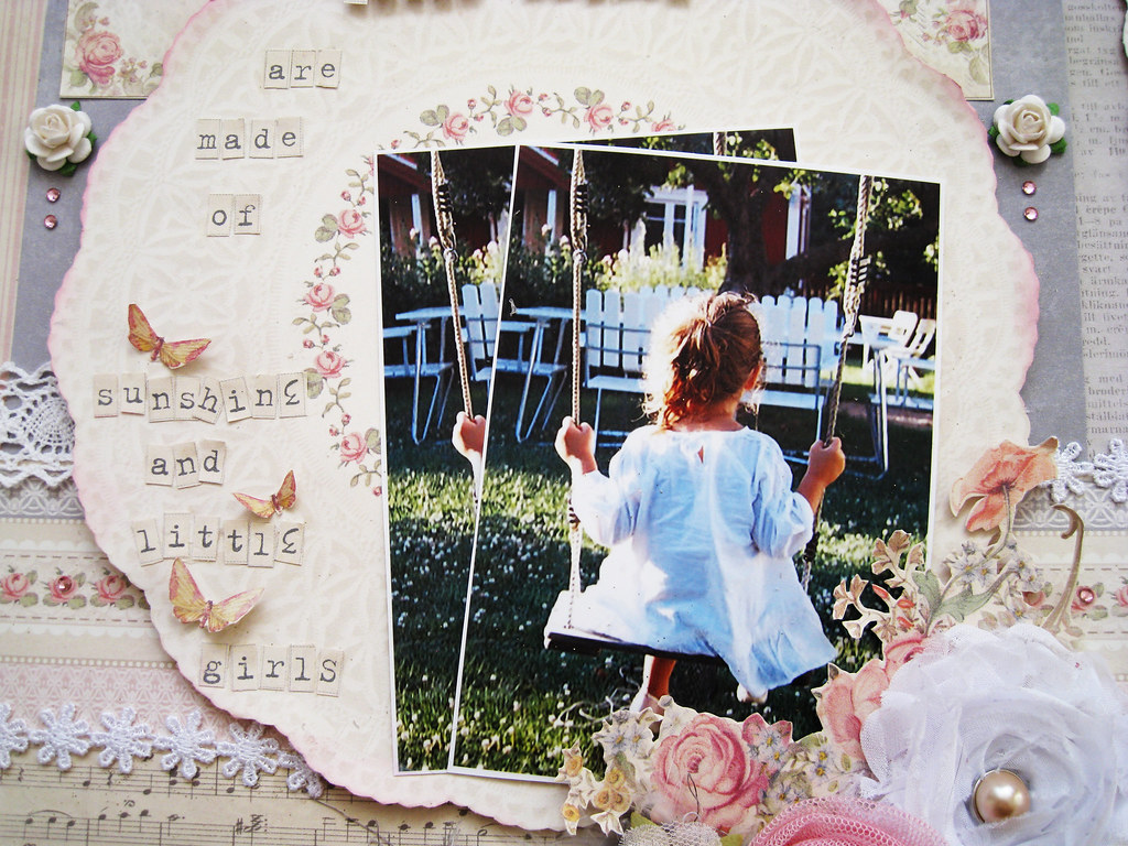
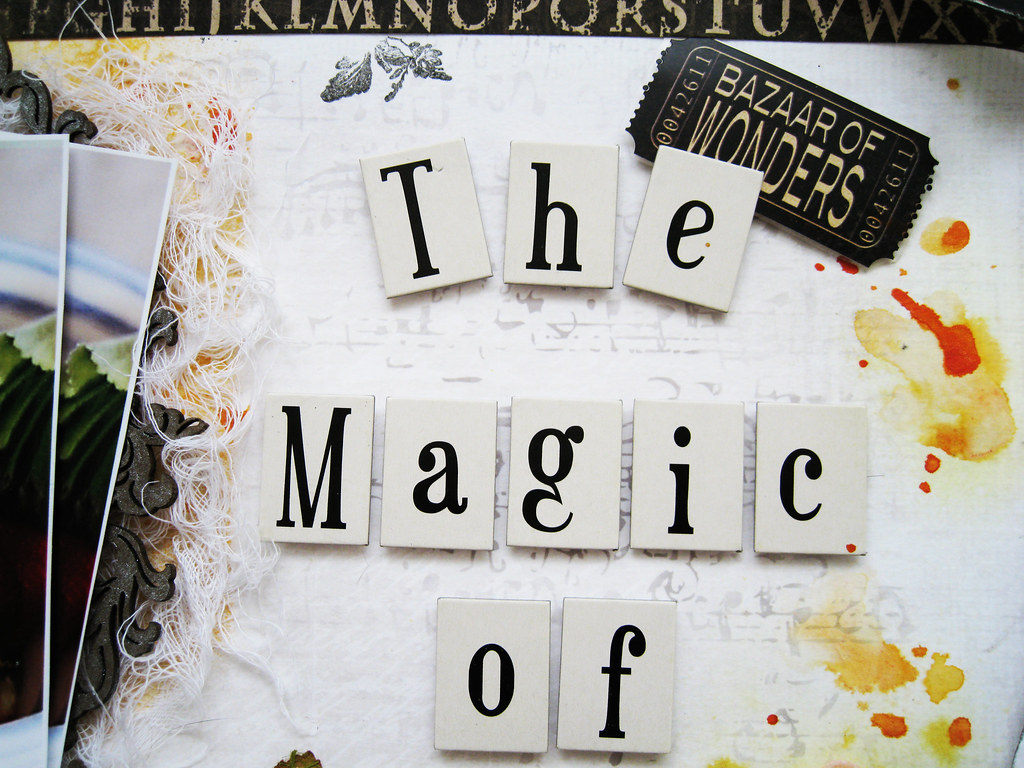
This longing for lighter and warmer days is impermeated in the Scandinavian soul, no wonder with 5 months of nothing but darkness and winter. This longing is also the theme for my TCR #108 page that I have called "Waiting For Summer". First the palette and inspo photo:


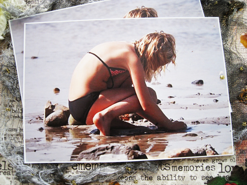
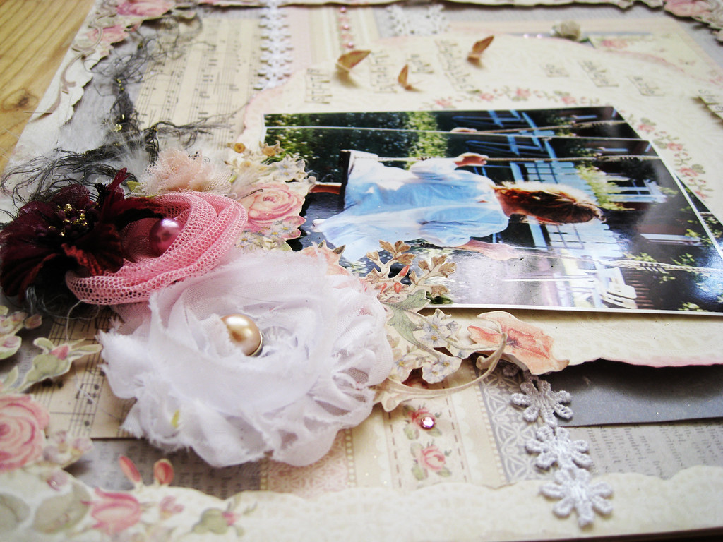
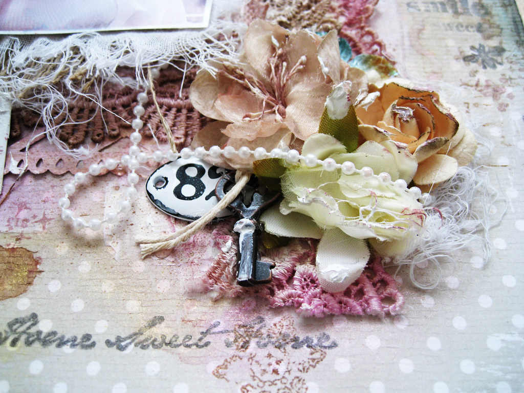
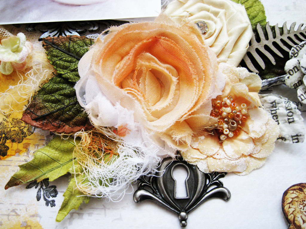
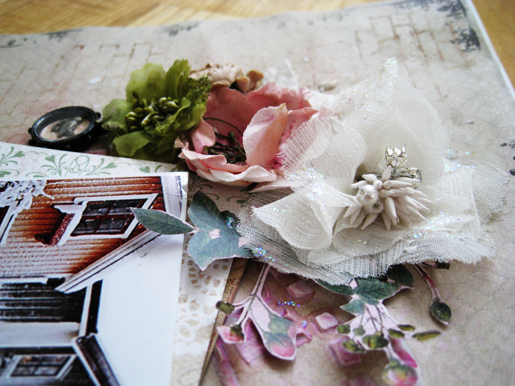
It is the last week of Manor House Creation's sponsor month and they have once again very generously donated flowers to the DT. Here is my page:

#108_Waiting for Summer 4000px-main

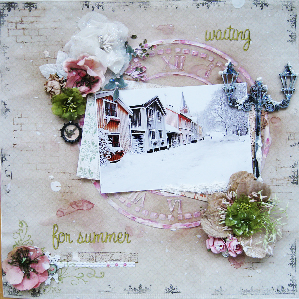
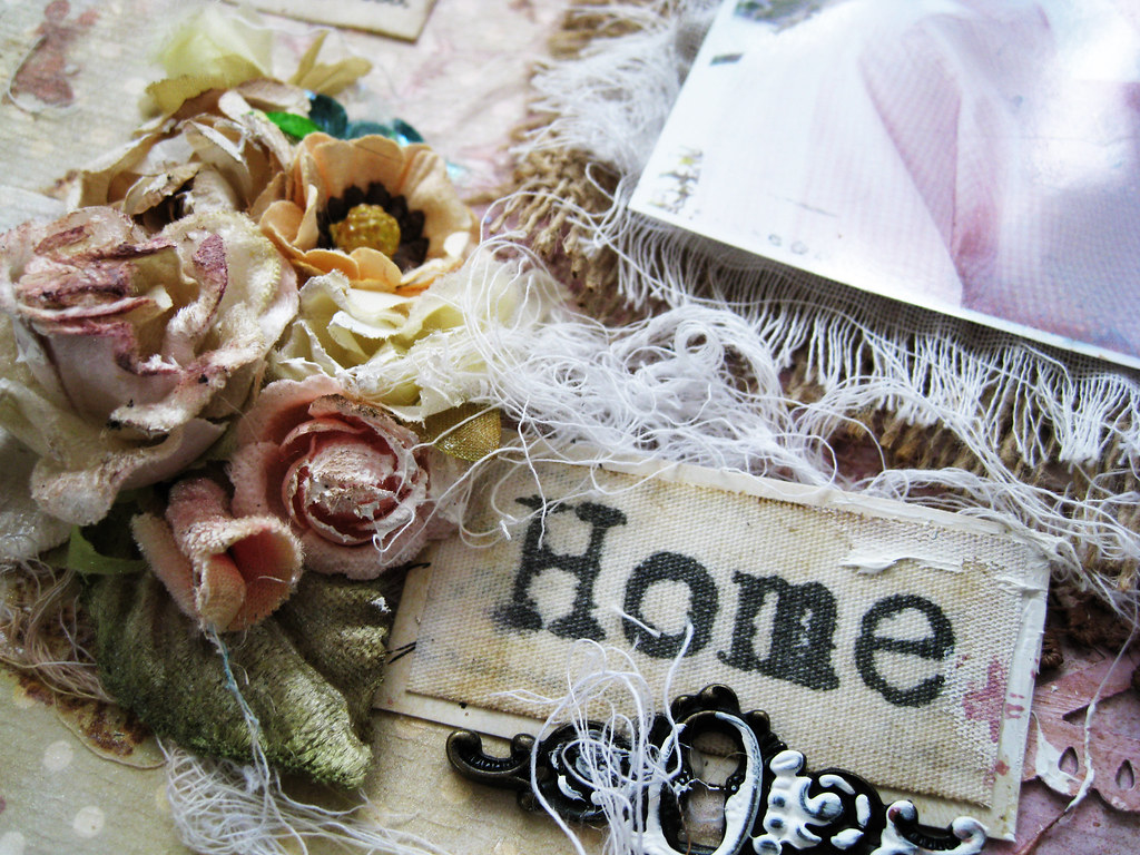
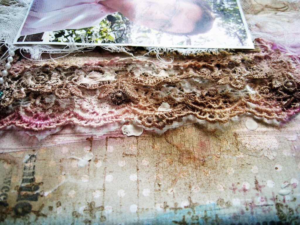
I found the photo on internet. This is a typical winter sight, although the quaint and cute little wooden houses are not the typical buildings of our cities. These houses can however be found in smallish country
communities.

 #108_Waiting for Summer -2

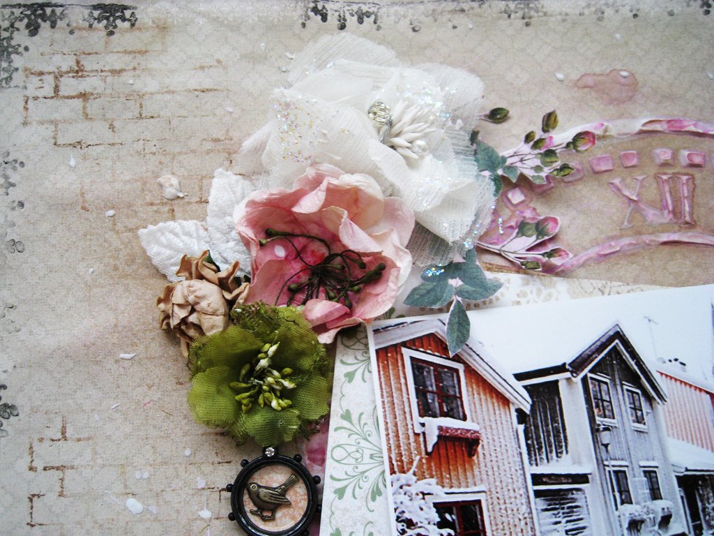
The backing paper is from Swedish Pion Design's new collection called For Mother. The subtle lace pattern is really lovely IRL but here it looks just kraft or beige.

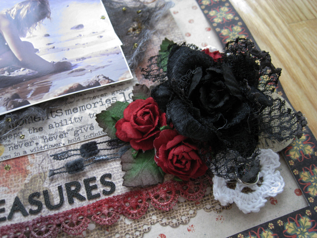
In the top cluster I have used 3 MHC flowers, the top one has a fantastic silvery glitter to it. The pink one in the middle was white to begin with, but I missted in a couple of soft pink shades.

The green one in tulle was more lime coloured, so I misted in Olive Vine to get a more muted hue.

Brick stamping from Prima and border stamping also from Prima.

#108_Waiting for Summer - 3

The new Blogger and I really don't like each other, I find it a lot harder to use than the old one. So annoying when it takes a lot more time to get the same result. Grrr!

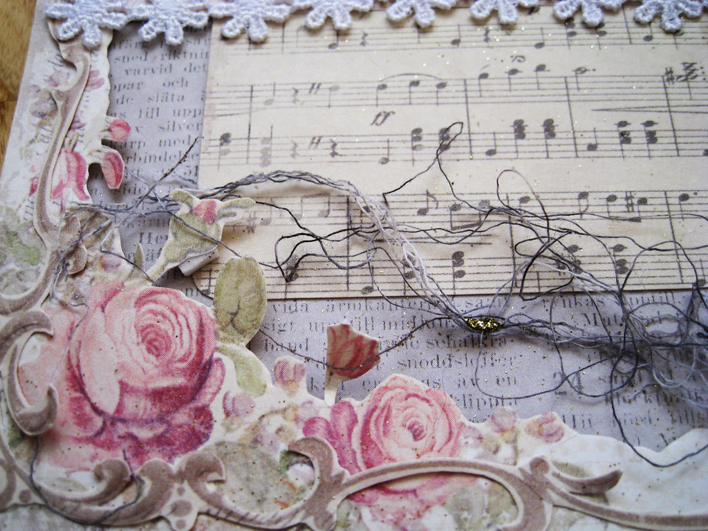
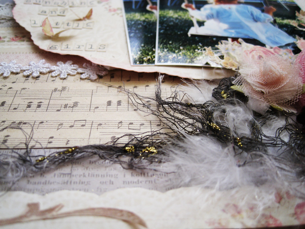
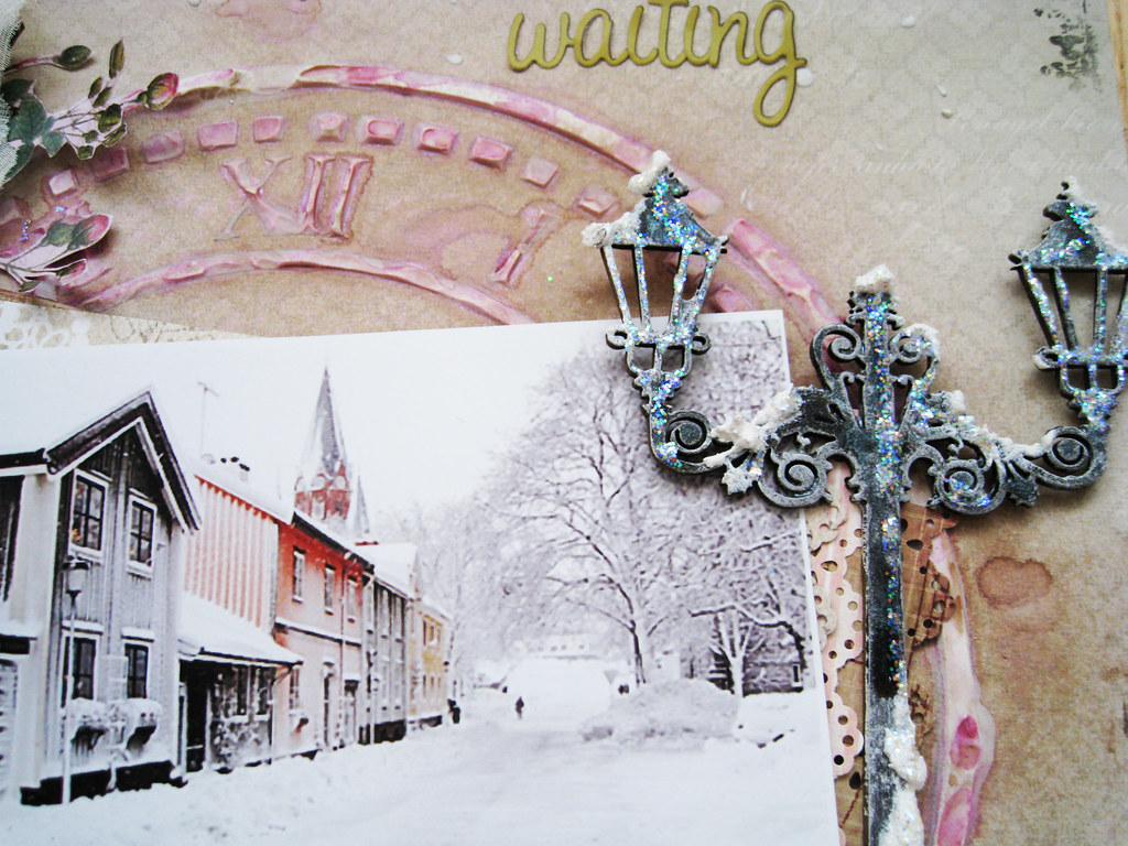
I gave the chippie lamp post from Dusty Attic a random coating of white acrylic paint for starters and then misted it in black and slate gray before adhering dollops of grainy snow paint and Stickles. I have to admit I like the effect.

 #108_Waiting for Summer - 4

Here's a close up of the cute little doll houses.
 
#108_Waiting for Summer - 5

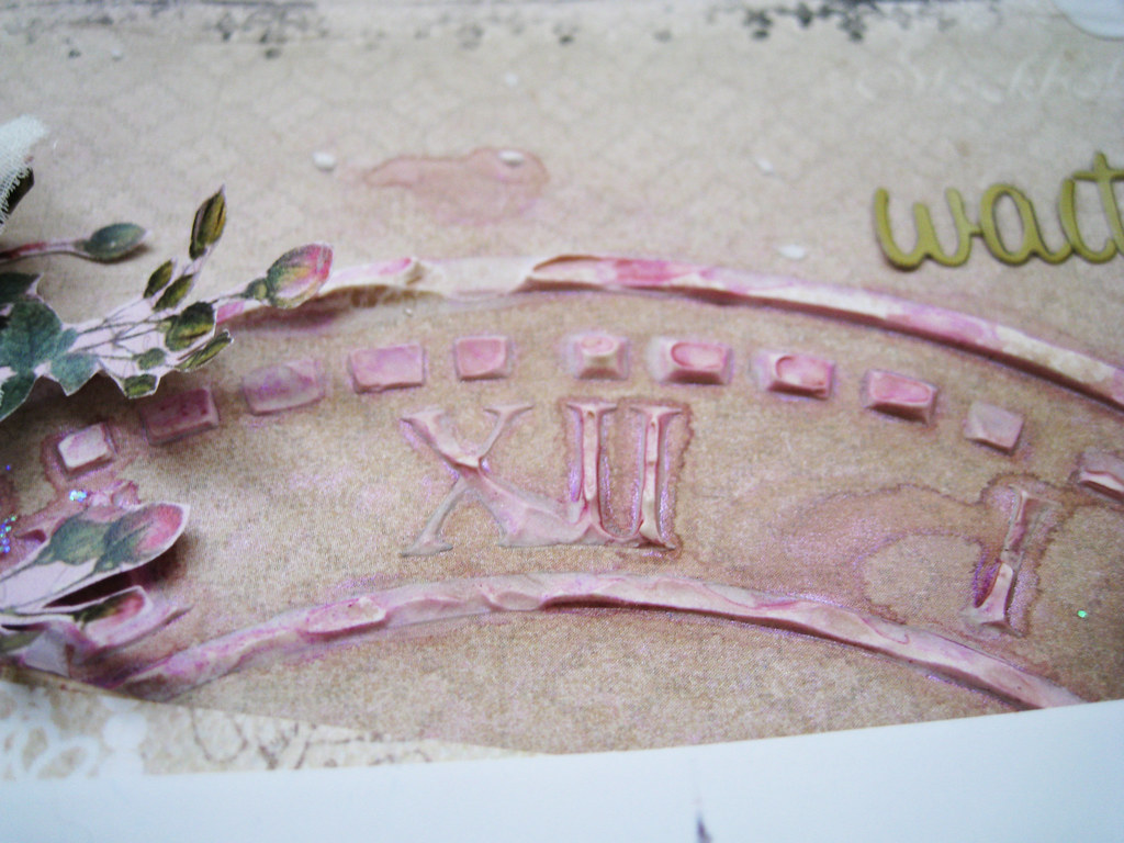
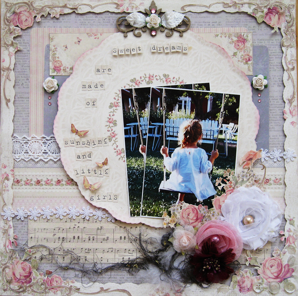
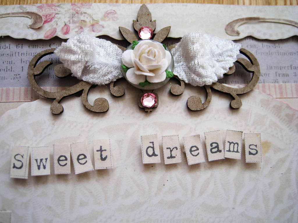
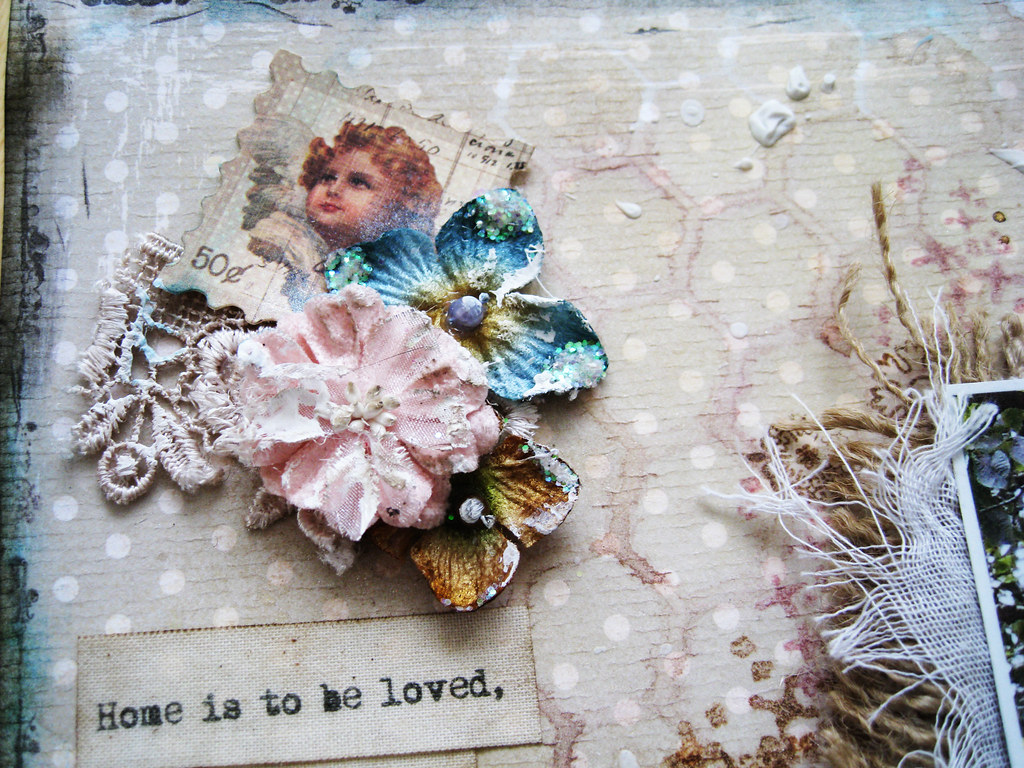
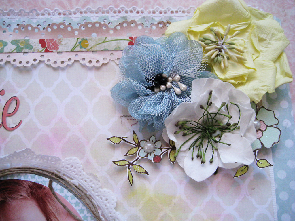
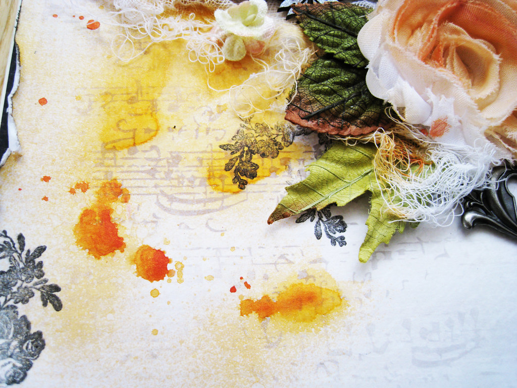
I used a big clock face mask and really thick slabs of molding paste as I wanted the pattern to show really well. Misting in Sand and a soft pink shade to bring out the pattern some more. Some fussy cut roses from a paper from Meg's Garden that I had sitting on my desk.

#108_Waiting for Summer - 6

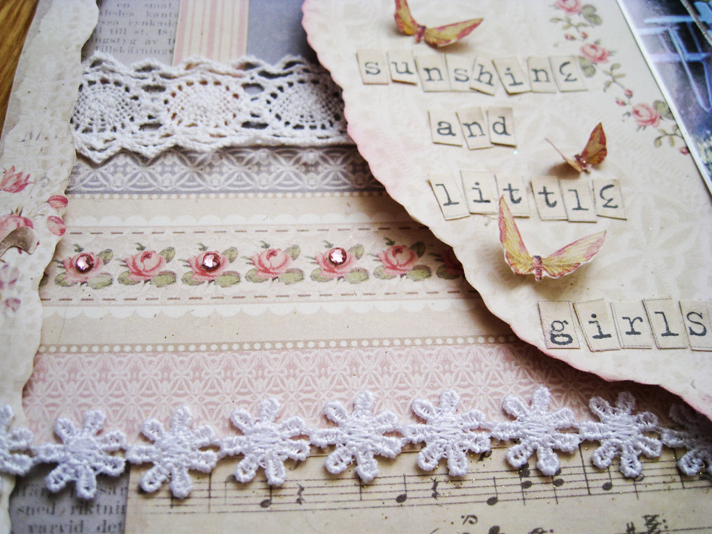
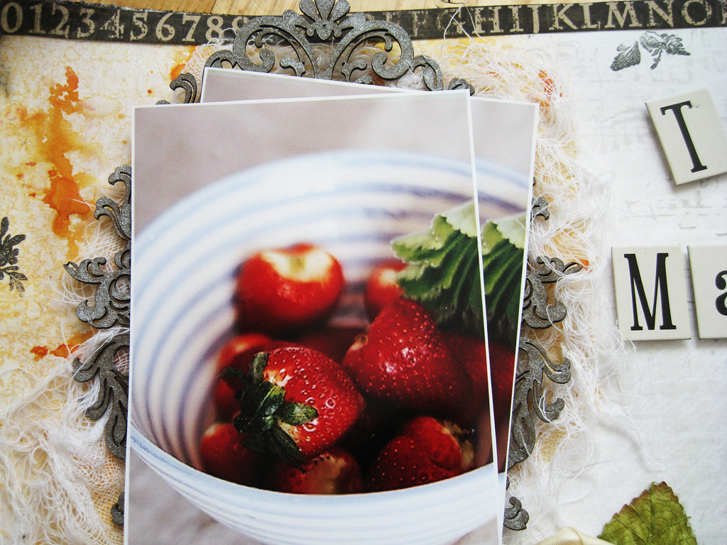
An old Prima floral corner swirl under the bottom cluster, a lovely postal strip stamp from our second sponsor over at TCR; Stamp-It-Australia. The brad is from a local store. The tiny itty doily was bought from Leeann Pearce's Etsy shop Chip Chop Shop and the white German lace is from Meg's Garden.


#108_Waiting for Summer - 7

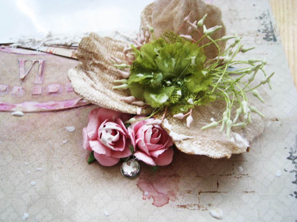
More MHC flowers, the big nougat coloured velvet bloom (love the stamens on that one) and the small lime tulle one that I misted in Olive Vine. The pink roses are from KaiserCraft.

#108_Waiting for Summer - 8

The Swedish scrappy magazine called Inzpira features TCR palettes but this week they kind of caught us unawares publishing a palette that we had no idea was being published. So abrakadabra! Lydell had to release an extra unplanned special edition palette this week:


I have only now started pulling papers for this and have no idea whether I'll come up with anything. I do love seeing other people scrap these vibrant happy colours but the colours don't come easily for me. Might have to add another forbidden colour to the palette just to make it work for me. More of this later.

Time for a refill of my coffee mug. Lovely having you popping by for a peek! Take care and have a wonderful weekend all of you.

Cheers! xoxox Eila

Tuesday 24 April 2012

TCR #107 Looking For Treasures and CSI #16 Sweet Dreams

It's already Tuesday, seems it was Friday only yesterday! Spring is back in Stockholm, the cherry trees are blooming and the air is mild. Weather forecast promises around +15C next weekend, me thinks will go for a spin and have coffee out of doors somewhere nice.

Yesterday was my birthday and DH had put pink champagne in the fridge and not a single drop was left to waste! I am so touched by all the birthday greetings that kept pouring in from around the world - thank you so so much to all dear friends near and far! I would like to share two gorgeous cards that the mailman brought for me, first a little gem from my Swedish pal Bente Fagerberg:


and a stunner from Lindy Gillespie, my friend in Brisbane:

Last Friday also saw the release of both the TCR palette # 107 as well as the CSI case file # 16. First one out is the dramatic palette from TCR which is the 3rd sponsored by Manor House Creations;


Here's my take that I have called "Looking For Treasures".

#107_Looking for Treasures 4000px-main

The cut out frame is from G45 and the other papers are a mix of Glitz Happy Travels and French Kisses.

#107_Looking for Treasures - 2

Gorgeous gorgeous fabric blooms from MHC who made it possible for the DT to create stunning projects with them.

 #107_Looking for Treasures - 3

A filmstrip from KaiserCraft, the compass is from Meg's Garden and some ribbon and bling from my stash.

#107_Looking for Treasures - 4

I misted muslin in black and dotted on Stickles gold here and there.

 #107_Looking for Treasures - 6

Splatter is TA glimmer glam in Golden Goddess, and I also misted the lace in different hues of red and some squirts of black.

 #107_Looking for Treasures - 7

Some more delicious flowers from MCH.

Now over to CSI and casefile #16.

As always, Michele has prepared a beautiful set of CSI Coordinates for you! Several of us have used them again this week. CSI Coordinates can always be found at the bottom of the reveal threads. Scroll all the way to the bottom, where it says "Attachments." They are just above the reply box.

COLOR DETAILS & RGB CODES

Rockin' Raspberry - pinkish raspberry red (from the background) - 191.90.95

Pink Serenade - medium pink (from the feathers) - 232.175.207

Whisper Pink- pale-pale pink (from the frosting's highlights) - 255.237.239 Gray Melody - light gray (from the lighter parts of the microphone tops) - 209.209.211

Groovin' Gray - dark gray (from the darker parts of the microphone tops) - 157.152.152

EVIDENCE
sparkly things
shiny things
feathers
sequins
stacked elements
 metallic paper
 musical elements (e.g., patterned paper, sheet music)
something sweet (interpret that as you wish!)  

TESTIMONY
Try out Magnetic Poetry: Here's an online version: http://play.magpogames.com/create.cfm?k=1

Use a song title as your layout title and then write your journaling off of this.

Add glitter or jewels to your journaling spot.

Write a six-word memoir (as inspired by the six mini-microphones). Info about this can be found here: http://www.smithmag.net/sixwords/ Inspiration Words: balance, sweet, sing - Use these as a jumping off point for your journaling.


This week's palette is one of my faves, pink and gray is an irresistible combo for a romantic gal like me! Add the brand new collection of papers called For Mother from Swedish Pion Design, and I've practically reached Nirvana. This is my take on this yummilicious soft and romantic palette; "Sweet Dreams":

16_Sweet Dreams 4000px-main

The evidence I have used this week are the sparkly pink jewels in the chipboard flourish at the top + dito under the small white roses on each side of the doily. I have also used a patterned paper with sheet music, tucked in some feathers in the floral cluster, and my sweet detail is the photo itself and the patterned papers.

16_Sweet Dreams - 2
16_Sweet Dreams - 3


Normally my journalling is pretty long and I put it at the back of my pages. This time I got lost in my own childhood memories of the summers in my ancestral Finland and believe it or not - I forgot to do any journalling! I'll take you through a snippet of what inspired me to make this page though and hope you'll forgive me for my omission this once.
 
16_Sweet Dreams - 5
16_Sweet Dreams - 4
16_Sweet Dreams - 6
16_Sweet Dreams - 7
The title started off with the old Eurythmics song "Sweet Things" but as the lyrics aren't exactly fit for childhood memories, I veered off in another direction. The little girl in the photo could very well have been me at the age of 5-7, I always wore my blond hair in a ponytail that bobbed when I ran and played. My grandfather had an old swing in a tree just outside his house and I loved sitting there singing to myself. I had very few other children to play with and spent most of the time in my own company. The summer sun never sets up north in Lappland, close to the Russian border where he lived so the evenings and nights were as light as during daytime. The scents and sounds were different in the evening though, and the gnats swirled in the dusty rays of the soft faded sunlight. Come bedtime and my bare feet would invariable be grubby and my summer dress full of grass stains and thistle "balls". So my childhood memories and sweet dreams are made of sunshine and little girls with pony tails.
16_Sweet Dreams - 8
  Thanks for popping by! Wishing you all blue skies and sunshine! Cheers! xoxox Eila

Thursday 19 April 2012

1APRIL UOAS "Wherever You Go"

Friday is the best day of the week don't you think! A working week has come to its end and one has the whole weekend to look forward to.

Monday 23rd is my birthday and DH the sweet darling asked me already a couple of weeks ago if I wanted to have "one of those machines you've been talking about". I've been refusing to buy one for several years, stubbornly sticking to my crafter's knife and scissors, but lately I've warmed up to the idea. I am now the owner of a Big Shot but have no dies - yet. Don't know what I need and have to check out what's out there first.

I've been fiddling with my page for the 1 April OUAS challenge for some days before finishing it yesterday evening. First the pretty sketch and prompt.


The theme of the challenge is HOME.
The prompt is to create a layout and freely interpret the theme "HOME" based on the sketch. One can journal as little or as much as one likes, but the layout must incorporate this theme and this sketch.

So here's my take on the theme and the sketch; "Wherever You Go". I've kept pretty much to the sketch, not flipping anything.

1APR2012 Wherever You Go 4000px-main

I get so frustrated when all the texture and mediums used on this page don't photograph at all. There is misting/masking, gesso, molding paste, stamping, chalking, inking in several colours on this page, but still hardly any of it comes across. Grrr!

1APR2012 Wherever You Go - 2

I printed on canvas using an old typewriter font and then mounted it on a piece of Prima packaging. The amazing velvet pink cabbage rose has travelled all the way from Brisbane, Australia in company with some stunning lace and other gorgeous flowers almost too beautiful to use. Thank you infinitely darling Lindy!!

1APR2012 Wherever You Go - 3

A glimpse of the soft chicken wire mask/misting.

1APR2012 Wherever You Go - 4

I've used this photo of DH taken last summer before, but as it's one of my faves of him, you'll no doubt be seeing it again :)

1APR2012 Wherever You Go - 5

Stamping in brown + black + a couple of pink hues, gesso, misting in sand + suede + a couple of pink hues and splatter in white acrylic paint.

1APR2012 Wherever You Go - 6

Soooo annoying that the layers of misted and gessoed lace don't show properly. It's very pretty IRL. Lindy - I just enhanced the dye with similar colours. Mwah mwah!

1APR2012 Wherever You Go - 7

Home Sweet Home from Marianne Design, TH key and number plate, Prima blooms.

1APR2012 Wherever You Go - 8

This is the journalling and that's all I've written this time:

Home is to be loved,
to feel safe
and to belong.
Home is where you are.
Where you go, I go too.

1APR2012 Wherever You Go - 9

More of the misting, stamping and gooooorgeous lace. I inked up the edges in TH distress ink in Broken China and Black Soot. The stamping is made in TH Vintage Photo + Victorian Velvet.

1APR2012 Wherever You Go - 10

I mounted the photo on cardboard before placing it on top of the matting of hessian and muslin. Together with the gessoed lace, everything on this page makes it rather chunky and heavy IRL.

And so we've come to the end of this post. To all of you lovely peeps out there, I wish a wonderful wonderful weekend when it comes! Thanks so much for popping by!

Cheers! xoxoxo Eila

Monday 16 April 2012

TCR #106 True and CSI #15 The Magic of Books

A bit of sunshine, warmer temperatures and Mother Nature resumes her work again. After the sudden snowfall last weekend, Monday came with bright sunshiny skies and tiny buds everywhere. Got an MMS (photo sent via mobile phone) from friends spending the weekend in London where the tulips were blooming. In Stockholm we won't see them in bloom in at least another month.

Just realised I will have cause for a birthday celebration in May - my blog's first anniversary! Have to think of a little something to celebrate it. More of it later!

In my previous post, I shared the happy news about my April guest designer spot at Berry71Bleu. An absolutely delight working with Marivic's pretty tags!

In this post I am sharing my take on both the TCR #106 palette and also the CSI #15 case file. First out is TCR;


It's the second palette in collaboration with Manor House Creations who have donated products to the DT to use on their projects. Our second sponsor for April is Stamp-It-Australia who have made it possible for some of the DT to work with their lovely stamps.

Here is my take on the palette, I have called it "True";

#106_True 4000px-main

The young lady in the photo is my stepdaughter Emelie from a studio shoot some years ago.

#106_True - 2

MHC yumminess and cut out small flowers from Fancy Pants Winter Wonderland. Pink and yellow chalk as well as a squirt or two of Shimmerz christmas mist edition Egg Nogg.


#106_True - 8

And now for the CSI #15 case file CLICK HERE

We are continuing National Poetry Month, with a special nod to National Library Week, which falls this week.

You will love the CSI Coordinates this week! Several of us have used them, and we're sure you'll have a blast with them. Michele Singh, the creator of these wonderful printables, has outdone herself this week! CSI Coordinates can always be found at the bottom of the reveal threads. Scroll all the way to the bottom, where it says "Attachments." They are just above the reply box.


COLOR DETAILS & RGB CODES

Midnight Sky - black- from the sky sky - 42.52.54
Monster Gray - medium gray - taken from the palm fronds - 188.180.162
Crescent Moon - light yellow - table cloth - 248.235.183
Orange Rumpus - medium orange - taken from the monster's party hat - 237.173.105
Wild White - white - taken from Max's costume - 253.254.249

EVIDENCE

*book pages
*monsters
*metal
*moon
*zig-zags (e.g., chevrons, ric-rac, border punch)
*stacking/layers
*foliage
*pom-poms
*something transparent
*create a frame of sorts around your page

TESTIMONY

*Document an adventure (literal or figurative).
*Document your feelings about books/reading.
*Start your journaling with "Let the wild rumpus begin!"
*Start your journaling with "once upon a time."

*Visit this site and choose a type of poem to write (there's one called a Monster poem that might be fun to try): http://www.kathimitchell.com/poemtypes.html

*April 14 is Poem in Your Pocket Day -- write a poem and put it in a pocket.
*Use a vellum/transparency pocket for your journaling.
*Write your journaling as chapters.
*Inspiration Words: wild, fun, imagination

As orange and I are not exactly the best of friends, I first decided not to play this week but then changed my mind in the very last minute. I admit it's not one of my better pages, nor very imaginative but I'm glad I played along. Strange as it may be, the strawberries in the photo on my page have a reference to books!

15_The Magic of Books 4000px-main

The evidence I used are: the metal key hole, stacked the alpha tiles on two cut out G45 book plates/labels, half of a frame as I only framed in the top and bottom, and also foliage - both chippie and mulberry. No book pages, although the b&w Prima vine has text on it.

My testimony is how I feel about books.

15_The Magic of Books - 2

15_The Magic of Books - 3

This are the first baby steps, I will share some pages with you over the next few weeks, on which I have started to use more and more mists and texture. The lovely white fabric bloom which I misted in peachy yellow and different hues of orange, is a very small part of an incredibly generous gift from Doreen Spencer aka Tinkerbell in the UK. Aren't you a darling - thanks a bunch Doreen! xxx

15_The Magic of Books - 4

15_The Magic of Books - 5

CLICK ON THE PHOTO WITH THE JOURNALLING AND IT WILL COME UP LARGER ON YOUR SCREEN!

15_The Magic of Books - 7

15_The Magic of Books - 6

And to tempt your imagination, here's a peek of CSI #16 case file that will be released on Friday Eastern US time

16 sneak

Thanks really so much for your lovely visit! Have a wonderful week all of you wherever you may be!

Toodelipip! xoxox Eila