
This Tuesday has been absolutely wonderful, sunshine and the mercury has been hovering around +-0C, a bit of a bite in the air but not bad at all. Shops are starting to dress their windows in Christmas themes but the big "window dressing" Sunday is not until the last Sunday in November.
Back to scrappy business.
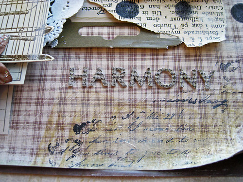
Time to share my OCTOBER Prima BAP with you. The colours I have used are quite a bit darker than those I normally use. I've mixed several different collections on this one. Here it is, I've called it "Dusk":
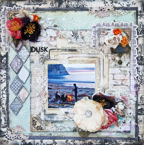
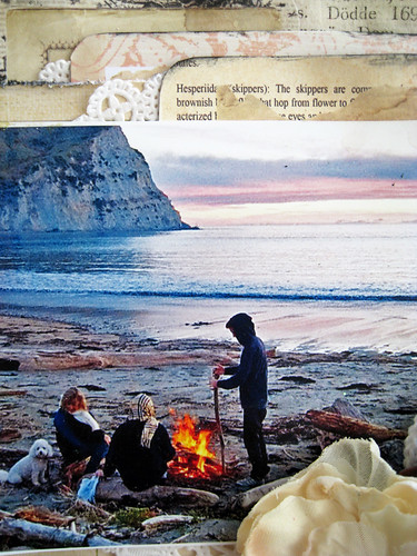
The photo belongs to Miss Kelly Faber, who lives in Wellington, New Zealand. The one and same young lady whom I scrapped in both my October Prima PPP and my TCR # 136 that you can see in my previous post. The photo is from Mahia Penninsula, New Zealand. Just look at that sky painted pink!
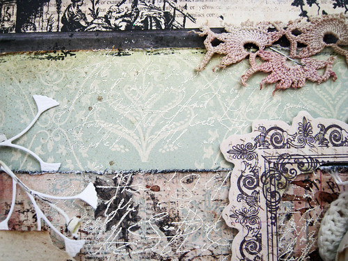
Very subtle script embossing in white.
As quite often happens, very nice splatter or background work gets covered up by everything that I pile on top.
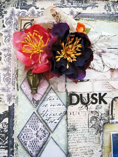
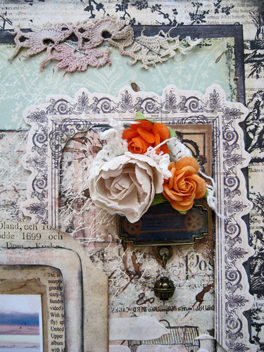
The Prima 2012 CHAS flowers are all just delicious, very very pretty. I've been re-stocking several times since the release.
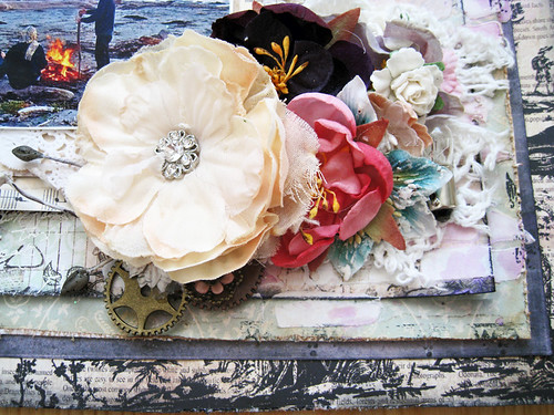
Last weekend also saw the release of CSI case file # 45. Another mega inspirational and gorgeous release! Quite somber and subdued colours. The theme is still something "home".

And the absolutely gorgeous printable coordinates that our own amazing Michele Singh has created for us.

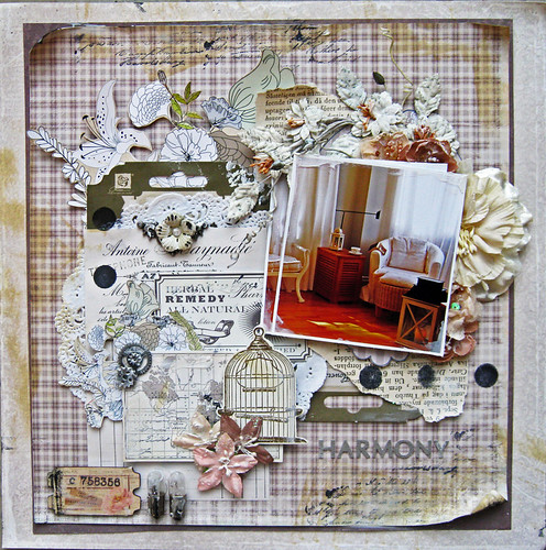
THE SCHEME (USE ALL 5 COLORS)
- Lodge - medium brown, taken from the brown pillow - 108.81.62
- Abode - cream, taken from the wall - 247.239.220
- Domicile - off-white, taken from the sofa - 253.250.243
- Hearth - taken from the tray on the table - 205.192.186
- Sanctuary - grayish green, taken from the green pillows - 183.178.146
EVIDENCE (USE AT LEAST 2 ELEMENTS)
- trees
- wood/woodgrain
- book pages
- buttons
- silver metal accents
- lantern/lamp accents
- windows
- vintage text element (e.g. ephemera)--inspired by that poster in the background
- textured paper
- mostly cardstock with one patterned paper
TESTIMONY (USE AT LEAST 1 ELEMENT)
- Document a favorite room in your house. Include details about why you love it.
- Weave a tale (inspired by woven furniture) - Write your journaling so that it sounds like a tale.
- Choose a prompt from here to write about your family.
- Add a button to your journaling spot.
- Include several family member's perspectives about your topic.
- Inspiration Words: family, comfort, home--use these as inspiration for your journaling, not just as a title
Both the stone/cream/off-white and checkered cream/white background papers are from Swedish Pion Design.
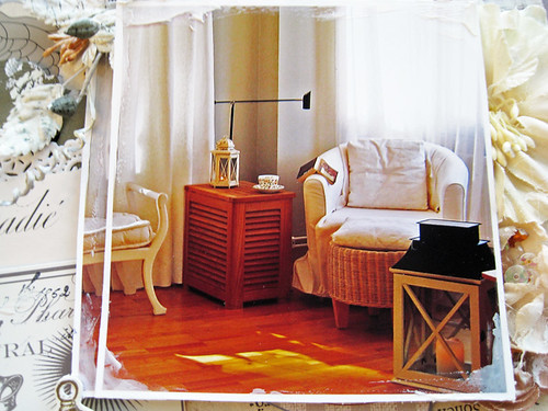
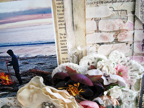
Can anyone guess why this is my favourite spot in our home? with the exception of our balcony of course, I'm talking indoors.
My cozy nook surrounded by light from the windows, something to put up my feet upon, a fleece blanket and a big cup of coffee and then something to read. Here I can relax, listen to music and have visual contact with most parts of our apartment. Really so nice to sit and muse while hubbs is doing whatever he's doing close by and the cats curl up either in my lap or on that white bench that can be seen on the far left.
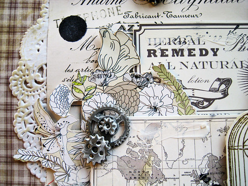
The evidence that I have used are; bookpages, silver accents (well these cogs were kind of shiny before I smeared gesso on them), ephemera and lamp accent (I used Tim Holtz light bulbs at the bottom of my page, next to the wooden Prima ticket).
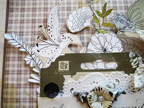
Prima packaging and fussy cutting from packaging too.
As always when I have used lots of strong colours, I feel the urge to use milder hues and if I have used quite a bit of mixed media for a period, I feel the need to go back to my roots i.e. work with paper.
My next post will be on Friday when I will share my OUAS November page with you. It is time for the release of OUAS Team B's pages on 15 November Australian time. A page that I dare say has all the acoûtrements of a classic Eila page.
Till then, have a really really great rest of the week!
Toodelipip! xoxo Eila


Beautiful layouts with lush details! I am off to look up the meaning of acoutrements :)
ReplyDeletelove your layouts, Eila! always so beautiful! and your place looks very cosy.
ReplyDeleteFørst av alt må jeg takke deg (igjen) for alle de herlige kommentarene du legger igjen hos meg og gratulasjoner! Det betyr så utrolig mye for meg!!
ReplyDeleteFantastisk den første layouten! Nyyydelige farger og jeg ser embossingen ja. Men ofte blir det jo sånn , man begynner på noe og så ender det opp med at det blir skjult :D
Kosekroken din ser bare så herlig ut!!!
ha en flott kveld!
klem
Wow, love your lay-outs so much! You really have so much attention for details and textures - love your work!
ReplyDeleteHi Eila, that spot looks so cosy and warm love the big storm lantern, I have a few of them and love to try out different Yankee Candles in them have just ordered the xmas ones! Well I'm browsing the net but should be planning my lesson for tomorrow, science, I think I will experiment with ice and colour LOL, that should amuse them for 15 mins LOL! Well your layouts are delightful I must get back into challenges but I'm enjoying my own thing at the moment. Well take care dear friend and will pop back soon x
ReplyDeleteOh how I love visiting here, Eila..your creations are always so full of amazing layers and details. Your use of color is like no other, everything just blends so nicely! These are both super gorgeous!!
ReplyDeleteWonderful pages you have made again.You spend lots of time with making them .It shows...stunning work!
ReplyDeletebyebye,Lean
You know what Eila!!!... You are simply amazing!!! both layouts are divine!!! Absolute stunning.... like I always said... I adore YOU!!! hugs...xoxo
ReplyDelete2 new stunning LOs Eila. That first one is gorgeous and the photo is fantastic. The second one is gorgeous too
ReplyDeleteBeautiful work as always my friend :0)
ReplyDeleteWhat a photo on the first one....amazing sky! Magnificent use of the packaging, and I can see why you have restocked on the flowers they are what I associate with you....elegant, pretty and the perfect finishing touch! I love the idea of a cozy nook to curl up in and escape from the world...if only!! Delicious paper and wonderful layering! Have a fabulous week my lovely x
Absolutely beautiful.. both of these, so many details... love them...
ReplyDeletegorgeous details, love the brick work and cluster, great photos too :)
ReplyDeletethanks for all your loving comments on my blog :)
Deilige sier med fantastisk mange vakkre detaljer , så flott med papirreutene du legger utover er en teknikk eg liker veldig godt selv , maling detaljer etc i fin forening , det hadde vert morro å scrappe sammen med deg klem Marion
ReplyDeleteBoth layouts are beautiful, Eila!
ReplyDeleteI think my fav is the Prima BAP - gorgeous colours, fantastic textures & clusters....and I LOVE those diamond shaped pieces of PP down the side.
I can't imagine it being pitch black at 4pm...I thought where I live with it being dark at 5.30pm in the middle of winter was bad enough! I guess it would take some getting used to...and a the mercury has been hovering around 0C & it's still a nice day? oh my goodness....lol
Both these pages are stunning, as is your Meg's Garden 'Winter" page ! I love them. You have really got your beautiful layering down pat now and your colour and pattern combinations have always been spot on. Beautiful work. xx
ReplyDeleteYou're such a master!
ReplyDeleteHeavenly pages! Both as beautiful as each other!! I love the photo of your special space in your apartment - it looks cosy yet still uncluttered. Lovely!! Your layering and gessoing are gorgeous...
ReplyDeleteI can not stop staring at all tge details, so nany new ideas. Thank you for the inspiration, and congrats of Prima feature
ReplyDeleteLove both the page and the details and the layers are just wonderful E! big congrats on the Prima feature wtg...Beautiful my friend xo.
ReplyDelete