Yesterday was a wonderfully balmy day with blue skies and sunshine, just perfect for the typical Swedish midsummer celebrations that call for out-door activities. Sooo many times over the passed years that the skies have opened up and we have huddled indoors while the rain has been pouring down in buckets. The Norwegians have their national day called 17 May, an equally important celebration as the Swedish midsummer.
Here's a link to YouTube and a short film on the traditional celebrations with a flower-bedecked pole (looks like the British May pole) and traditional costumes and dances.
The place in the film is called Skansen. It is an open air museum founded in 1891. It's the most quintessentially Swedish that can be found and tourists come in millions each year to experience it.
MIDSUMMER AT SKANSEN
Midsummers Eve passed over in night and it was still not dark. Hubbs and I sat on our balcony drinking a last glass of wine and then when the sun started spreading its pink glow over the skyline of Stockholm, we called it a day and went to bed. Woke up this morning to a freshly laundried Mother Nature and raindrops still on the balcony railing.
Anyhow, enough of my ramblings on nature. Here's the TCR palette # 116, the last one based on a collection of very unique papers from Feature Art.

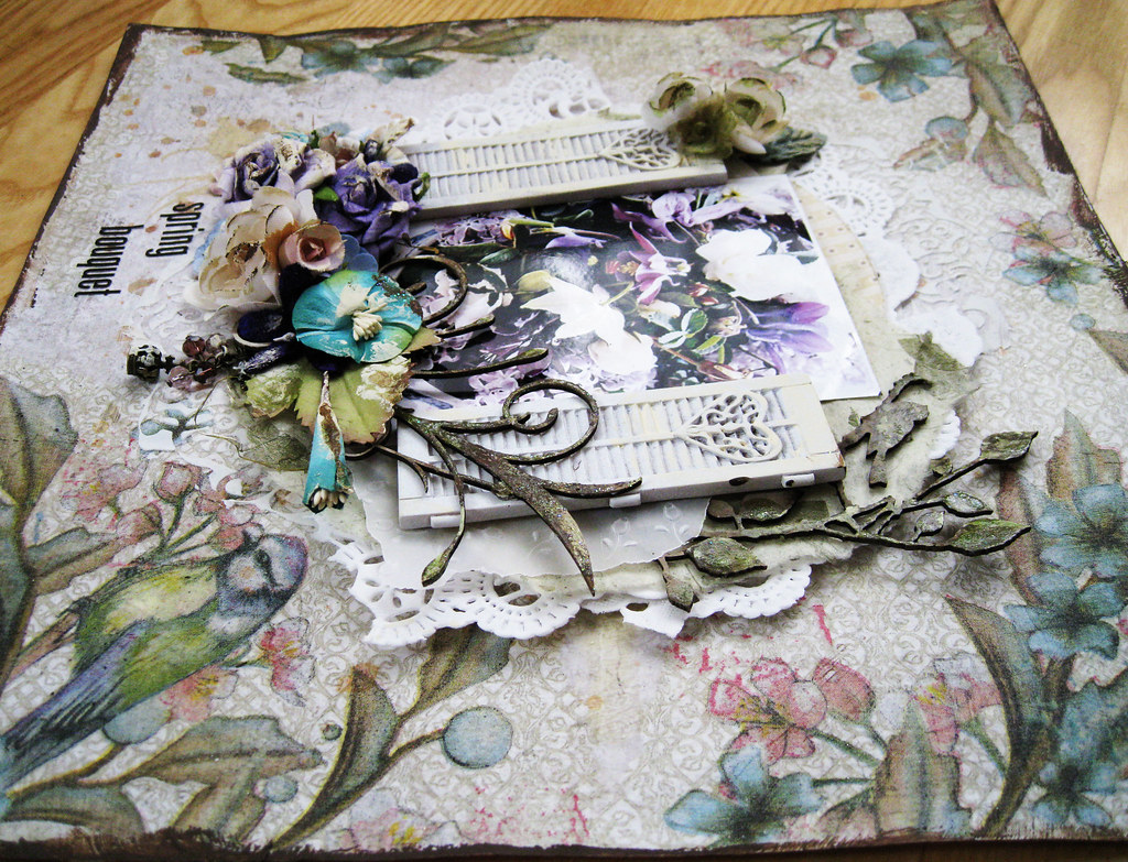
No beating around the bush, the colours were hmmm .... interesting and I procrastinated for ages before coming up with this;

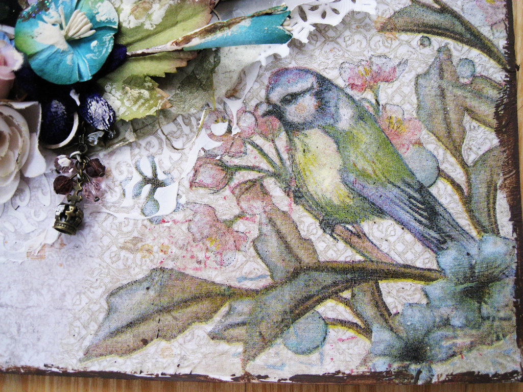
I made the background by using the very top layer of serviettes and pasting the scraps onto my cardstock with matte gel medium. Masking/modelling paste at the bottom and then ripped pieces of doily, pieces of handmade papers from India with flowers, others with grass and also torn pieces of vellum with white-on-white floral pattern. At the bottom I have also a circular shape cut out from one of the Pion Design papers of Grandma's Schoolbook.

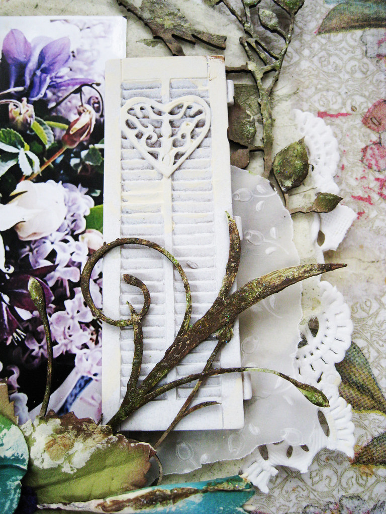
A cut off piece from a DA chippie branch with birds, coated in cream acrylic paint and then dabbed in TA Glimmer Glam in Organic Garden.

The bouquet of fantastic spring flowers in different shades of purple, white and lilace is from a Swedish gardening site. Prima resin shutters.

The yellow on my page is kept to the very minimum, it can be found on the chest of this bird.

DA chippie flourish treated in the same way as the birds on a branch.

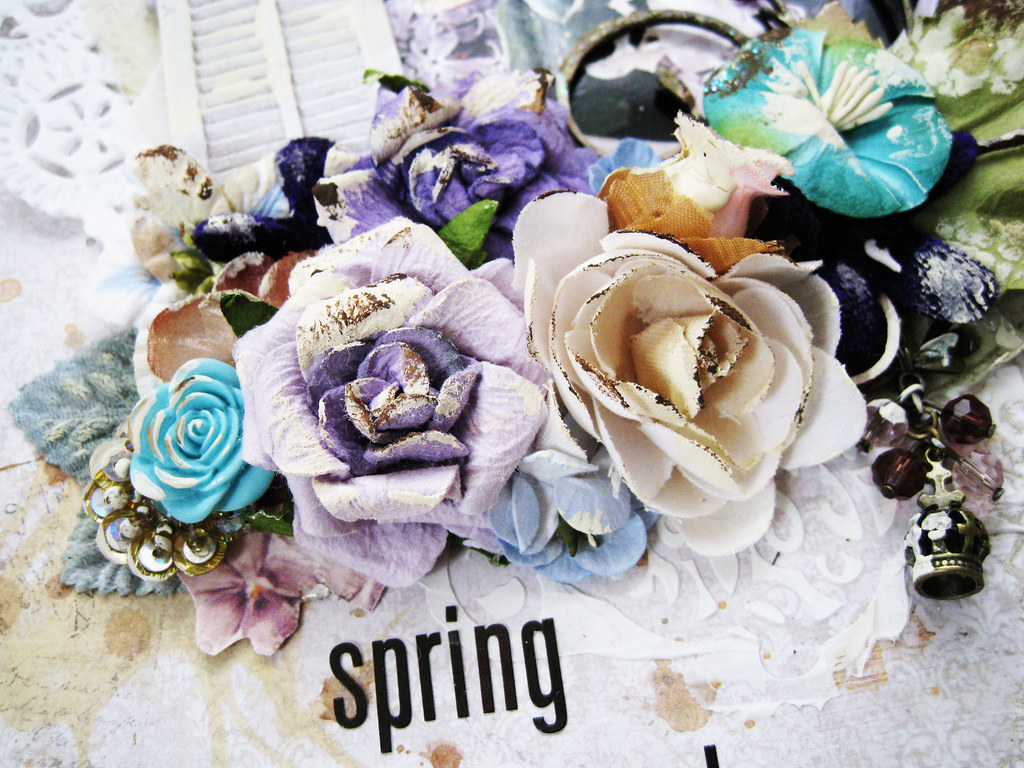
When in doubt, pile on Prima blooms! a trinket in there too and some bits and pieces from KaiserCraft and Petallo as well. Tiny violets fussy-cut from a Pion Design paper.

There it is, my Spring Bouquet!
In my next post I will share my DT page for the CSI case file # 25. Some of you have already seen the palette that was released yesterday, if not - here's a peek!

Wishing you all a really great weekend! DH has vacuumed the apartment while I've been writing this, I've promised him to do no more blogging today (well perhaps not till this evening ...) so bye for now!
Toodelipip! xoxo Eila


hahaha i hope you keep your promise..lol!
ReplyDeleteLovely page you have made cool thecnique's.
byeeeee,Lean
Eila, I love your ramblings about nature...so poetic and beautiful :)- as is your page- lush and full and gorgeous. Thanks for sharing :),
ReplyDeletexErin
Such a beautiful layout! Love all the details & the gorgeous layers...the little window shutters at the side of the pic just really set it off beautifully...makes it look like we are looking thru a real window, out into a beautiful garden. Fabulous work :)
ReplyDeleteI saw this on Facebook and had to stop by, this is seriously some gorgeous stuff!! Beautiful details and layers, I really love it!
ReplyDeleteI love how you've been using the Lily Bee mini alphas lately. They suit your style well.
ReplyDeleteThe background is genius Eila! All the details you included add so much texture and interest. Very inspiring and the challenge brought out the best in you! I always wondered where "pole dancing" originated. :)I learn something new all the time when I visit your blog.
ReplyDeleteThis is just gorgeous - that background couldn't be more perfect! Love how you interpreted the challenge!
ReplyDeleteBeautiful page Eila, I love how you have created your background and then added more lovely interesting layers. xx
ReplyDeletesuch a fantastic page Eila, love all the textures and details, enjoy the sun while you can :)
ReplyDeleteKjære søte, snille Eila. Du er bare helt fantastisk flink. Elsker LOene dine. Det er bare helt utrolig nydelig med det vinduet.Alle de lekre detljene dine, nydelige bildene, ja......du er bare SÅ flink. Ha en flott søndag. Klem fra Brit
ReplyDeleteSTUNNING layout Eila, so many gorgeous details & thanks for sharing all the info. Just beautiful. Cheers Di xo
ReplyDeletePS Did your little parcel arrive yet?
Oh Eila, you dear sweet thing :0) What a lovely surprise to see that you had popped in to visit my English blog!!! You are so right, our styles are poles apart but I adore your work and sit and stare in wonder because not in a million years could I do what you do. This layout and all the other beautiful things I spy here are no exception. Happy Midsummer! Lucky you to have blue skies :0) p.s. I am your newest follower xxx
ReplyDeleteWow! Gorgeous, gorgeous, gorgeous! Love how you used those shutters too!
ReplyDeletefabulous page Eila...
ReplyDeleteTotally gorgeous Eila! I can't wait to use those shutters, I have a couple of packs and they are so delish! Glad you have some blue skies too!!
ReplyDeleteFabulous page Eila!! love how you did the background with serviettes...cool!! Nice that you have a lovely weather. I sent you an email, I received your package ...I LOVE everything...THANKS!!!!! Beautiful work!!
ReplyDeleteTake care, Hugs! xoxo
Such a beautiful take on the challenge Eila. Beautiful elements beautiful design & put together so superbly. Those little Prima shutters look great too. I have these but haven't used them yet. You have inspired me to get them out & actually use them instead if just coveting them!! Stunning layout as always.
ReplyDeleteCheers Di xo