I like when people share peeks into their scrappy spaces and perhaps even a glimpse or two of their homes, it feels like I get to know them just an itty bit more. So I thought some of you might like to see a peek of a Swedish home, but mind you what I said about all the personal items that are removed so it looks kind of bare.

I'm standing with the kitchen behind me looking out over the living room. The whole wall in front of me and to the the right of me, have windows.
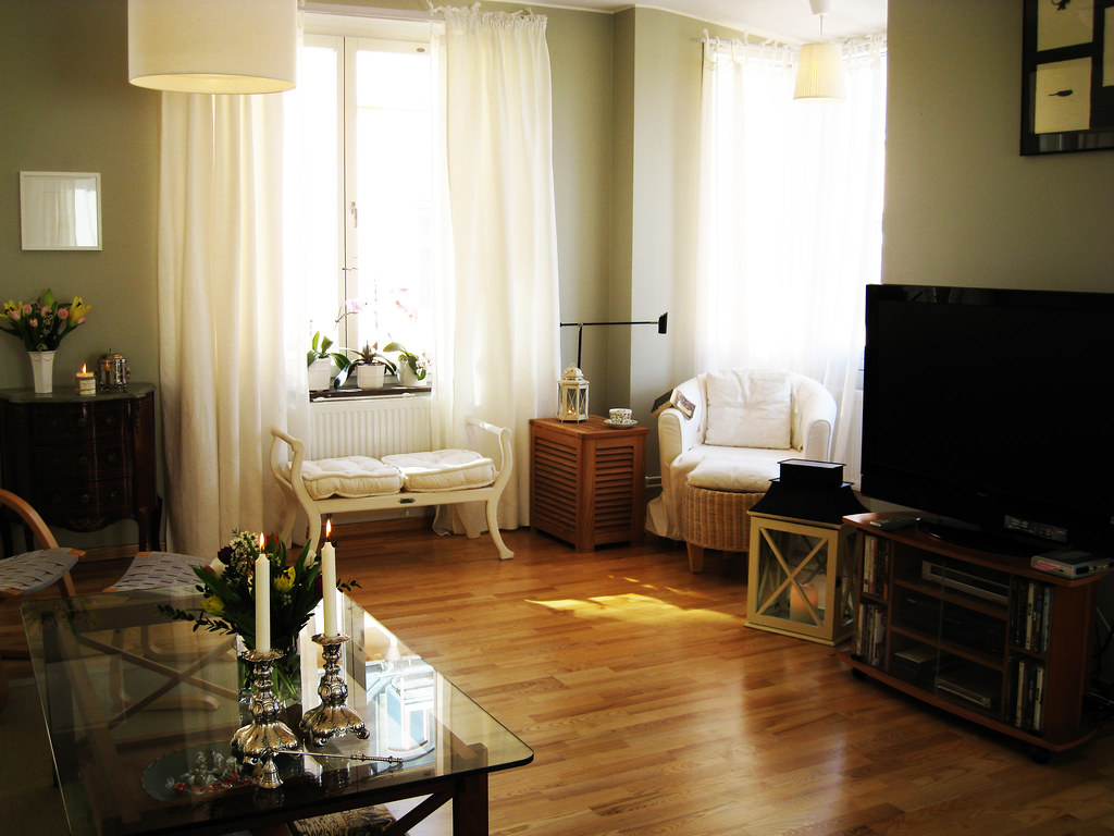
A slight turn to the right and there's my cosy reading nook.
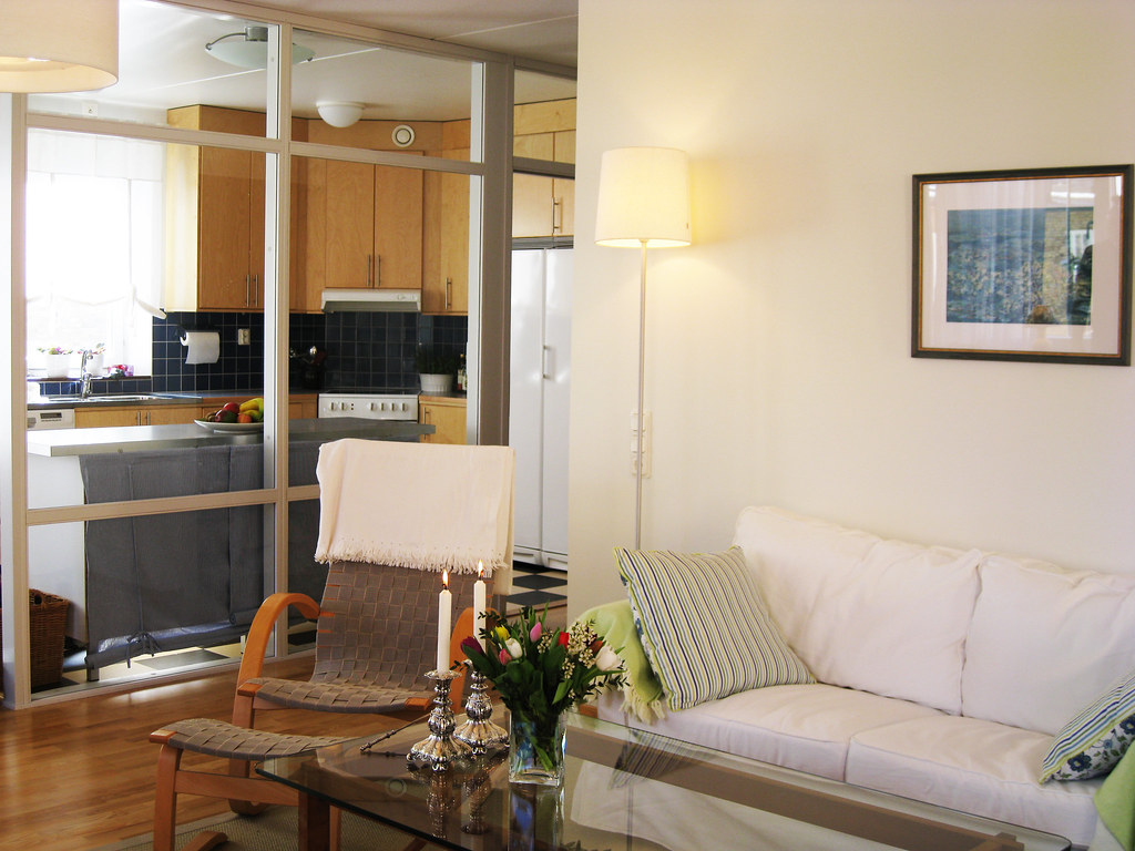
I've made a 360 turn and have the cosy nook behind my back, looking into the kitchen outside of which I stood when photographing the previous 3 pics.
.

More of the kitchen. Our dining table is directly on the left out of the pic.

Standing in the kitchen looking out towards the balcony. All of the kitchen/dining area/living room is open space.

Our bedroom with all photos and memories removed, very bare.

This is how our spare room looked before I moved in with my scrappy stuff. Instead of the bed, is a cabinet and the computer station. The book shelf is replaced by an L-shaped working table where I stand when I scrap. Under the table are boxes of my stuff and behind me on the right is an IKEA bookshelf with papers and more stuff. I have very very little wall space as you can imagine. Sorry ladies, I won't share my scrappy nook with you, it's too packed and far too messy. ;))
On the subject of messy but in a different way, painterly mess. Several weeks ago when I started experimenting with more texture and mediums, I made a page for the Prima May PPP, here it is; "Apple Harvest":

Have never understood the use of a brayer before the workshop with Nat Kalbach where I had a heureka moment. Here the brown acrylic paint has been rolled out with one.
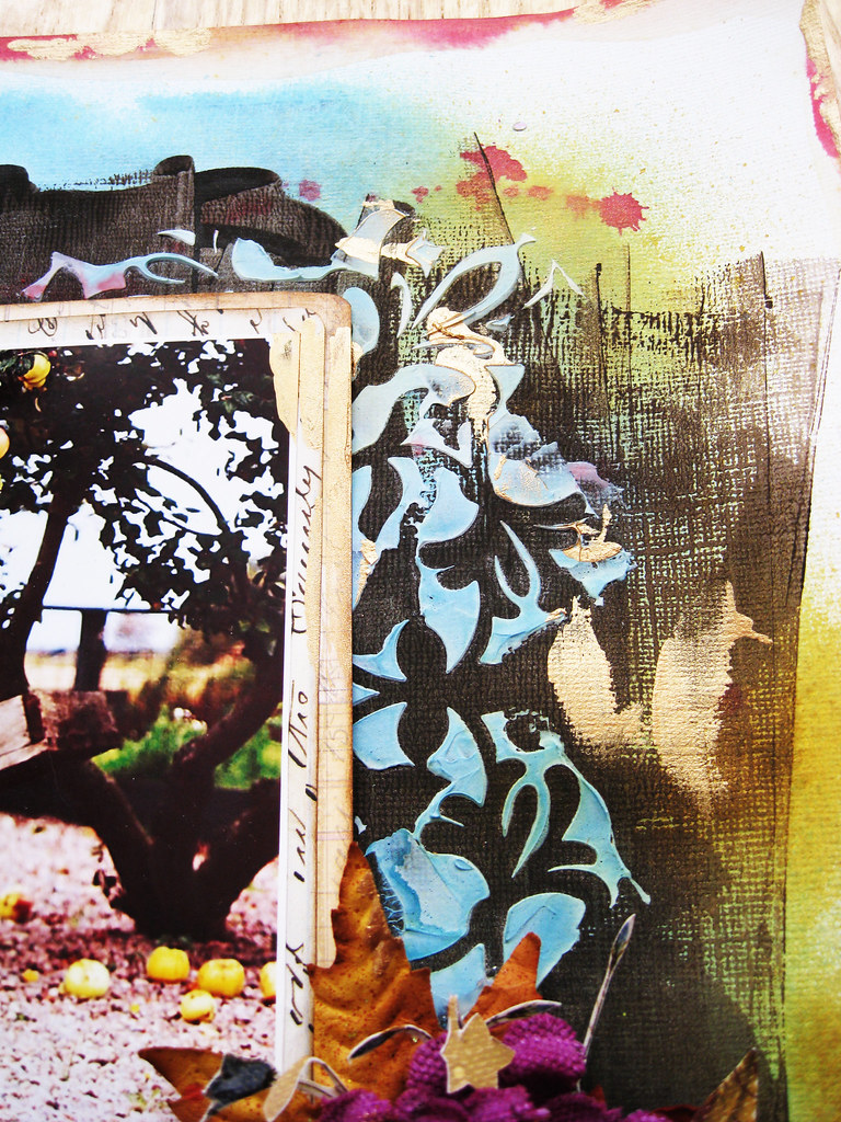
Modelling paste and misting, pretty straight forward.
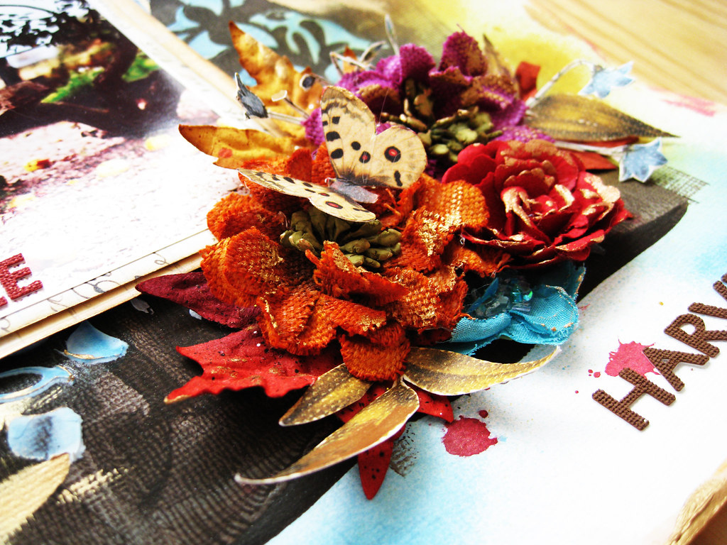
The PPP had rich autumnal colours, not quite up my alley but the teal was a very nice pop against the burnished hues.
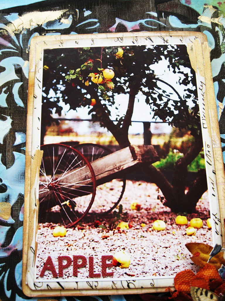
I found the photo on a French site, cannot even remember which.

Not colours that I normally gravitate towards but can almost feel the crispness of October and rustling of leaves.

Will be back at the weekend with a page from The Color Room, more experimenting going on in that one. And in a few day's time, I'll share my page for CSI. More arty stuff on that one too!
Have a wonderful Friday and start to the weekend! thank you so much for popping by and saying hello!
Toodeloo! xoxox Eila





Your house looks very cosy love the clean and fresh look very easy to look after i say ...love the new techniques you learned at Nat's class i too have never had use of a brayer but your paintwork looks amazing ...have a lovely weekend
ReplyDeleteLindy xo
Love the photos of your house - we are doing the same thing - trying to get ready to downsize - packing up all the personal stuff (snf). Your page is fabulous - never used a brayer but going to have to look into it - it looks amazing!
ReplyDeleteI am reminded of the days when I was a student of interior design and I used to pore over Scandinavian Design Books blowing up my allowance in the process. I was a huge fan of your minimalist look until the kids came. Now the look is TORNADO with toys and my scrapping supplies!
ReplyDeleteI am loving your experiments with the wet medium, Eila. They look delish!
Love the photos of your house. There is so much light and I don't think it looks bare at all.
ReplyDeleteAnd loving the richness in your page. The colours are fabulous and the texture, delish.
Beautiful walk-through of your lovely home- thanks so much for sharing!
ReplyDeleteAnd I loved your PPP page when I saw it on FB- amazing texture and color- I might even sense a winner with this one!! Love it!
xErin
Love peeking in your home..lol!
ReplyDeleteBeautiful page so full of lovely details and layers...COOL WORK.
Have a lovely weekend byeeee,Lean
love your home and your work!
ReplyDeleteI adore all the natural light too. It gives such a wonderful atmosphere. So lovely to have a tour around and see your space.
ReplyDeleteLovely all the textures on that lo. Looks like you had lots of fun playing. Fabulous!
Oh to live in such a clean and uncluttered space!!! Your apartment looks wonderful Eila. I could never share photos of this old farmhouse. It is definitely a work in progress!! LOL Your layout is absolutely stunning. Such vibrant and beautiful colours. I may just need to invest in a brayer too. :-)
ReplyDeleteBeautiful home and fantastic LO love all the grunge!!
ReplyDeleteEila, this is truly beautiful and inspiring!!! That flower cluster is stunning, the rich colors really stand out. Love it, love your work!
ReplyDeleteWow Eila great page! They just keep evolving!! They have always been fabulous but are just getting better and better now!! I love all the painterly effects. I hope it prompts me to play more. I am kinda feeling over it myself, when I should really be getting more into it! I loved the tour of your swish apartment. That glass wall in the kitchen is simply sublime!! I am so sad that we can't get a peek into your scrappy room. You really need to work on that as I can tell it stresses you out...I am sure with all that gorgeous Scandinavian furniture that you can sort out the storage so you can enjoy it more. I know it is not cheap but I paid R30 000 for my scrap room to be fitted out like a kitchen (about US$4 000) but without it I just couldn't cope. I waited 5 years and scrapping was always a pain in the neck for me before...
ReplyDelete