After a smorgasbord of sunshine and rain during Midsummer, the summer is officially inaugurated. Today saw almost mirages in the asphalt jungle of Stockholm, the mercury hovered at +35C (95F) at 4 p.m. when I got home - that's as hot as it gets here!
This week's palette over at TCR is absolutely lovely dovely, who doesn't adore Bright Red, Baby Blue, Lolly Pink and Buttercup Yellow?
I find it fascinating to see how different all pages look depending on what colour has been used as main. So many of the pages uploaded have used Crate Emma's Shop and Girls Paperie papers, I spent over a day pulling out papers and embellies without getting anywhere, so I just gave it a rest.
CCG are having a DT call, so no uploads in the gallery, only applications submitted. I wish all applicants really really good luck!
With a day to scrap at hand I simply dived in and played for my own pleasure. After a period of creating multi-layered romantic and shabby layouts, I really felt like doing something less elaborate but very Scandinavian. As I had the whole stack of papers from the brand new line from Swedish designer Maja almost untouched, the choice was rather easy peasy.
I used photos that were taken last winter together with the very summery maritime papers to remind me of how incredibly we long for summer when the snow piles up and lakes freeze over.
Here's the first one that I've called Winter Sailing. It's taken by my friend K and shows the marina with the jetties and red buoys that pop in the blue-white landscape.
I had some anchor and star shaped charms in my stash that I used together with the rope- like white thick silk twine.
Some pearls that I stuck in crackle paint and heated to get out the cracks, mimicing ice.
A plexi star and papers with summery motives; sailing boats and red floats so typically used for leisurely summer angling.
Here you can see the crackle paint again.
And the second page I called Frozen Days. It was the fluffy reed in the photo that made me go for the orange in the papers. Orange is by the way the colour most Swedish life wests have.
The photo is of people skiing and skating in the Stockholm archipelago. On a sunny, wind-still day it's really a wonderful experience, though I prefer to sit on shore having my coffee and sandwiches. Simply enjoying a glorious, peaceful moment in life doing absolutely nothing.
The fluffy brownish/orangeish/creamish ribbon is just so touch-me-please yummie IRL. I had to rescue the reel from the cats several times while working on the layout. They loved it too!! Thank you sweet colourful Rebekah Krueger for the gift!
Here you can see it close-up. White acrylic paint, both dry brushed and splatter à la Lindy. My DH said it looked like the stuff seagulls leave behind ... have to admit he's not entirely wrong ;)
I used a Crafter's Workshop mask and misted with TA Gold + Lemongrass + Suede for the flowers that I also cut out. Some Stickles Cinnamon, white acrylic paint, iridiscent and white embossing powder on a cut-off Prima jewel branch that I zapped with my heat gun. Hoped to get a feel of snow and ice on a dry twig but it doesn't come across that well in the photo.
Killed two seasons with one stone; winter and summer! Hope you enjoyed having a peek at what winter looks like over here. Really loved having you for a visit, thank you! Please do come again if you are in the neighbourhood.
xoxoxo Eila
Tuesday, 28 June 2011
Thursday, 23 June 2011
OUAS 15JUN2011 "Duckie" and Swedish Midsummer
Today is the day before Midsummer's Eve, the longest day of the year and the lightest night. This is the day/night that fairies dance in misty rings leaving traces in meadows and grassy patches, pixies make mischief, it marks the start of Scandinavian summer!
Girls of any age make flower wreaths of birch twigs and decorate them with wild flowers and wear them today. Pretty summer dresses, bare legs (itch itch itch - we have moscitoes the size of B52 bombers but today nobody cares!) Never does people check the weather forecast more often than on this day as EVERYTHING is planned with a sunny, warm weather in mind!
Most places in Sweden have the same set-up for the Midsummer celebrations. My MIL lives in the first capital ever of Sweden, called Sigtuna. It was renowned viking headquarter in the 800th and 900th centuries and the nation's first mint can still be seen there. Sigtuna is located about 1 hour's drive north from Stockholm and in the summer it is invaded by tourists from all over the world. Midsummer in Sigtuna is as traditional as it can get.
People dress up in their national costumes and fiddlers lead the march from the meadow where the pole (looks like a maypole) has been dressed in birch twigs and wild flowers. Two huge wreaths crown the pole. Masses of people have been waiting in another huge open grassy area with pick-nick baskets for the pole to arrive.
Now we're getting to the exotic bit; children and adults alike gather in rings around the pole and start dancing and singing the traditional songs that make tourists think that Swedes have lost it entirely. That's because the dancers are mimicing movements in the songs and what looks like a mad waving behind people's bums, is actually them acting the movements of a frog, and jumping like one too ..
Strawberry cream cake of course. In Sweden the ultimate summer cake is based on sponge, whipped cream, crème Anglaise (cold vanilla cream) between the layers and strawberries - the more the better!
So there's to give you some Midsummer feel from last year and now to UOAS 15 June 2011 challenge that you can find HERE
Journalling Criteria: The theme 'A Moment In Time'. You can interpret this any way you like, but you must journal at least 4 sentences on why your pictures are memorable.
Go check out what the mind-blowingly talented girls from the team of sponsors at Webster's Pages and Imaginarium Designs have come up with!!! My goodness do I feel like the girl from the country farm in the hicks seeing their creations and what is uploaded in the gallery. Ahem, be gentle with me when you see what I've come up with ... me thinks I deviated a bit from the sketch too, that's not good Mrs S!
Dear hubby in the pic as you can see, it's taken on the same day that my LO for TCR 63 One Happy Dude that you can see in my previous post.
Papers are all from K&Company's old lines and bought at the fabulous Dutch online store Scrappapier that you can find HERE
On 8 May 2011 I was thrilled to bits to learn that I had won the weekly draw over at Imaginarium Designs blog, I was over the moon as I had been seeing their chippies in several gorgeous LOs and desperately coveted them. Here I have used the frame and the butterfly.
Both were first painted with TH crackle paint in White Fence, then in Rock Candy. The butterfly was then dabbed with acrylic paint in Cloudy Blue and misted with TA chalk in Cornflower that I rubbed on to the cracks with my finger. The frame I rubbed with brown acrylic paint, really like how the cracks came out, and then I used Lindy's technique for distributing paint splatter with some white acrylic dollops and finally I poured out some Shimmers Blingz in December Sky. Rather pleased with the result considering it's my first real try with chippies.
The rest is then distressing, chalking, misting the edges. Some machine stitching, MS punched border and paper strips under the pics, fussy cutting of course and red liquid pearls, torn muslin and some jewels. The flowers are a mix of Prima, John Lewis in London, and internet. The twig with leaves that peeks out from bottom cluster, I snipped off from a really old table decoration.
For those of you who have actually read the whole post and finally ended here - THANK YOU! From me to all of you - a very happy and sunny MIDSUMMER or as we say in my own lingo; Glad Midsommar!
Have a wonderful wonderful weekend all of you and thank you warmly for your visit and any love you may want to leave for me!!
xoxoxox Eila
Monday, 20 June 2011
CCG 197 Say Cheese and TCR 63 One Happy Dude
This period of the year is just as the weeks up to Christmas, incredibly intensive and everybody is so busy, moi included. Thanks to a really glum and rainy Sunday, it took no major battle with my conscience to bin the to-do-list of chores. Well, what's another week in dust balls when the other option is to scrap?!
I finished two layouts and started on a third that I will probably wrap up tomorrow.
The first one is for CCG 197 and I've called it "Say Cheese" because DH and I look like total dorks in the pic. It was taken last summer at the Swedish Royal Family's residence called Drottningholm Palace. My LO # 182 Splendour was taken just moments after. I couldn't believe my eyes when I saw that I was wearing a coral red top and DH a pink shirt, bingo!
Here's the fruity and vibrant summery palette over at CCG!
This week's Designer Challenge is Digital Stamping. We are stamping on photos and are encouraged to use flourishes, borders, text whatever we can think of and embellish our photo. Well, too bad I suck with Photoshop, so no digital embellishing of my photo.
I was sooo inspired by the colours and had the perfect papers; Crate's Emma's Shop. What I had in mind did however not materialize like magic on my page. I used a couple of old decorating scissors to cut the strips of paper that I mirrored vertically.
I misted the edges with TA Vintage Pink & Tattered Rose, and stitched some stylized flowers.
I kind of like torn paper with layers peeking out. Here I've used a PP Artisan Element and some small roses as well.
A Martha Stewart punched leaf border that I stitched onto the outer strip and some flowers of course. The roses were originally white, I've misted one in TA Vintage Rose and Tattered rose, another in Rum Punch and the third one I doused heavily in Diamond Dazzle and Shimmerz Candle Light.
Not the best layout I have made but Friday sees a new palette and hopefully a fresh mojo just out from the cleaners!
On to TCR's palette nbr 63 of Creamy Stone, Pale Mustard, Rust Red and Grey Blue! Lydell sure knows how to push us out of our box, this one had me scratching my head real good before I started pulling out papers.
Seriously, I checked and re-checked the colours on my screen but it still made no sense when I printed out the palette; it looked completely different. My Rust Red looks like burgandy and it's not IRL! It has the same hue as the painted wooded fence in the background of the photo.
The photo was taken on my birthday back in April, hubby and I took a long leisurely walk in a vast garden allotment area very close to where we live. The allotments were originally handed out at the turn of the century 1899-1900 to less fortunate families with many children as a means for them to grow vegetables. Over the century that has passed since then, people have erected little miniature cottages on their plots and now the waiting list is so long that people cannot expect to get a plot during their lifetime.
All the papers are K&Company Julianna. In my previous post I wrote about this fantastic Dutch online shop with the most impressive stock of any K&Co lines past or present among all the numerous other lines that they carry. What makes me so happy is that one doesn't have to buy a full stack as Bea splits the stacks and sells them divided.
The store is called Scrappapier and if you click HERE you will come to her online store.
I think the papers remind me of old wallpapers, there are 10 layers of them on this layout.
Couldn't resist finishing this post on the old-worldy note, here are some more photos from our trip to London. This time from Cheyne Walk down by the river Thames on the Chelsea Embankment, just look at those houses! If you click on them you will get a larger view!
And finally, this is what DH was served to the tones of "Happy Birthday" played by their pianist at Brown's Hotel when we had our Pink Champagne Afternoon Tea. How delish to have "Happy Birthday" spritzed in chocolate on the plate! (nooo, DH did not lick the plate!) :))
Thanks a bunch for your visit, hope you want to come again for a peek! I would be truly happy for any comment you may want to leave. Have a wonderful week!
Cheers! xxxx Eila
Tuesday, 14 June 2011
CCG 196 Golden Days and a birthday card
Monday came and went and so did Tuesday. These next few weeks up till Midsummer (24 June) will be completely hysterical at work, everything has to be finished before the Swedish summer hols set in. It doesn't leave as much time for scrapping or for commenting as I would like, so I apologize in advance for my at times seeming absence.
Anyhow. Last Friday saw the release of beautiful summery palette 196 over at CCG; don't you just love the names Debbi and Janet came up with!
This week's Designer Challenge: Focus on Topic - What do you love about summer? So what is your favorite thing to do? How do you enjoy your summer? Such a broad topic, hope you have fun with it! Create a project - layout or card, using this themed topic. Cardmakers can create a fun summer card!!! The Designers made a fabulous job this week, I hope you are inspired!
A little note: Grease is one of my all-time favorite movies, this challenge week is dedicated to Jeff Conaway, the actor who played Kenickie, Danny Zuko's best friend. He passed away May 27, 2011.
Swedish winter sets in at the end of October and doesn't release its icy grip till March, it gets pitch black at 3 o'clock in the afternoon and people hybernate, desperately dreaming of spring and summer to come. No wonder Scandinavians live life at triple speed during June-July and August just to savour every single second of the light and warmth. So asking what I love about summer or how I spend it is pushing my happy button!
I love that its light, almost 24 hours a day. Living where I do, also means a lot of my life is focused on every aspect of water; being in it, on it, by it, near it. The first day of my vacation is blissful, I'm letting my feet out of their high heels, I'm not wearing any make-up, I take long leisurely breakfasts, stay up as late as I want, and ... finally I get to read all the books that have been waiting to be read. Summer is just a long string of Golden Days.
I chose this photo of my MIL (to the left) and her SIL half a century ago, because it shows them doing exactly what I do today; loving the sun, the scent of green grass, flowers and enjoying a perfect summers day.
Here I have cut strips of cardboard rather than used a square of it to mimic the ground and placed scrunched up torn pieces from an old book in between the cardboard strips as symbols of the books I read. The two text strips say the same, the one in English says "Reading books in the hammock". A daisy of course, the typical summer flower.
More flowers of course. The torn out threads of muslin is like the white fluff of dandelions that fly about in the summer. I'm really letting my hair out! The buttons are for unbuttoning my office clothes and stepping into my baggy comfy shorts.
The splatter of TA mist in Patina is for the omnipresent water and the strip of canvas for the garden umbrellas and sails.
I used these papers because I think they are pretty and have both a summery, maritime and old-worldy feel to them. All of them, except the teal one, which is white cardstock that I have misted in TA Patina, are from Swedish designer Maja. Same lines that I used in my previous LO 195 Paradise. Oh yes, and the scattered petals and stamens are there because I was cutting up a Prima flower and dropped the whole thing on my page. Thought it looked rather whimsical so I decided to stick them down where they had more or less ended. I matted the photo in black and hand stitched on the photo and on one of the papers. Black card stock used as well.
Yesterday was the 60th birthday of one of my colleagues at work and I had been asked by the other ladies to make a card that we could leave together with our present. Margareta, as her name is, loves flowers so with the scraps I still had sitting on our kitchen table after having made the page for OUAS' 1 June challenge, I made this:
The papers are K&Co Julianna and the sunflowers I bought at John Lewis' haberdashery department in Oxford Street, London. The doily is from Chip Chop Shop and the tiny glazed brad is BG Curio. "Grattis" means "congrats" in Swedish.
Thank you so much for your visit and for bearing with my ramblings! Hope you have a good rest of the week, take care all of ya!
xoxox Eila
Saturday, 11 June 2011
TCR #62 Angelic and a glorious morning
Once again it is Saturday morning in Stockholm, and a glorious one it is! cats and I have been sitting on our balcony watching the seagulls soar by. We live in a 4-storey multi-dwelling house only a few blocks away from the water front, our balcony is perched on the corner of the house between two residential streets both of which offer a lush park. This is the view from our kitchen door with Mr Max checking out the neighbours;
Having set the scene for this already hot day, I fear I will have to postpone my scrapping till the evening or tomorrow. No matter how much I would want to stay indoors with my papers, I simply have to savour this beautiful day in Mother Nature.
Just a quick additional photo. In the summer evenings I hang up lanterns on our balcony railing. Seeing the day turning into gentle evening, (remember Scandinavian summer evenings/nights are never totally dark) tea lights softly glowing and my darling hubby sitting next to me, is something I can really long for during the long and dark winter.
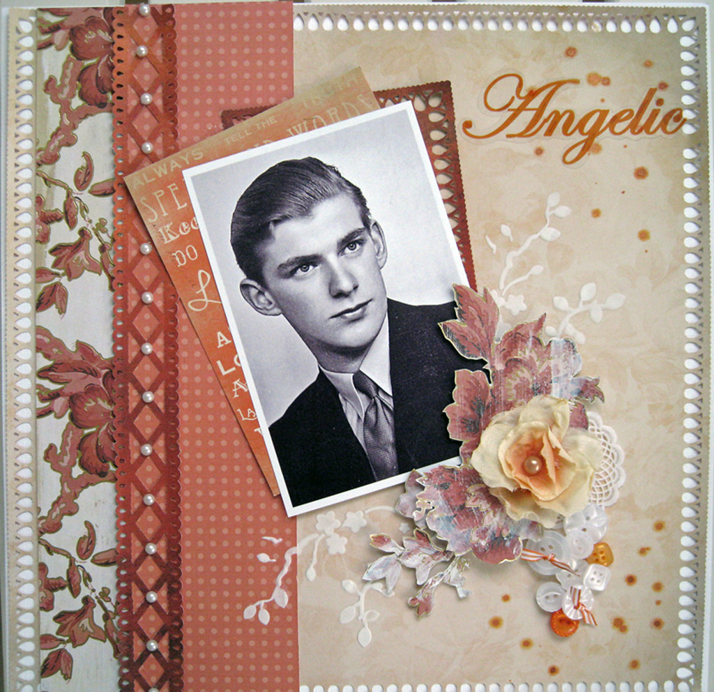
So, before I bore you stiff with my talk about summer, here's the rather challenging palette #62 that was released over at TCR yesterday. A whitewashed orange. My mojo quickly left for a very loooooong walk-about when I first saw it, but decided to come back home and for that I am very happy!
I cannot belive how quickly 4 weeks have passed, it is already my last palette as RDA. Thank you infinitely for all the gallery love you have left me and thank you Lindy for having been my partner!
The beautiful young man in the photo is my FIL when he was about 17 or 18. Even when he was in his 80's women blushed and fanned around him. Good thing my MIL is a very cool woman not easily flustered about anything.
The floral paper on the left is from DCWV Tradewinds. I made an extensive search on internet but could only find it in the US or in Singapore until I stumbled across a brilliant Dutch online shop called Scrappapier, you can find them HERE
As I like to use lots of DIFFERENT papers, I am quite often reluctant to buying stacks as they often have 2 or even 3 of each paper. What immediately got me hooked about Scrappapier, is that wonderfully sweet Bea, who runs the online store, divides the stacks into two and sells them in halves with only one paper of each pattern. Even more so, she has a huuuuuge selection of K&Company both discontinued and current lines, which I being Miss Marple/Mrs Hyacinth Bucket, absolutely adore, plus of course a lot of other current lines and brands.
As she is located in Holland, shipping to any country in Europe is easy peasy and so much less costly than ordering from the US.
Back to a close-up of my #62 Angelic.
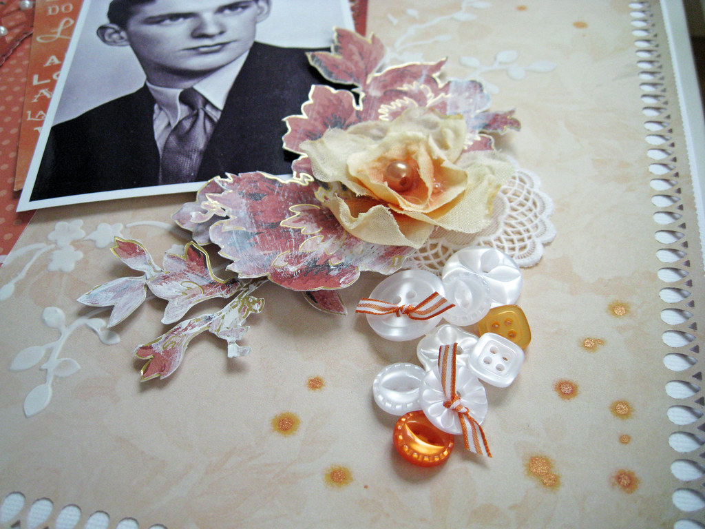
The other papers are from Glitz. Here you can see the subtly delicious pattern of the pale peach backing paper. Martha Stewart punches used. The pile of buttons is a tribute to my MIL who faithfully washed and ironed FIL's shirts until he passed away 4 years ago. Here you can also see the different orange tiny splatter, I used TA Tiger Lily and Peach Delight. It really shimmers beautifully IRL!
The white doily is a generous gift from fantastic Leeann Pearce who runs Chip Chop Shop in Australia. She has the most funny, vibrant and happy selection of pins, fimo buttons, doilies, chippies and looots more! You can find it HERE
Those of you who also visit Color Combos Galore, have seen me use the Crafter's Workshop template with molding paste in other pages. I am a huuuuuge fan of Julie Winks' and this template is often seen in her pages, used with a flair and artistry that are of inter galactic dimension. I am happy the molding paste actually stayed where I wanted it *giggle*. If you haven't checked out Julie's blog before, I highly recommend you a peek. Click HERE to get to her blog.
So we've reached the end of this post, Saturday chores are calling. Thanks lovely ladies for your visit! I cherish each comment you may want to leave me. Have a lovely weekend!!
xoxoxo Eila
Monday, 6 June 2011
Feature at Once Upon A Sketch + new layout for OUAS + CCG 195 Paradise
Monday, 6 June is a bank holiday in Sweden so we are having an additional day off from work and an extended weekend. I say yay becuase it means I've had extra time for scrapping!
First I have to make a happy dance and share that my CCG 193 Mischievous
caught the eye of the DT over at Once Upon A Sketch and got an honourable mention and a blinkie to prove it. :)) Winner of the 15 May challenge was Vibeke Harila's gorgeously shabby layout
and Marianne Johansson's wonderful page was second runner up. Both girls are from Norway. Heja Norge!!
Now to the 1 June challenge that you can find HERE
Our JOURNALLING CRITERIA this time is to journal about a female. It can be ANYONE...your self, your best friend, your daughter,grandma, mum, sister, cat. ...As long as you write at least 2 sentences about the female in the photo (you can always create a CARD or ALTERED item based on this sketch and use a quote instead). Your journalling can be any type, i.e. typed, printed etc.
To help you with this I designed a feminine looking sketch for you.
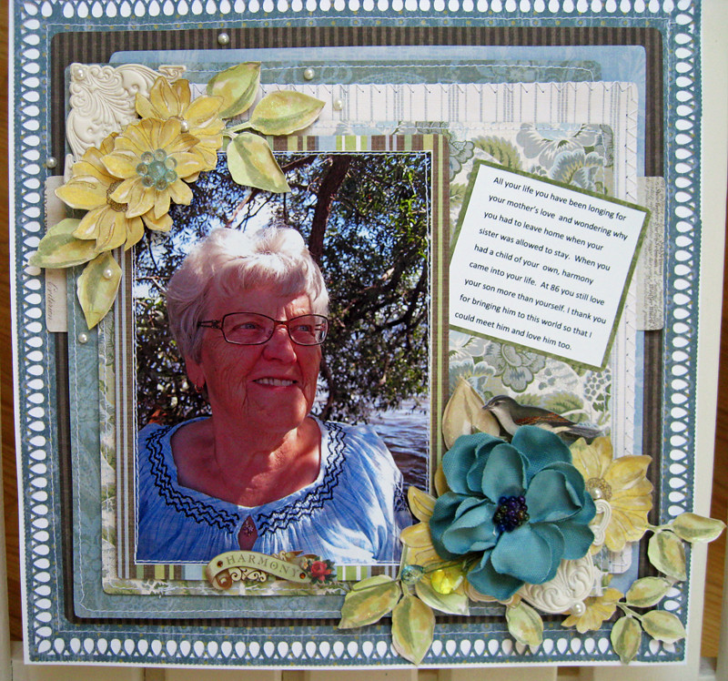
I chose my mother in law as I think she is an amazing woman. My MIL had a twin sister who was the apple of her mother's eye. When my MIL was very very young, she was sent away from home into service at a mansion, never to return till she was an adult. Having a child of her own brought happiness and harmony back into her life.
And here's my page. All papers are K&Company Julianna, I love the old-world feel to them:
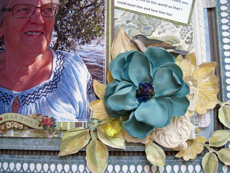
I have fussy cut the yellow flowers, machine stitched the papers and used loooots of pop dots. A Prima bloom, a couple of Artisan Elements, a snipped off Prima jewel branch and some pearls.
It was a vibrant summer palette nbr 195 that was released over at CCG on Friday, 3 June.
Hello everyone and welcome to a new challenge week! We are kicking off the month of June with great bold and bright colors! This week's Designer Challenge: Focus on Trends - Hot Air Balloons! Create a project - layout or card, using this latest product trend. If you do not have a hot air balloon in your stash, you can always use a stamp, download a digital image, or even make your own! The Designers made a fabulous job this week, I hope you are inspired!
I had already a photo in mind for my layout, unfortunately balloons don't fit in. My theme is still very typcial for Swedish summer and the holiday theme, as everything is geared towards water if you live in Stockholm. Scandinavian summer colours tend to be less "Miami" and more "Cannes".
We humans so often miss that which is staring at us right on our door step. DH and my summer paradise is here; with the soft rustling of the wind in the birches, the gentle lapping of our lakes and the Baltic, the soft greens of Mother Nature and the sweet scents of summer. The oh so bright night when it never gets dark and people live to the fullest to savour as much as possible before the dark autumn comes, all too soon.
So without further ado, here's my LO that I've called "Paradise".
All papers are from Swedish designer Maja's line just hot-off-the-press called "Life by the Sea" and "Life in the Country". The papers have absolutely delish names, I've used; Island and Skerries + Nautic + Boat at the Bridge + Flower Meadow and Strawberries and Cream.
The letter sticker and the little stamp ditto with the scooter, are from K&Company.
The tiny doilies under the BG buttons and the bright blue one on the right, are from Chip Chop Shop run by absolutely wildy talented Leeann Pearce.
I've stitched red&white bakers twine around the border, unfortunately the cute little tassels that I left in the bottom corners don't show as I had to crop the photo. The red sticker alphas are BG.
I touched up here and there with white acrylic paint on my finger and voilà, there's Swedish summer for your!
Thank you lovelies for staying with me this far and for wanting to have a peek at my pages! I treasure any comments you may want to leave, they mean the world to me.
Tomorrow is Tuesday and another working week begins! See you! till then - hej då och på återseende!
xoxoxox Eila
Subscribe to:
Posts (Atom)