First day in the office yesterday after having been away for a week and whaddya know - only 613 emails waiting in my inbox. Dunno if it's because I am such a Very Important Person or just people copying me on everything they send ;)) Still, each and one has to be read and actions taken.
This Tuesday in Stockholm is cold, dark and with streets dressed in snow. Just like any ordinary morning in January in other words. In my previous post I mentioned what a joy it was feeling the taste of coffee and coffee is the subject of my CSI case file 3.
Flickr decided to be naughty to me and wouldn't allow me to upload my pics, so I have to do it from my own computer which means you cannot click on the photos and get a bigger image. Will update this post as soon as things have sorted themselves out with Flickr.
Now over to CSI.
From our January sponsor, Dusty Attic, we have two more design team members, Natasha Naranjo Aguirre and Nancy Winter, joining Mistra Hoolahan and Michelle Grant as Guest Detectives this week. We are sure their gorgeous work will inspire you! Nadia Cannizzo, our January Special Guest Detective, will be back next week.
Our third Case File from January's Alice in Wonderland series is a departure from the first two Case Files, which had vibrant color schemes. This week's "Scene" inspired a softer palette which could be perfect for heritage layouts but is also versatile for pretty much any topic, as you will see from the layouts below.
Now, CSI Members, get out your forensics kits and get ready for some sleuthing as we reveal Case File No. 3...
Blogger was in a bad mood too and wouldn't allow me to re-size the gorgeous inspirational photo, so below you can actually only see half of the image. Really so sorry for that.
(Be sure to scroll all the way down for RGB codes, color descriptions, and more thorough explanations of the journaling prompts.)
Presenting a stunning collection of layouts created by our Guest Detectives from The Dusty Attic...
The CSI team have also created the most gorgeous projects, go check them out! Always so amazing to see what an incredible spread of styles is represented depending on what has triggered our imagination.
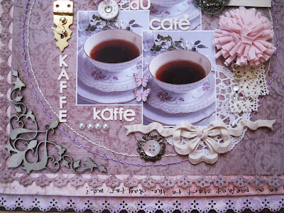
Here is my page. Going rather clean and flat this time and letting the composition speak for itself.
Brown cardstock, followed by punched pale lilac paper from Swedish Maja Design. Then the back of a Prima Pixie Glen paper on which I have also written my journalling. The top paper is actually brown though it looks like mauve or dusty purple when photographed. It's from K&Co Flora and Fauna.
In the corner a chippie flourish from Dusty Attic. I chalked it in Champagne, Gold and touched up randomly in Oyster White and Dusty Mauve though the IRL effect doesn't come across at all when photographed.
The golden metal lock is from Australian online store Meg's Garden. The yummie yummie white buttons are custom made for me by gorgeously talented Ivana Camdzic. The roses are from KaiserCraft and the photo of the old-fashioned floral coffee cup is from internet. My own cups are far from this dainty and pretty.
Two handstitched circles.
The pink fabric flower is from Prima, gosh I do love those fluff balls! The metal trinket is either BoBunny or Prima, cannot remember which, and the button on top of the crocheted mini bloom is from Prima. The violets are cut out from a paper from Swedish Pion Design.
The cream bow is actually from a local DIY shop and meant as a wall decor. It's paintable but I left it raw.
A strip of lace and a couple of safety pins. The journalling says:
"Quiet mornings with coffee belong to the best things in life. It doesn't cost anything, only time. The moments when I have time to enjoy a leisurely cup, feel so much more precious! Coffee is the key to a perfet start to the day for me!".
And now to the page I made for the Once Upon A Sketch 15 January challenge. Another clean and un-dimensional page. Can you believe it - not a single Prima flower on it!
All the papers are from the brand new spring collection from Norwegian Tilda. It hit the Swedish stores only a couple of days ago. You will definitely be seeing me scrap these papers!
The title of my page is "Cultivate". It should say "Cultivate Colours" as it's about my wish to explore other aspects of scrapbooking than paper. The photo is a reminder of all the mists and paints that I have in my drawers, some still have their original sealing left.
I really look forward to this new year - 2012, a whole year full of everything I can imagine. It depends on what I plant myself and cultivate into bloom. That's why I have used the big colourful flowers in my LO.
I have also put seed bags on my page with the most beautiful images and names to remind me that I am the maker of my own flowerbeds. The dragon fly is a symbol of creativity. The ruler tucked in there also symbolizes that life is measured for us and we can decide to fill it with happy memories or limit ourselves to squares and lines.
And that's it for today. Thank you so much for having a peek! I know there are so many of you lovely ladies that I haven't visited in quite a while, I haven't forgotten you and will make amends soon. Thank you for remembering me too!
Much love,
xoxox Eila
Subscribe to:
Post Comments (Atom)


Both such beautiful layouts Eila. Also I love your journalling too. I think it is so nice to read the little story behind the picture.
ReplyDeleteCheers Di xoxo
PS. I know what you mean about the emails, you dread going back to work after some time off because you know that your inbox will be full!!!
So i try again you have problems with flickr and blogger ..i have with my provider and some with blogger to..i try again.
ReplyDeleteLovely pages you have made i like the new Tilda looks yummie cool of you work with no Prima..lol..
And the koffie one lovely details and sweet colors.
So i hope my comment stay's this time..lol..byeeee,Lean
Loving the creativity one, cannot wait to see what you come up with let loose on paint! Went on a school visit to London today, thirty, six year old's in the pouring rain, saw the EYE, St Pauls and went up the Monument, now completely exhausted! and did I mention WET! Take care, have a great week, Doreen x
ReplyDeletenew beautiful pages again... Like this layout about coffee...
ReplyDeleteHi Eila. I so enjoy reading your posts..you somehow have a wonderful way with words and you make me feel as though I am right there with you, on those dark snowy streets of your town. :) I love your first layout..so warm yet again. Your layout for OUAS is gorgeous. Those papers ..WOW. I want some. I will keep an eye out for those. I love your journalling. I have just rearranged my scrap area and believe it or not brought forward all my paintbrushes/mixed media stuff that was dusty!! LOL! I need to do more than just stick paper to more paper this year LOL! TAKE care and thanks once again for joining us at OUAS. I appreciate your support always :)
ReplyDeleteSo so beautiful. Love the non-dimensional page. It looks great and the colors of the papers are gorgeous. Fabulous details as always.
ReplyDeleteJag håller verkligen med Miss Nadia om att det känns som man är tillbaka i Stockholm fikandes på Sturekatten när man läser dina epos! Du har verkligen ett sätt att skriva som kan fånga uppmärksamheten! Glad att förkylningen släpper för det är SÅ jobbigt!
ReplyDeleteDina sidor är båda underbara. Var det den fina rosetten du köpte när Bea och jag var med? Det blev ju kanoners!!Den vackra koppen blir också ett underbart blickfång tillsammand med doilies och underbara papper.
Gillar också bilden på OUAS sidan mycket. den känns så äkta.Och Tilda med blommor och även fröpåsar,...ja det är så man börjar längta....
Funderar fortfarande på kursen i mai. Eventuellt skulle min syster komma då men det blir inget av. Nu kallar jobbet, som vanligt!! Kramis!
Well, Eila you certainly have 'cultivated' a beauty of a layout.. it truly blooms with glorious detail and delight!
ReplyDeleteI agree with Nadia, what you write transports me to Sweden near you. I can imagine the snowy dark streets in your town and the rich smell of coffee in the morning...you can be a writer! Beautiful pages and details!! and the papers are lovely!
ReplyDeleteA Big hug!! xoxo :)
Reading your blog transports me far away & is one of my most pleasurable activities...I only wish I had time for more of it! Still behind!! How I would love to sit with you in a cosy coffee shop with the snow falling outside the window - that is definitely on my bucket list :) Wow I am loving both these layouts & your simpler approach here too (not that I don't like your more detailed work of course...) Your coffeee layout is JUST EXQUISITE!! and that bow?!? Oh my goodness...you need to start an Etsy shop just for those...!!!...I see that everything Swedish is just so TASTEFUL...gosh!!! and those Danish Tilda papers are DELIGHTFUL - do they have a blog?!? You should be on their DT!! (I know how much you would love another deadline hee hee...) Your photo is great & your journaling is brilliant. Yes I think that the whole mixed media artsy vibe that has come into fashion in the last year has certainly added an interesting new twist to our vocation - sure papers are lovely but there is a limit to what you can do with them on a layout whereas with paint, mists & modelling paste>>>!!! You can go all out...I am looking forward to enjoying your experimentations here...
ReplyDeleteoOOoooopsie I forgot to thank you for playing along with us at Once Upon A Sketch. I do hope 2012 affords you the opportunity to indulge in your scrappy endeavours to your heart's content & with superb results...
ReplyDeleteHi Eila!
ReplyDeleteThis is Very Beautiful page!!
Thank you for joining us at OUAS!!!
You may call them 'clean and flat' but I still think they're wonderfully embellished and perfectly detailed! Thanks for playing along at OUAS.
ReplyDelete