Hello lovely ladies!
This post will be short and sweet, at the moment I am working with 2 conferences that run in parallell and do practically nothing else than sleep, eat and work this week.
So, the leisurely ponderings on life will have to wait until my next post. I'm taking you straight to the release of Case File 4 of CSI which was released last weekend.
It's hard to believe January is winding down so soon! What a fantastic month it's been, and we're looking forward to another fantastic week as we wrap up our January theme. As we approach our fourth week, we already have almost 400 members and 234 beautiful layouts in our gallery! We continue to grow each day. We can't wait to see what's in store in the coming months. Please help spread the word by sharing our site with your scrappy friends.
If you haven't yet had a chance to take a crack at our Case Files, you will definitely want to make time this week so you'll have a chance to win a prize from our generous January sponsor, The Dusty Attic.
We've been so inspired all month by our guest designers from The Dusty Attic, and this week is no exception! Mistra Hoolahan and Michelle Grant contributed amazing layouts again this week. And our special Guest Detective, Nadia Cannizzo, is back with another gorgeous page.
We're very excited to announce that Brit Sviggum has joined the CSI design team and she's now an official CSI Detective! Brit's unique style captivated us, and we knew we had to have her join the team. We will be growing our team in the coming months, and we plan to have a design team call at some point, so if youwould like to become a part of the team, be sure to keep playing along--you might just catch our eye like Brit did!
Our final Case File celebrating Lewis Carroll's January birthday is inspired by a fascinating remix of Alice in Wonderland by Elena Kalis, who does amazing underwater photography.
Now, CSI Members, get out your forensics kits and get ready for some sleuthing as we reveal Case File No. 4 . . .
COLOR DETAILS & RGB CODES
TIPTOPE IN THE TEAL - 2.136.130 - the wavy part of the water on the left
GILDED FRAME - 207.149.67 - reflection of her legs (I think) in the water)
PATENT LEATHER - 14.9.6 - her shoes
BOUYAN BEIGE - 245.238.220 - water reflection highlights
WATERY TEAL GREEN - 138.175.162 - mid-tones of the water
Please check out all the prompts for JOURNALING DETAILS (TESTIMONY)and EVIDENCE DETAILS on CSI - looooots of inspiration there for your!
The deadline for completing Case File No. 4 is Sunday, February 5, 11:59 p.m. EST.
Thus, you have a week plus the two weekends to complete your layout.
If you haven't visited CSI yet, go have a peek HERE
And here's my page:
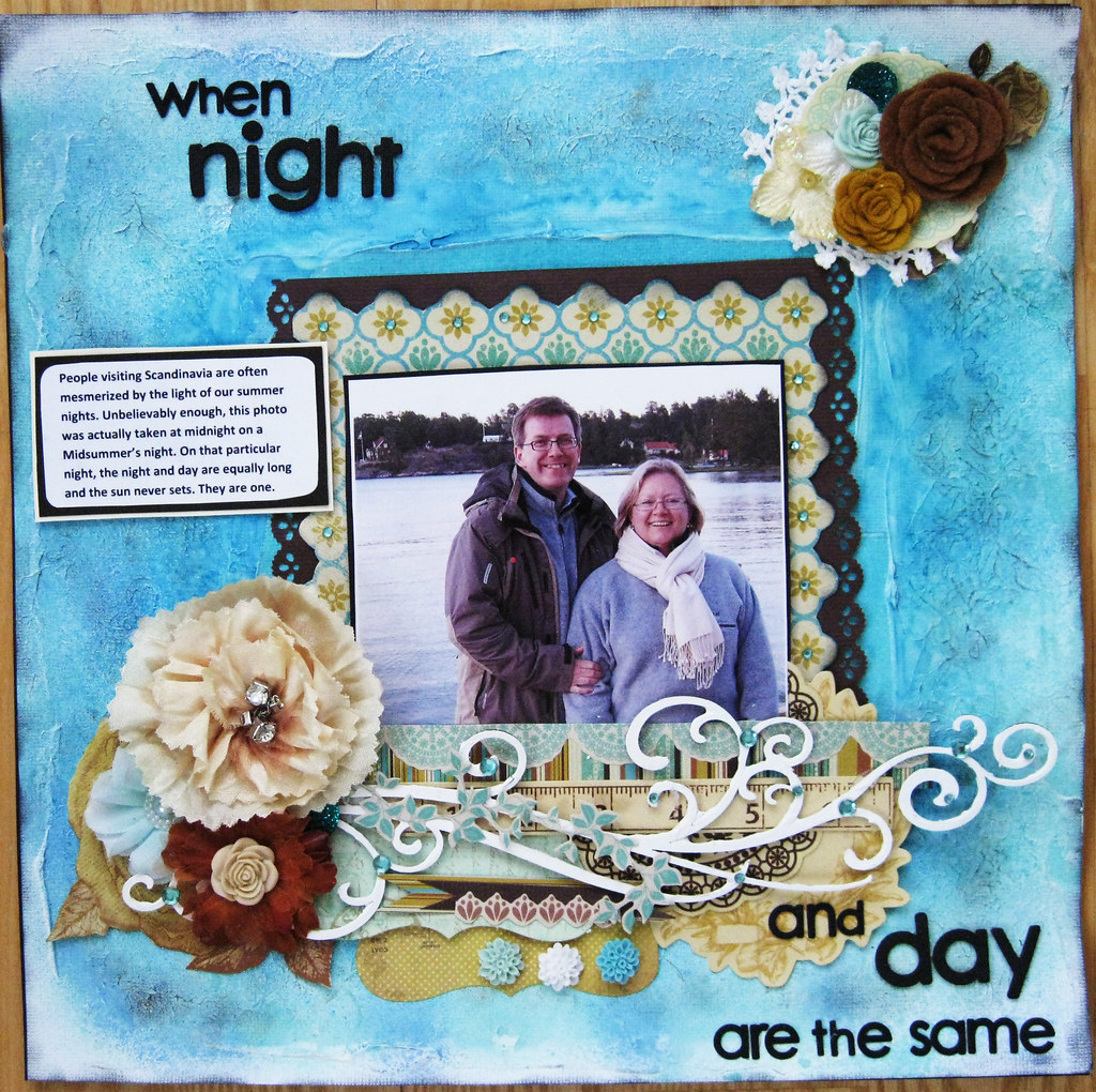
In my post on the OUAS 15 January challenge, I wrote that I want to explore other aspects of scrapbooking than just scissors and paper during 2012. This page is the first of these explorations where I have used gesso and lots of mists.
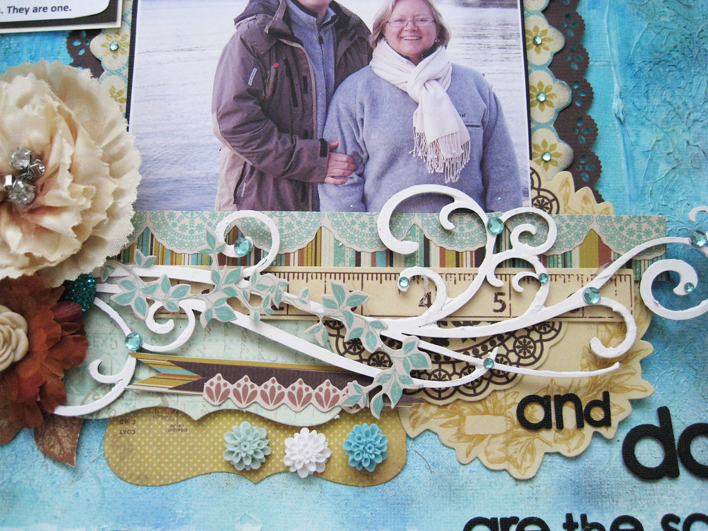
The title "When Night & Day Are The Same" comes from this photo. It was taken in the Stockholm archipelago at midnight - YES at 00.00 - on a Midsummer's Night some years ago. You can see that hubbs and I are rather bundled up with double fleece sweaters and scarf, so the light and the water give a false impression of warmth.
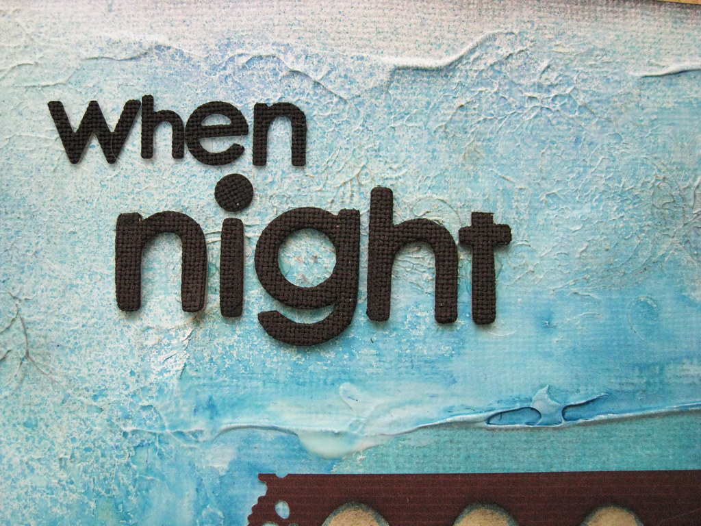
Some KaiserCraft Madame Boutique yummies in there and a white painted Dusty Attic flourish.
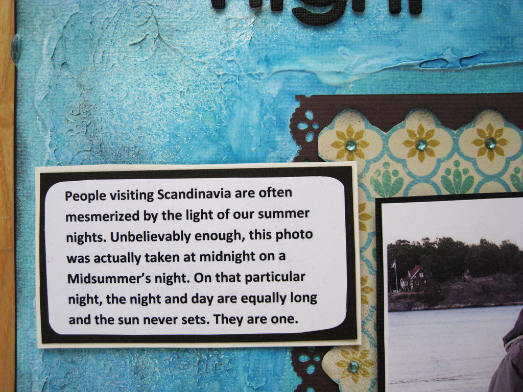
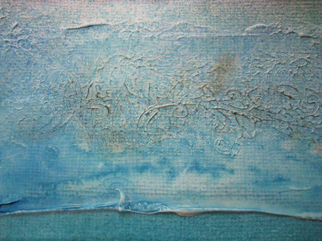
Love the swirls and puddles of the glimmer mist on the gesso. Used a flourish stamp on the semi-wet gesso before misting. Lesson learned, use a larger stamp or else the pattern won't come across. I very very lightly dabbed the surface of the gesso rivulets with a finger sponge and TH distress ink in Black Soot to make them come out just a tad better.
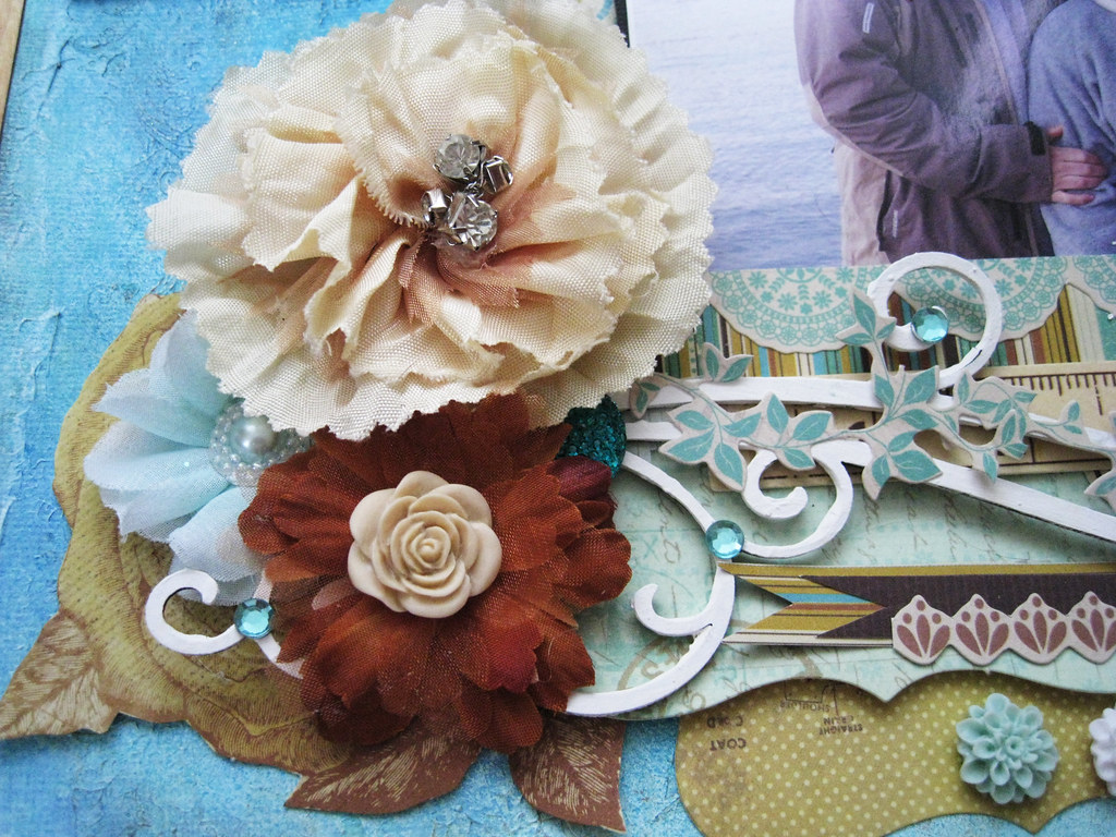
But I wouldn't be me if I didn't finish with some flowers :))
Thanks so very very much for still wanting to come for a visit even if I haven't shown you the same courtesy in a while, I have all of you in my heart!
Have a lovely week! see you on Friday!
Much much love, xxx Eila
Tuesday, 31 January 2012
Friday, 27 January 2012
TCR #95 Picking Mushrooms
Still dark, still cold, still snowy, but yay it's Friday! Treated myself to something called "semla" which I suppose would be what is also called a cream bun. Only ours are cut in half, filled with almond paste before a generous dollop of cream is added on top.
Eating them is serious business, Swedes are divided into those who want to put this de luxe bun on a plate with hot (yuk) milk and eat it when it's all soggy. Others say the right thing to do is to eat it as it is with a glass of cold milk on the side. And the third group insist on having a cup of coffee with it. Well, I leave it to your imagination to guess which fan club I belong to, I can say as much that I certainly don't like soggy buns LOL.
They look like this:
Friday doesn't only mean eating "semla", but also release day over at TCR. It's the fourth and last of the palettes specially designed by Lydell Quin for Meg's Garden. Lovely Meg has provided the DT with papers to work with and we thank her warmly for her generosity!
How about Chilli Pepper Red, Musk Stick Pink, Gum Leaf Green and Licorice Black for yumminess! makes me want to go out and buy my fav salty licorice candy. Just look at that sketch, don't you just itch to scrap it!
The DT certainly did and boy have they created fabulous pages! Here is what I came up with;
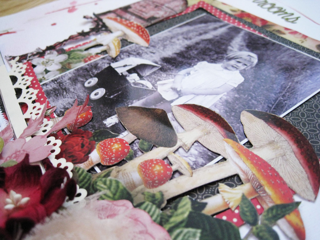
I found the photo of this little girl called Gudrun, 3 years old, in the archives of our county museum on internet. It was taken for an article in a local newspaper in the summer of 1954. Little Gudrun has her dolly pram full of the forest gold - mushrooms!
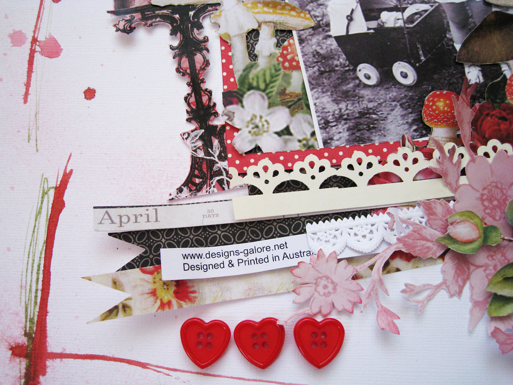
The "frame" is simply TA mists in Olive and Mel's Diner (red) that I have traced on white cardstock with the nozzle, straight out of the bottle.
All the strips were leftovers sitting on my desk. Of course it wasn't April when this photo was taken, but I thought it looked cute anyway. The heart shaped buttons are from my stash.
A DA chippie fern peeking out there under the Prima autumn leave, a small white doily from Leeann Pearce's Chip Chop Shop on Etsy. Fussy cut buds and blooms from a Meg's Garden paper.
I just love the mushrooms which can be found on another paper (Embossed Silk & Satin) than the one featured for the current palette (French Bird Cage). As a matter of curiosity, the brown ones are edible and the red ones with dots take you straight to the morge, but they are pretty to look at :)
The bird cage is fussy cut from the featured paper called French Bird Cage. I think both the red/white dotted paper and the black/white papers are by Crate but cannot remember which collection/collections as those squares were what I had in my stash without reference.
The red floral paper is also from Meg's Garden and is called Ramling Rose.
Go have a stroll in Meg's Garden, you will be enticed and seduced by what you see! Click HERE
and you'll find yourself straight in her delightful online store. There you will also find the link to their blog.
Happy browsing! and with that I wish you a wonderful weekend!
Thanks for your visit and hope to see you again! Cheerio!
xoxoxo Eila
Tuesday, 24 January 2012
CSI #3 Coffee and 15JAN2012 OUAS Cultivating
First day in the office yesterday after having been away for a week and whaddya know - only 613 emails waiting in my inbox. Dunno if it's because I am such a Very Important Person or just people copying me on everything they send ;)) Still, each and one has to be read and actions taken.
This Tuesday in Stockholm is cold, dark and with streets dressed in snow. Just like any ordinary morning in January in other words. In my previous post I mentioned what a joy it was feeling the taste of coffee and coffee is the subject of my CSI case file 3.
Flickr decided to be naughty to me and wouldn't allow me to upload my pics, so I have to do it from my own computer which means you cannot click on the photos and get a bigger image. Will update this post as soon as things have sorted themselves out with Flickr.
Now over to CSI.
From our January sponsor, Dusty Attic, we have two more design team members, Natasha Naranjo Aguirre and Nancy Winter, joining Mistra Hoolahan and Michelle Grant as Guest Detectives this week. We are sure their gorgeous work will inspire you! Nadia Cannizzo, our January Special Guest Detective, will be back next week.
Our third Case File from January's Alice in Wonderland series is a departure from the first two Case Files, which had vibrant color schemes. This week's "Scene" inspired a softer palette which could be perfect for heritage layouts but is also versatile for pretty much any topic, as you will see from the layouts below.
Now, CSI Members, get out your forensics kits and get ready for some sleuthing as we reveal Case File No. 3...
Blogger was in a bad mood too and wouldn't allow me to re-size the gorgeous inspirational photo, so below you can actually only see half of the image. Really so sorry for that.
(Be sure to scroll all the way down for RGB codes, color descriptions, and more thorough explanations of the journaling prompts.)
Presenting a stunning collection of layouts created by our Guest Detectives from The Dusty Attic...
The CSI team have also created the most gorgeous projects, go check them out! Always so amazing to see what an incredible spread of styles is represented depending on what has triggered our imagination.
Here is my page. Going rather clean and flat this time and letting the composition speak for itself.
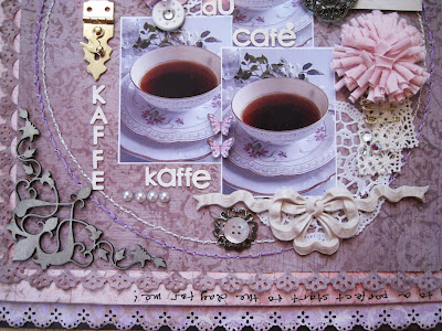
Brown cardstock, followed by punched pale lilac paper from Swedish Maja Design. Then the back of a Prima Pixie Glen paper on which I have also written my journalling. The top paper is actually brown though it looks like mauve or dusty purple when photographed. It's from K&Co Flora and Fauna.
In the corner a chippie flourish from Dusty Attic. I chalked it in Champagne, Gold and touched up randomly in Oyster White and Dusty Mauve though the IRL effect doesn't come across at all when photographed.
The golden metal lock is from Australian online store Meg's Garden. The yummie yummie white buttons are custom made for me by gorgeously talented Ivana Camdzic. The roses are from KaiserCraft and the photo of the old-fashioned floral coffee cup is from internet. My own cups are far from this dainty and pretty.
Two handstitched circles.
The pink fabric flower is from Prima, gosh I do love those fluff balls! The metal trinket is either BoBunny or Prima, cannot remember which, and the button on top of the crocheted mini bloom is from Prima. The violets are cut out from a paper from Swedish Pion Design.
The cream bow is actually from a local DIY shop and meant as a wall decor. It's paintable but I left it raw.
A strip of lace and a couple of safety pins. The journalling says:
"Quiet mornings with coffee belong to the best things in life. It doesn't cost anything, only time. The moments when I have time to enjoy a leisurely cup, feel so much more precious! Coffee is the key to a perfet start to the day for me!".
And now to the page I made for the Once Upon A Sketch 15 January challenge. Another clean and un-dimensional page. Can you believe it - not a single Prima flower on it!
All the papers are from the brand new spring collection from Norwegian Tilda. It hit the Swedish stores only a couple of days ago. You will definitely be seeing me scrap these papers!
The title of my page is "Cultivate". It should say "Cultivate Colours" as it's about my wish to explore other aspects of scrapbooking than paper. The photo is a reminder of all the mists and paints that I have in my drawers, some still have their original sealing left.
I really look forward to this new year - 2012, a whole year full of everything I can imagine. It depends on what I plant myself and cultivate into bloom. That's why I have used the big colourful flowers in my LO.
I have also put seed bags on my page with the most beautiful images and names to remind me that I am the maker of my own flowerbeds. The dragon fly is a symbol of creativity. The ruler tucked in there also symbolizes that life is measured for us and we can decide to fill it with happy memories or limit ourselves to squares and lines.
And that's it for today. Thank you so much for having a peek! I know there are so many of you lovely ladies that I haven't visited in quite a while, I haven't forgotten you and will make amends soon. Thank you for remembering me too!
Much love,
xoxox Eila
Friday, 20 January 2012
TCR #94 Bringing in the Hay
Once again it's Friday and the week has just swooshed by! Thanks to all of you sweet ladies for your get-well wishes! I am happy to report that I actually tasted the coffe I was drinking this morning and could smell the tantalizing wafts coming out from our little corner bakery. Life is returning to normal pretty soon - yay!
Heard a really silly song played on the radio this morning and then I couldn't get it out of my head. I just say Barry Manilow ... Had to make my cool 1980's disco moves to the utter shock of the cats who really looked like sphinxes watching mummy making a fool of herself. What the heck, nobody else there to see me and if they had, well - who cares!
What do you say about Buttercup Yellow, Sage Green, Off White and Avocado Green? if that isn't spring totally sprung I don't know what is!
The Australian online store Meg's Garden are the January sponsors of The Color Room and this is the third palette using the beautiful papers from their newly released paper collection. The palette is specially designed after the sweet paper called "Green Toile". Meg's Garden have very generously donated papers to our DT to work with and what a joy it has been!
Check them out HERE
Here's the page I made:
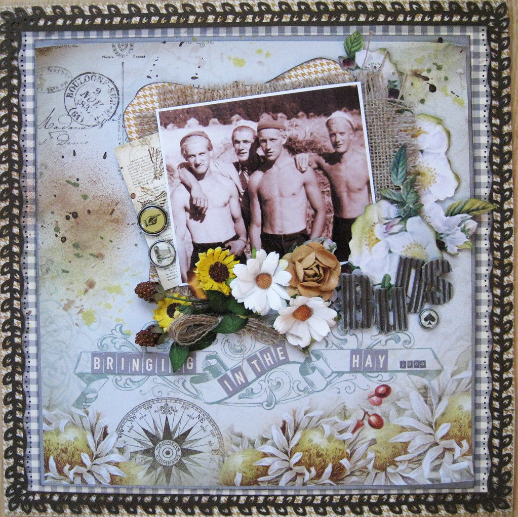
The sharp observer will notice that the paper I have used is not the "Green Toile" but another one from Meg's Garden, it's called "Wild Flowers Field" and has the same colours.
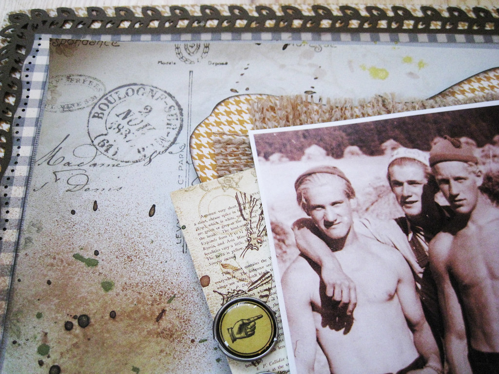
I started with a houndstooth paper from MME Lost & Found 2 as cardstock. On top of that I have brown cardstock with punched leaf border and on top of that, another grey & white checkered paper from October Afternoon and on top of THAT, grey cardstock before the beeeeeautiful patterned paper.
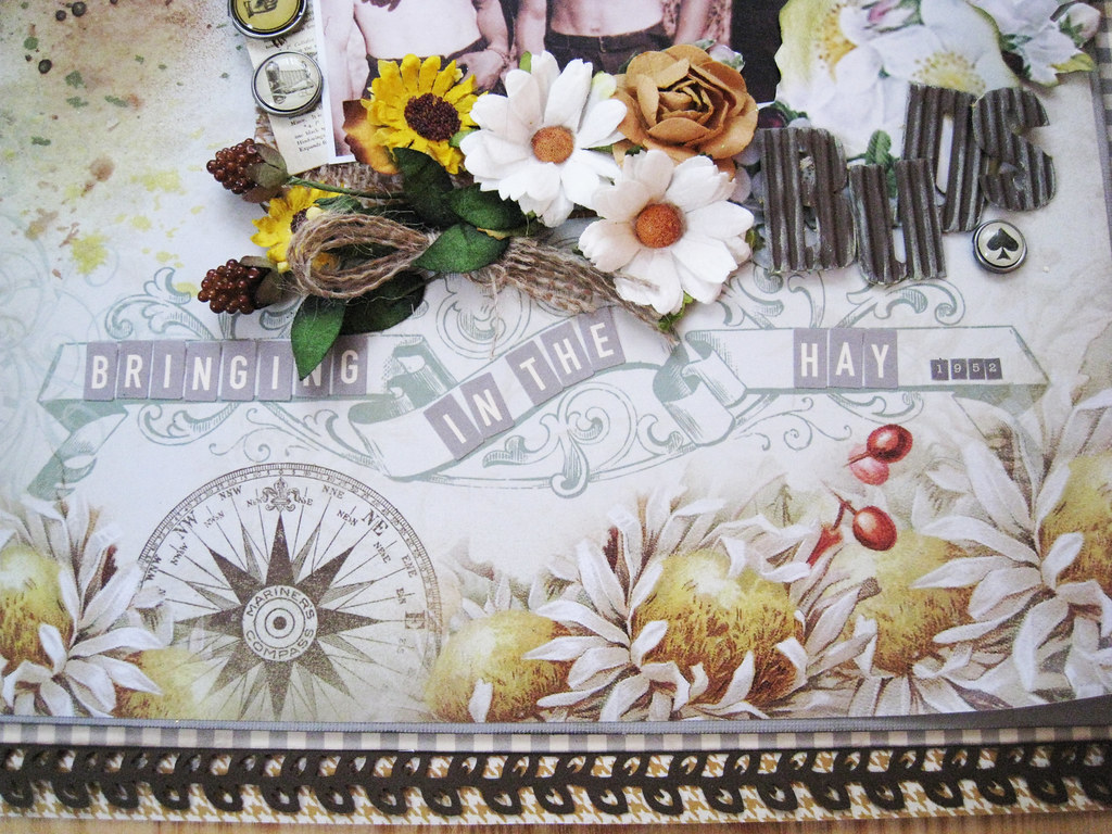
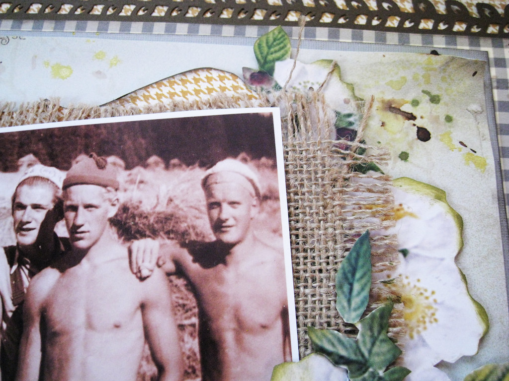
I unravelled some of the hessian and made a bundle that I tucked in there next to the berries and sunflowers that I have cut-off from a Petaloo vine.
The grey & white alpha stickers are from October Aftrnoon.
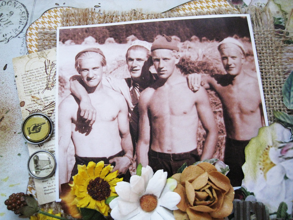
Really cool guys on a warm summers day in about 1950. The handsome bloke who is number 2 from the left, wearing a white hat, is my FIL.
The brads are from MME L&F 2.
Subtle misting and splatter in different green, brown, and yellow hues.
The brown cardstock alphas that form the word "buds" are from Lily Bee
The papers are so incredibly beautiful in themselves that one really doesn't need a lot of texture or mediums to make them stand out.
Have a little something up my sleeve coming up in March. Might have something to share with you in April too and what do you know, even something in June and July too .... Making those silly moves again just thinking about how bountiful life is to me.
I will be back on Tuesday when I will share my CSI case file 3 with you.
Toodelipip! enjoy your weekend!
xoxox Eila
Monday, 16 January 2012
CSI case file 2 "Cottage Dreams"
It was ages since I had to stay at home from work because of the flu, this one is a rather persistent one. My nose has a rather interesting shade of pinkish-red and I cannot live without Kleenex. Getting better by every day though, thanks very much :)
What an amazing week we've had over at CSI! the case files keep pouring in every day.
Last week, we were so excited to announce that The Dusty Attic is our January sponsor. Mistra Hoolahan and Michelle Grant, our guest designers from The Dusty Attic design team, and Nadia Cannizzo, our special January guest designer, are here again this week with absolutely gorgeous inspiration.
We continue our January Alice in Wonderland inspiration with another image from the Tim Burton film. The colors this week are so lovely and bright and positively dreamy. You will again see how versatile the color scheme is and how the look of this palette can change dramatically, depending on the neutrals you use and the proportions of the colors you design with.
Now, CSI Members, get out your forensics kits and get ready for some sleuthing as we reveal Case File No. 2...
Detailed clues, as promised...
COLOR DETAILS & RGB CODES
Absolem blue - (blue with a VERY slight touch of green) - 104.164.185 - dress
Raspberry reverie - 152.45.75 - flower to the left of Alice
Lost in lavender - 186.189.220 -purple flowers
Wonderland yellow - 242.235.132 - yellow flowers
Untamed teal - 72.178.175 - big leaf on the right (just under the curvy swirly plant)
JOURNALING DETAILS
Choose one (or more) of the following to inspire your journaling:
* Look at your photo and journal in a stream-of-consciousness way (free-writing).
* Document an adventure.
* Use this quote as inspiration: "Good advice. If I listened earlier, I wouldn't be here. But that's just the trouble with me. I give myself very good advice, but I very seldom follow it." -- and journal as advice
Inspiration Words: dream, journey, subconscious
EVIDENCE DETAILS
Choose two (or more)of the following elements to include on your layout:
* flowers
* architectural elements (e.g., gates, fence, windows, bricks, etc.)
* sheer elements
* swirls/flourishes
*something stone-like (interpret that any way you wish!)
We trust we've left enough clues for you to solve the case!
The deadline for completing Case File No. 2 is
Sunday, January 22, 11:59 p.m. EST.
Thus, you have a week plus the two weekends to complete your layout. (See count-down timer on the right-hand sidebar of most pages.)
We can't wait to see what you create!
And here's my page:
As Debbi says, it is always so fascinating to see what the DT come up with, even if we have the same palette as starting point, all our pages look so totally different! This time I have chosen to use a lot of the neutrals and the colours only as accents.
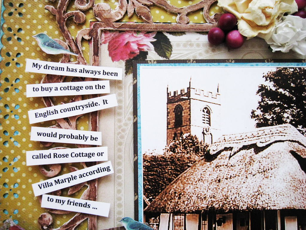
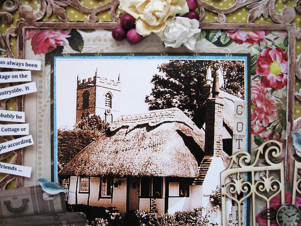
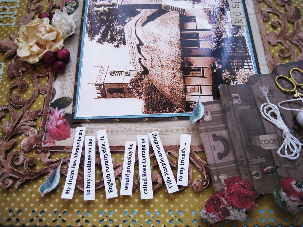
My journalling is about a dream that I have always had; to move to England when I am retired and buy myself a cottage with thatched roof. It doesn't come as any surprise to anyone I'm sure ...
A mix of Prima and Petaloo in the cluster and a peek of the teal under the dotted brown KaiserCraft paper.
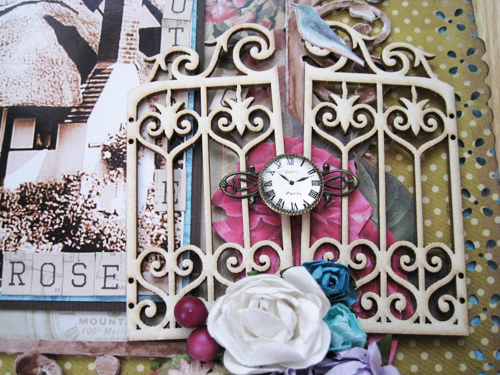
Raw chippie gates from the French online store Embelliscrap. Cannot remember if the metal trinket is from Prima or from BoBunny. I do know that the cute little clock face is from Australian online store Meg's Garden. The blue birds are cut out from a dimensional sticker from Danish Tilda.
Here it is, the cottage of my dreams! English cottages always have rose gardens and the floral paper from Meg's Garden that I have used as an inset under photo is just that - a rose lover's delight!
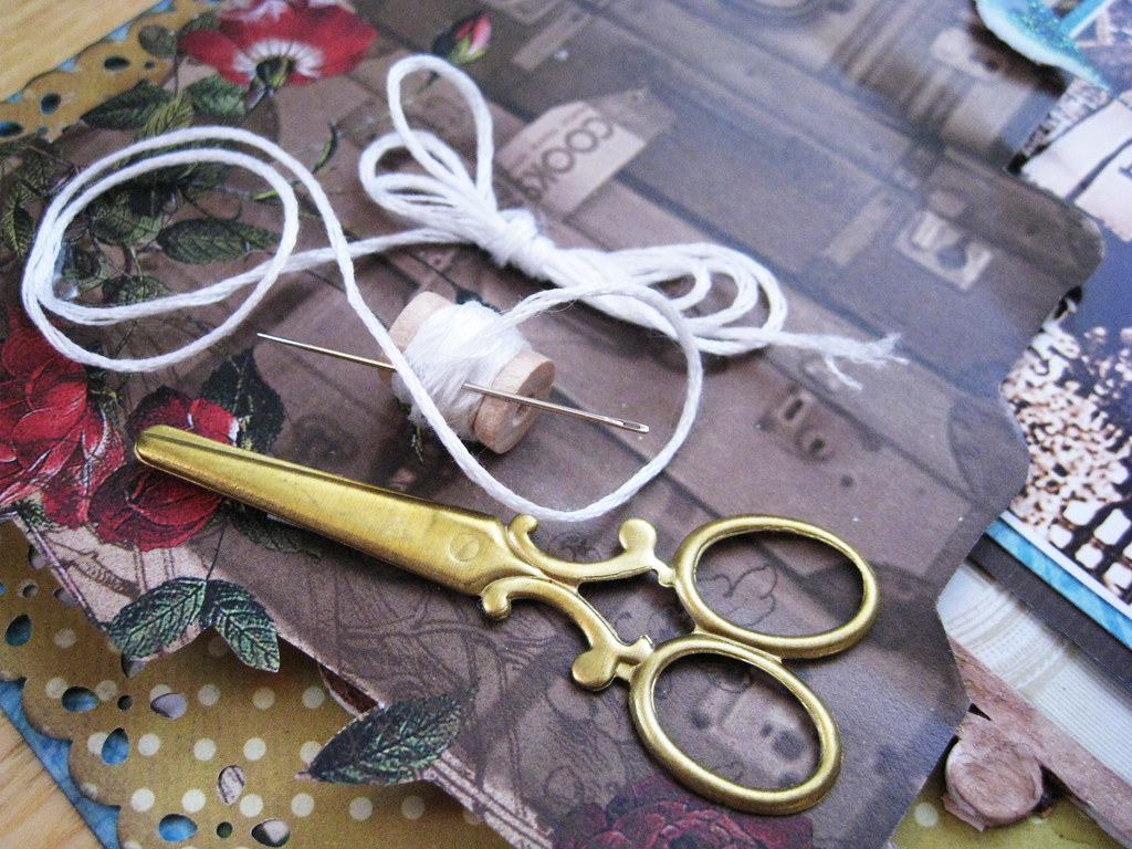
The little cute thread spool is a gift from darling Lean de Ruiter in Holland - thanks sweetie! the brass mini scissors are from Meg's Garden as is the cut-out pile of suitcases which I took from one of Meg's Christmas papers. So this is what I am going to do when I am an old and wrinkled woman: pack my bags and head for England with my cross stitching and scrapbooking scissors (or perhaps they are for cutting off dried roses in my beautiful lush garden?)
A view from the side just to give you a dimensional peek and with that I say bye for now!
Thanks for your visit and have a happy scrappy week folks!
xoxox Eila
What an amazing week we've had over at CSI! the case files keep pouring in every day.
Last week, we were so excited to announce that The Dusty Attic is our January sponsor. Mistra Hoolahan and Michelle Grant, our guest designers from The Dusty Attic design team, and Nadia Cannizzo, our special January guest designer, are here again this week with absolutely gorgeous inspiration.
We continue our January Alice in Wonderland inspiration with another image from the Tim Burton film. The colors this week are so lovely and bright and positively dreamy. You will again see how versatile the color scheme is and how the look of this palette can change dramatically, depending on the neutrals you use and the proportions of the colors you design with.
Now, CSI Members, get out your forensics kits and get ready for some sleuthing as we reveal Case File No. 2...
Detailed clues, as promised...
COLOR DETAILS & RGB CODES
Absolem blue - (blue with a VERY slight touch of green) - 104.164.185 - dress
Raspberry reverie - 152.45.75 - flower to the left of Alice
Lost in lavender - 186.189.220 -purple flowers
Wonderland yellow - 242.235.132 - yellow flowers
Untamed teal - 72.178.175 - big leaf on the right (just under the curvy swirly plant)
JOURNALING DETAILS
Choose one (or more) of the following to inspire your journaling:
* Look at your photo and journal in a stream-of-consciousness way (free-writing).
* Document an adventure.
* Use this quote as inspiration: "Good advice. If I listened earlier, I wouldn't be here. But that's just the trouble with me. I give myself very good advice, but I very seldom follow it." -- and journal as advice
Inspiration Words: dream, journey, subconscious
EVIDENCE DETAILS
Choose two (or more)of the following elements to include on your layout:
* flowers
* architectural elements (e.g., gates, fence, windows, bricks, etc.)
* sheer elements
* swirls/flourishes
*something stone-like (interpret that any way you wish!)
We trust we've left enough clues for you to solve the case!
The deadline for completing Case File No. 2 is
Sunday, January 22, 11:59 p.m. EST.
Thus, you have a week plus the two weekends to complete your layout. (See count-down timer on the right-hand sidebar of most pages.)
We can't wait to see what you create!
And here's my page:
As Debbi says, it is always so fascinating to see what the DT come up with, even if we have the same palette as starting point, all our pages look so totally different! This time I have chosen to use a lot of the neutrals and the colours only as accents.
My journalling is about a dream that I have always had; to move to England when I am retired and buy myself a cottage with thatched roof. It doesn't come as any surprise to anyone I'm sure ...
A mix of Prima and Petaloo in the cluster and a peek of the teal under the dotted brown KaiserCraft paper.
Raw chippie gates from the French online store Embelliscrap. Cannot remember if the metal trinket is from Prima or from BoBunny. I do know that the cute little clock face is from Australian online store Meg's Garden. The blue birds are cut out from a dimensional sticker from Danish Tilda.
Here it is, the cottage of my dreams! English cottages always have rose gardens and the floral paper from Meg's Garden that I have used as an inset under photo is just that - a rose lover's delight!
The little cute thread spool is a gift from darling Lean de Ruiter in Holland - thanks sweetie! the brass mini scissors are from Meg's Garden as is the cut-out pile of suitcases which I took from one of Meg's Christmas papers. So this is what I am going to do when I am an old and wrinkled woman: pack my bags and head for England with my cross stitching and scrapbooking scissors (or perhaps they are for cutting off dried roses in my beautiful lush garden?)
A view from the side just to give you a dimensional peek and with that I say bye for now!
Thanks for your visit and have a happy scrappy week folks!
xoxox Eila
Friday, 13 January 2012
TCR #93 Adored & Cherished and #93B Elsa's Sweet Dream
Hello peeps!
Once again it's Friday which means release time over at TCR. We have a gorgeous set of palettes for January, specifically designed for the new ranges of products at MEG'S GARDEN, who are sponsoring us for the month of January.
This week brings us a gorgeous vintage inspired palette from Her Room.
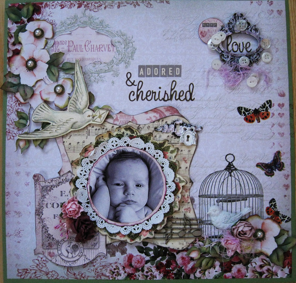
I made two layouts for this palette, the first one I called "Adored & Cherished".
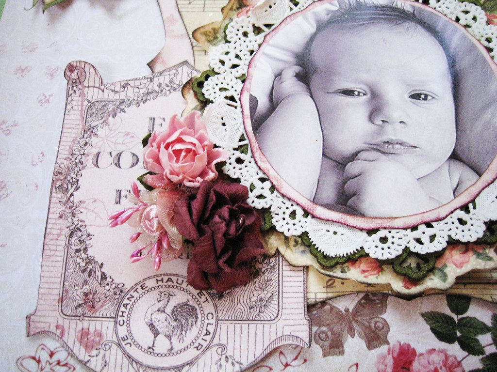
This little man is the youngest member of our big family of aunties, uncles, cousins and grandchildren. He's the son of my youngest cousin.
Unfortunately I had to leave the photo of my page a tad too dark or else the lovely pattern of the pale pink backing paper would have been lost entirely for the viewer.
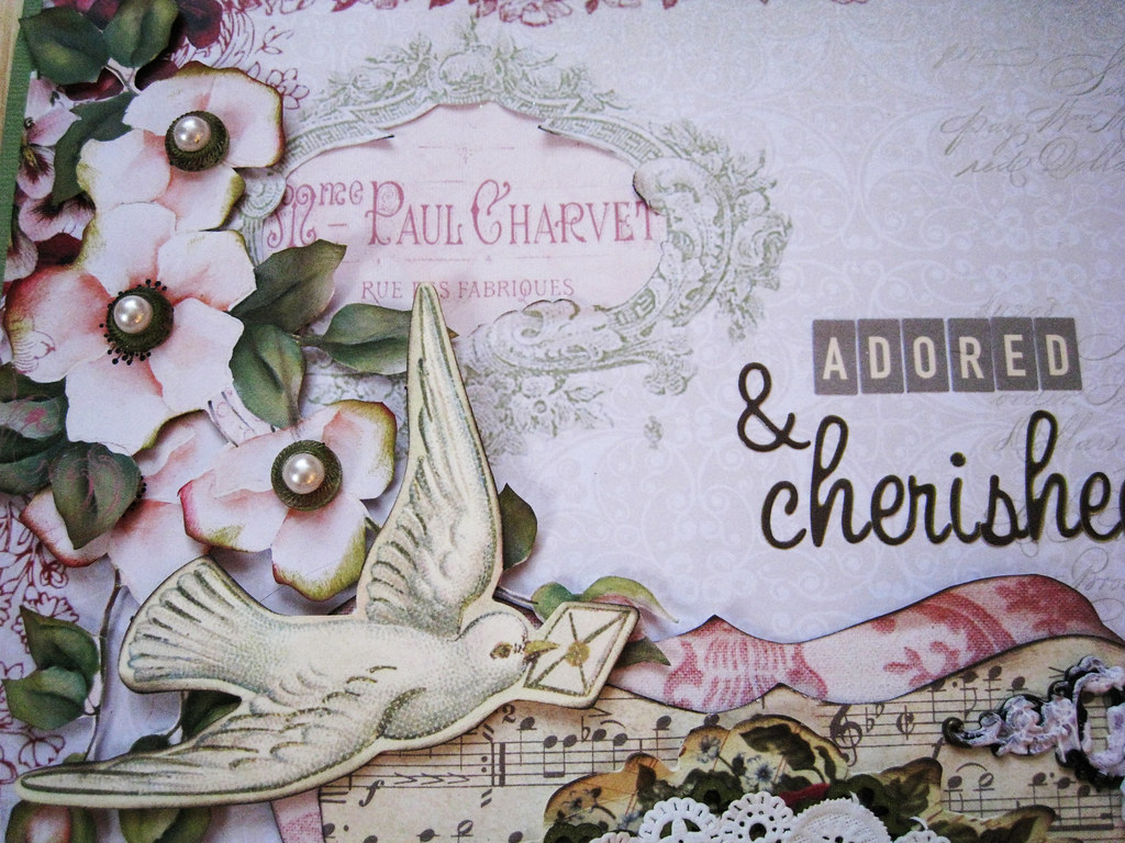
Green pearl sparklers from Webster's Pages as flower centres. The birdie is from KaiserCraft Sweet Nothings.
I cut out the centre of the medaillon and placed a pink label from another paper from Meg's Garden in its place. I also stamped small hearts in dusty pink chalk randomly over the borders of the page.
A metal bookplate from Tim Holtz that I gessoed and misted in Vintage Pink. White buttons strewn around and some thread that I also misted in the same pink.
Here you can see the colours better. That label to the left is of course cut out from one of the MG papers. The photo is matted with both patterned paper, a doily, a circular lacey chippie misted in Olive Vine from the French online store Embelliscrap, a round floral die-cut from KaiserCraft and a sheet note paper on top of a patterned paper from MG.
A resin key hole from Melissa Frances and a dito in metal from Tim Holtz.
Fussy cutting and more of the misted thread, a resin Prima bird and KaiserCraft roses.
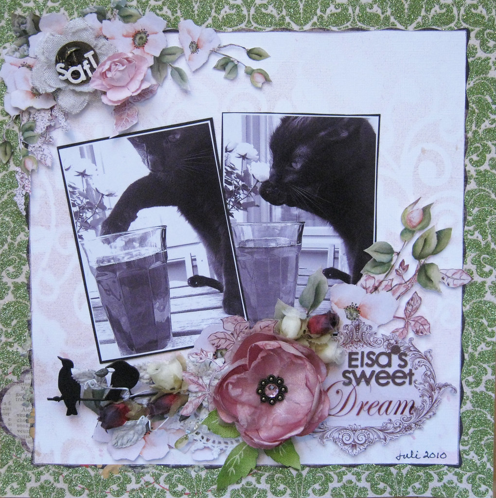
The second page is with the same range of papers from Meg's Garden but I've mainly used the fussy-cut flowers and misted/masked my white cardstock for a very subtle pattern.
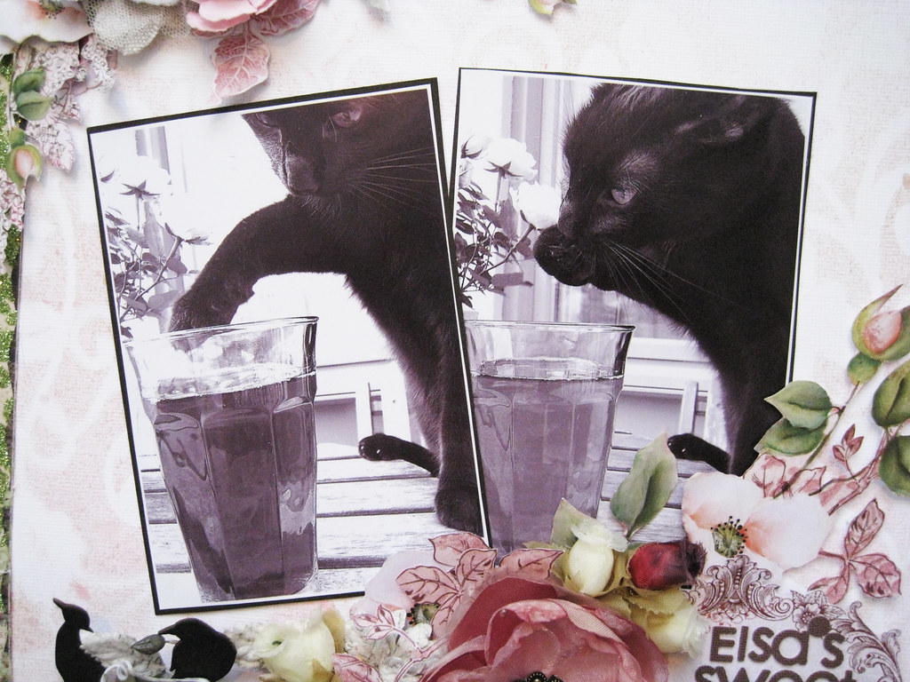
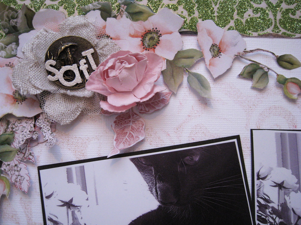
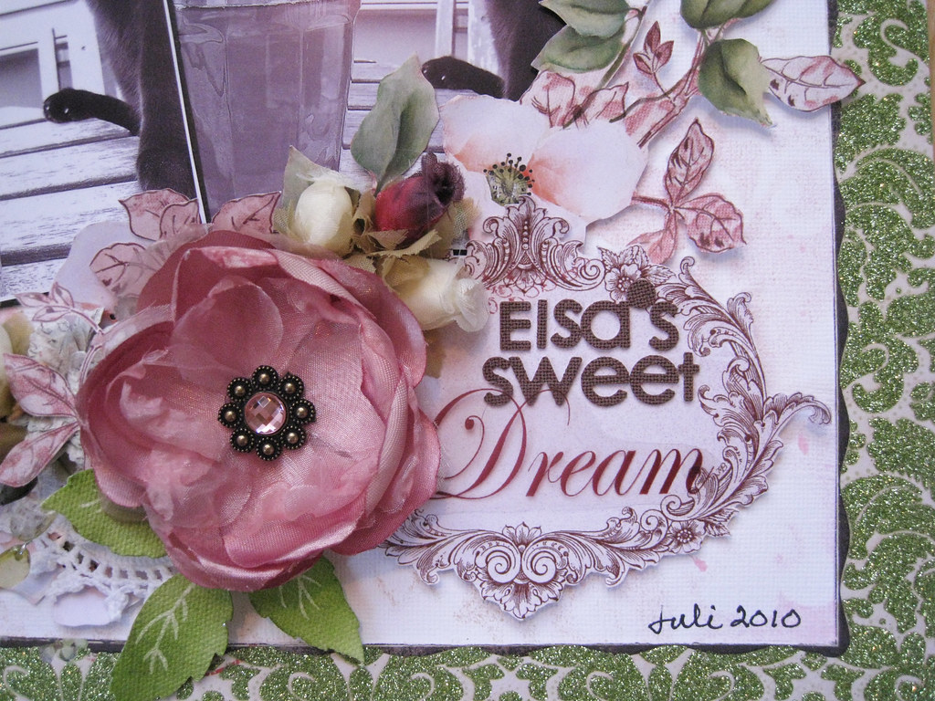
I've called it "Elsa's Sweet Dream", a totally ridiculous title I know, but it has to do with what's in the glass she's dipping her paw into and the Swedish word "Saft" on the trinket in the top left cluster.
Here I've used white cardstock as base and then cut out the green frame from a MME Lost&Found 2 paper.
This is our Elsa last summer. Hubby and I were sitting on our balcony having a glass of raspberry fruit-drink (SAFT in Swedish) when she jumped up on the table and stuck her paw into my glass before I could do or say anything. The next second she licked her paw and dipped into the glass again. That was the end to my cool drink! Nothing else to do but let Miss Elsa have her drink.
This is also the way she drinks her water: dips the paw, then licks it. Our Alice on the other hand, likes to drink hers straight from the tap while Max our boy does it the classic way; from his bowl. Who says cats don't have personalities?!
A teensy glimps of the misting/masking.
My pal Lindy in Brisbane sent me pretty pretty white crocheted doilies, here's one peeking out under the bottom cluster. A script vine from Prima, chippie birdies from DA, some mixed flowers from one of my kits from Swirlydoos and some fussy cutting tucked in there.
That's all for today my friends! I apologize for not being my usual chirpy self, but today I have to admit that I might have been bitten by a bug. I slept for 13 hours last night and woke up sweating and freezing at the same time. Let's see what tomorrow brings.
Take care, have fun and see you next time!
xoxoxo Eila
Subscribe to:
Posts (Atom)