Once again it's Friday and the weekend is waiting around the corner. What a fantastic week it has been, I've been riding on a wave of energy the whole week. Work is good, life is good, I'm good too!
Friday means release time over at TCR and this week we're in His Room. Here's the gorgeous palette of Basic Grey, Bright White, Olive Green and Steel Blue. I just looove the Missoni-inspired pillows piled up in the sofa! and that's what inspired me to use the blue and green as mains in my page.
DH and I spent an extended weekend in Nice, Côte d'Azur by the Mediterranean in France some years ago. Very nearby is located Cap Ferrat where the jet setters scoot around on their humungus yachts. This was the place to be seen in even 100 years ago when the Rotschild family built a divine pink summer villa, a mirage perched high up on the cliff with views over the sea. The villa gardens are a miniature copy of the ones of the Versailles palace, utterly lush and dreamy.
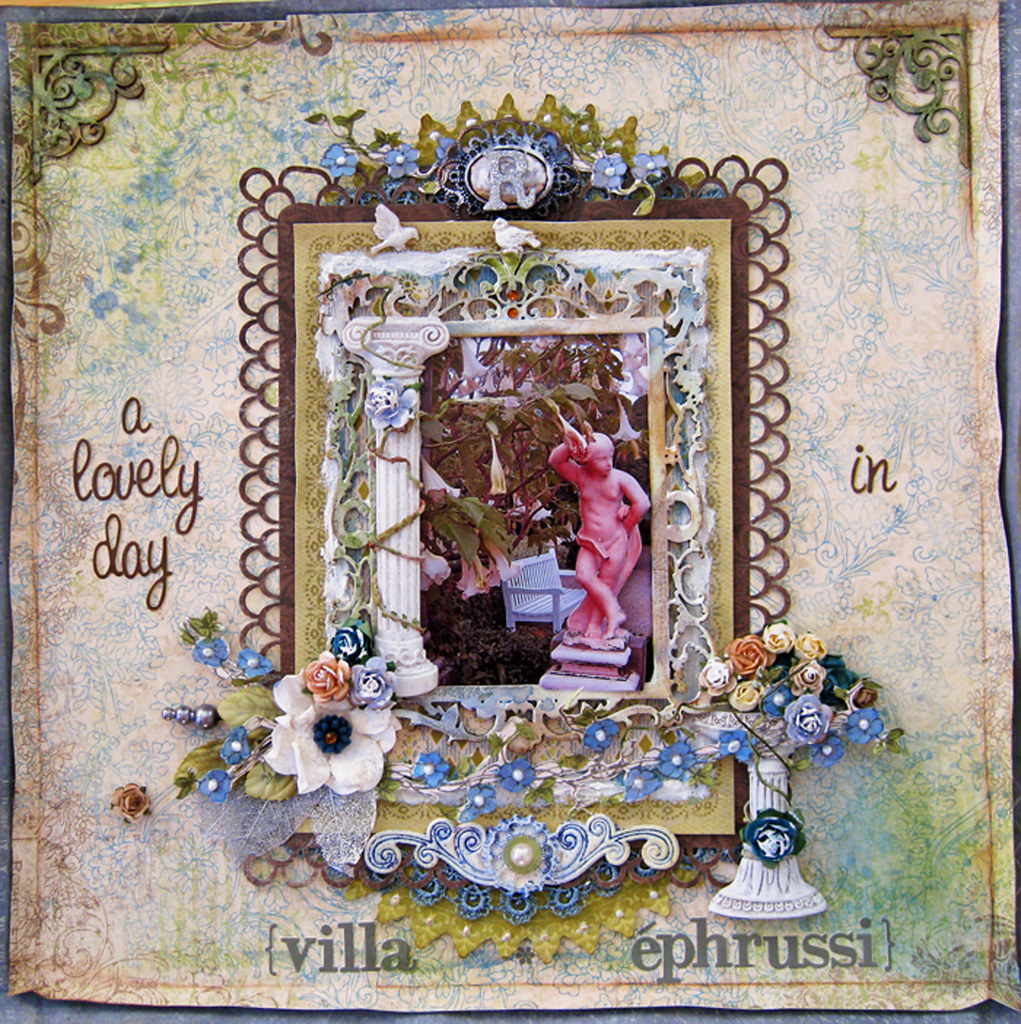
This pic was taken in the villa gardens. I thought the marble statue and the huuuge white "angel trumpets" growing around it give such a fantastic and a little mysterious feel of a Secret Garden.
So lots of fussy cutting and misting on this one!
I have used 3 backing papers; first layer is white Bazzil cardstock that I misted a frame on. Used TA glimmermist in Olive Vine and Sweet Clover.
The second layer is a steel blue paper from Swedish designer Pion Design.
The third and top paper is BoBunny Welcome Home. At the Ingvild Bolme workshop that I've mentioned in an earlier post, she taught us to fold the paper about 1,5 cm into it, i.e. folding downwards towards the table thus leaving a sharp edge that could be lightly touched up with chalk. I used Chestnut Roan. When folding back the paper one gets this effect of a subtle frame. I also misted and splattered the page in TA Glimmermist Olive Vine + Sweet Clover + Fall Breeze and Glacier.
I also used chippie corner flourishes from Imaginarium Design that I misted in the green and blue hues that I've used throughout my layout. Finished by dotting on some silver and brown liquid chalk.
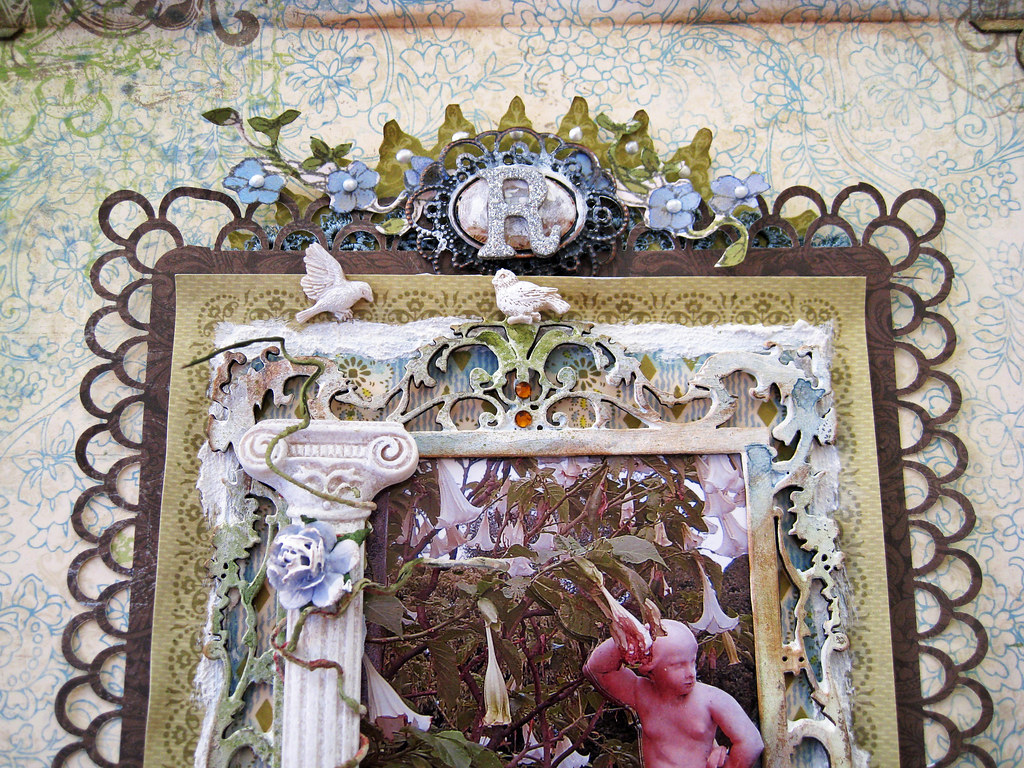
The brown punched paper is from KaiserCraft Hunt&Gather. The olive green matting is Anna Griffin Francesca as is the patterned blue/olive one that peeks out under the chippie frame. You can see it a bit better further down in the pic with the fountain. The flourished chippie frame is the same that I used in one of my previous pages for Les Papiers de Pandore, the autumnal one with the stacked photos of the cress flowers.
This time I primed the frame in white acrylic paint and then misted it in TA glimmermist Glacier and Fall Breeze + Olive Vine and Sweet Clover. The white stuff that goes around the photo under the frame, is my beloved "snow paint".
The two little birdies perched up at the top come in the same pack as the Prima resin fountain. The crest at the top centre is a BoBunny trinket that I Gessoed a bit and then placed a glittery silver alpha R on top of it (R for Rotschild of course).
The resin pillar is one of Prima's latest releases. I took a Prima summer carnation vine and pulled off the flowers and then wound a couple of the tendrils around the pillar. Then coloured it lightly with TA glimmermist in Suede, used a very fine-tipped brush. The rose is from my stash, very lightly brushed some Gesso on it with my finger tip.
Everything was pop-dotted heavily to add dimension as you will see a bit further down.
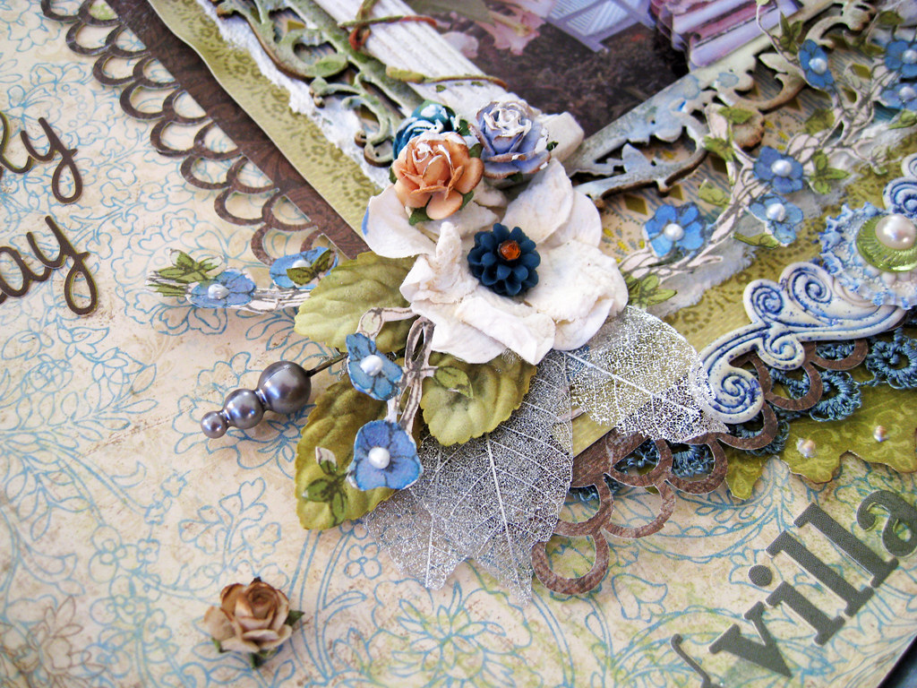
Silver skeleton leaves, a grey stick pin, some leaves from the Prima vine that I had stripped. I dismantled a white large gardenia, leaving only the centre bit. Added a resin bloom from Webster's Pages to it and popped a brown jewel at the top.
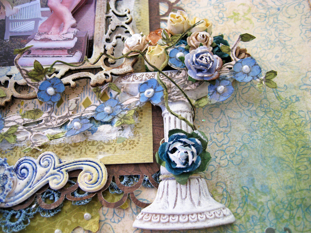
Here you have a better view of the blue/olive Anna Griffin paper that I mentioned earlier. Resin fountain from Prima and Gessoed Prima roses. Some more of the Prima summer carnation vines.
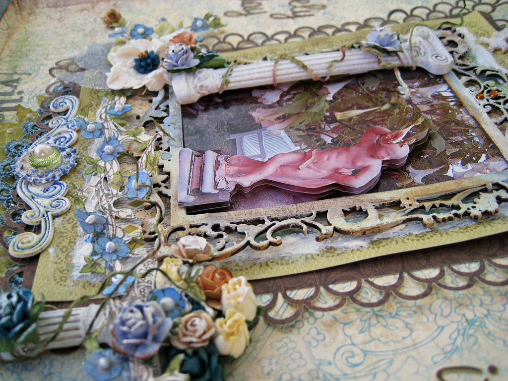
This is a rather heavy page IRL, lots of stuff on it you know! Don't know if you can see that I have printed out 3 copies of the photo, silhoutted the statue and pop-dotted it to make it stand out from the bottom photo.
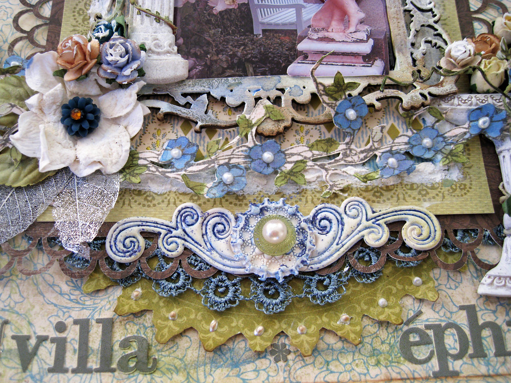
The stickers are all Webster's Pages, superduper alphas that work beautifully on any layout in my opinion. The centre white/blue flourish is a PinkPaislee Artisan Element that I have stickled with TH distress stickles in Faded Jeans. Looks a bit bright when photographed, but IRL it has a muted steely blue hue. Another round tiny Artisan Element and an olive green Rose and Pearl Sparkler from Webster's Pages on top of it. Under the punched brown matting, I have used steel blue lace and under that is an olive green fussy cut semi circle from an unknown scrap of paper. Liquid pearls running around the circle.
And finally the fussy cut sweet blue blooms which are from Prima Pixie Glen and not blue at all to begin with. I used a very fine-tipped brush and painted them several times in TA glimmermist Fall Breeze and Glacier. They were pink and beige before I painted them. Liquid pearls on each little bloom, both here at the bottom but also at the top of the page. The leaves were hand-painted in TA glimmermist Olive Vine.
With this I thank you warmly for popping by, so lovely having you for a visit! Have a wonderful weekend peeps, take care!
Cheerio! xoxoxo Eila





gorgeous page indeed! I love every details, dimension and textures on this page..awesome beautiful!
ReplyDeleteSo very lovely LO. All those details - how do you do it? I can never arrange so many details and make them look stunning :)
ReplyDeleteHave a wonderful day hun!
Liva ❤
The page is so beautiful!
ReplyDeleteYvonne
this is gorgeous Eila! There are so many yummy layers and little details. I love this about your layouts! Every one is a master piece and suitable for framing. This was a lovely palette - perfect for your design.
ReplyDeleteHope all is well! Hugz!
Wauwyy now i can see the cool dimension look of it..stunning page and i love everything on it....love it if i was a dog i will be slobber all over it..lol..Be i am a nice and need person so i just say..WAUW!!!
ReplyDeletebyebye have a lovely [sunny] weekend,Lean
Alldeles alldeles underbar:)
ReplyDeleteJust gorgeous as always. Have a great weekend.
ReplyDeleteGoodness gracious me Eila! This is just complete & utter shabby heaven - each of your works is such a special masterpiece created with such love & attention!! So did you take the day off on Friday? Or you blogged before work...now that is sheer bloggy commitment for you :)I am so glad to hear that everything is good for you despite the looming cold weather. Hope you are having a lovely weekend xx
ReplyDeleteHi Eila, a masterpiece indeed, loving those pillars, the flowers, the layering and all the gorgeous details a true classic layout, the TCR are so lucky to have you! Hope you are enjoying the weekend and the warmish weather we are having, I have next week of for school's half term week and have a list as long as your arm of things to do, hope to catch up on some blogging as well, take care, Doreen x
ReplyDeleteOh my gosh!! This must have taken you so long to create!! Your attention to detail is just amazing!
ReplyDeleteOH MY GOODNESS Eila.... I just finished reading thru the amount of work you just put into this piece of art! and i just have to say truly amazing truly inspiration and truly just an awesome lady. You have used so many fabulous techniques and it really does finish the page off. Thanks for popping by too. hope you have a fabulous week. mwah xxx
ReplyDeleteWow, Eila, this is GORGEOUS, GORGEOUS!!! love everything here and how you worked the photo is fantastic!! Love it, love it!!! many great details!!!!
ReplyDeleteA big hug dear!!!!! :)