Welcome to the PaperHaus Magazine Summer Delight Blog Hop!
We are excited that you are hopping with us and we would like to thank you for hopping along! We are celebrating the release of the Summer Issue of PaperHaus Magazine! There is SO much inspiration, techniques, projects, and exclusive artist interviews inside! Not only that but it’s an issue filled with amazing Mixed Media projects from people from all over the world!
We hope you enjoy flipping through the pages as much as we enjoyed putting it together for you! HERE IS THE LINK TO THE SUMMER ISSUE BUT come back as we want to show you some amazing Summer projects!
 |
Our Summer Delight event is all about fun summer days filled with scrapbooking and crafting! We want to share with you what we have made! Every day on the PaperHaus Blog (www.thepaperhaus.com) there will be amazing inspiration and tutorials so be sure to stop on by everyday in June!
The blog hop runs between
1 June 2013 08.a.m. PST/05.00 p.m. CET
and
7 June 2013 at 09.00 p.m. PST/06.00 a.m. CET
Simply visit each of the blogs below, then leave a comment (and become a
follower, if required). There are sure to be plenty of goodies along
the way!
Additionally, I will be giving away a little prize pack myself to a randomly drawn international winner! To be eligible, please leave a comment and become a follower of my blog if you are not already.
My draw closes on 7 June at 09.00 p.m. PST/06.00 a.m. CET
Here's what you can win, going from left to right;
Leeza Gibbons "Wishes & Dreams" collection, Pocket Book Pad Flowers in coral
Prima "Lady Bird" collection, vintage trinkets
Prima "Divine" collection, floral vine in yellow
Leeza Gibbons "Wishes & Dreams", Essential Petals
Prima "Lady Bird" collection, Flower Stem in turqoise
I will announce the winner of my prize on 9 June.
We have different blogs for you to visit every day but it always starts over at the PaperHaus Magazine. Today is day 1 as in 1 June, and the following blogs have inspiration for you.
If you have come from Audrey Yeager's blog, then you've come to the right place. If not, pls start over at the PaperHaus Magazine.
Here is the blog list for day 1, in order:
- 1. Paper Haus Magazine
- 2. Frank Garcia
- 3. Audrey Yeager
- 4. Eila Sandberg - that's me!
- 5. Jodie Lee
- 6. Bente Fagerberg
- 7. Peg Hewitt
- 8. PINK PAISLEE
This is the base I started with and the acrylic paints, mist and dabber that I used on the chipboard pieces and for stamping on my page.
and here's the finished page
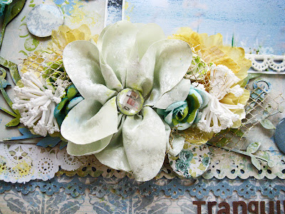
Prima (Fairy Belle)
Swedish Pion Design (Vintage Garden)
Swedish Pion Design (Vintage Garden)
KaiserCraft (Secret Admirer)
KaiserCraft (On This Day)
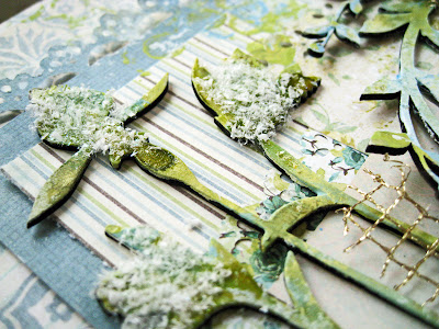
Blue Fern Studios chipboard Spring Iris - Large that I misted in different hues of green and then swiped randomly with pale blue acrylic paint before dipping into white Flower Soft for fluffy blossom heads, almost like dandelions just before they start floating in the wind like little hot air balloons.
Spring Iris - Large (074875)
I also used the Blue Fern Studios chipboard Royal Bird Frame that I randomly painted in all the colours shown in the first photo.
Royal Bird Frame (074592)
I'd love for you to go and check out her amazing work CLICK HERE FOR JOYCE'S BLOG
I promise you will be totally bowled over by her incredible techniques and use of colour!
When I attended one of Finnabair's workshops in Stockholm earlier this year, we used some cool transparent epoxy stickers. You just plop the sticky side onto a patterned paper and cut out the shape. Brilliant custom made pebbles!
Thanks ever so much for your visit! I'll be back on Tuesday, 4 June with a page for Norwegian Skissedilla.
Every day is a new day full of wonderful Summer Delight. Remember to start off your hopping at PaperHaus Magazine.
Next stop on today's blog hop is HERE


Oh your layout is breathtaking! I love the colors and the way you've done well everything! The picture is so serene and the colors just want to make you sit back and relax! Gorgeous!
ReplyDeleteLove this layout Eila, the colours are beautiful.
ReplyDeleteYou are very talented- Your layout is beautiful!
ReplyDeleteLovely layout!
ReplyDeleteLovely LO TFS x
ReplyDeleteWonderful LO! Thank you for sharing! I love the colors!
ReplyDeleteI am a follower of your blog and your LO is amazing... Thank you for sharing both the magazine and your talent...
ReplyDeleteSo Beautiful!
ReplyDeleteSimply gorgeous Eila! I'm already a follower! Thank you for sharing!!!!!
ReplyDeleteOh my, the colours in your lay-out are so beautiful, fresh and summery! I'm truly in love with every single detail of this page!
ReplyDeletewhat an amazing lay out ....inspirational
ReplyDeletehugs
thankyou for the inspiration
ReplyDeleteLove your layout! Thanks for sharing!
ReplyDeleteYour layout is absolutely divine!!! Thanks for the inspiration and for the chance to win a gorgeous prize!
ReplyDeleteAwesome layout!
ReplyDeleteWhat a stunning layout, love the colours you have used
ReplyDeleteSo so beautiful my dear friend. I love your LO. It's so serene.
ReplyDeleteYour layout is gorgeous! LOVE the magazine, too!
ReplyDeleteBeautiful layout.
ReplyDeleteThe flowers are
so pretty.
Carla from Utah
Fabulous layout so many pretty details to look at
ReplyDeleteSo so lovely and with such a delightful explanation on how you proceed. Loved seeing the stuff you used to make up your beautiful project.-And who can resist such Prima goodness...! Huggies!! Now I can go back to sleep...LOL!
ReplyDeleteYour page is simply stunning! Gorgeous details and those flower give aways are awesome!
ReplyDeleteTotally stunning, I love it, beautifully done!
ReplyDeleteWow, so shabby and beautiful, love this layout Eila!
ReplyDelete(leave me out of the rak)
x
Stunning. Colors are so calming.
ReplyDeleteBeautiful page. Great layout. Love the doilies and embellishments. Great job. I follow you on Bloglovin and GFC.
ReplyDeleteReally happy to have found your blog. Thank you for showing the base of your layout as well as the products that you used on it! That is so helpful!
ReplyDeletewhat a stunning page my friend... !!! loving the softness on this page... simply perfect for the photo too!!!... Hugs...x
ReplyDeleteLove what youve done with all the chipboard - might have to try to use some of mine!
ReplyDeleteSimply fabulous girly!
ReplyDeleteOh Eila, I love your layout - so gorgeous :) After seeing this my fingers wants to scrap ;)
ReplyDeleteThanks for the inspiration :)
I love this colour combination!!! I'm not a fan of pastels, but these are still bright enough and intensive enough that they are not lost on the page. Great layout!
ReplyDeleteLovely work; the colours are so well edited!
ReplyDeleteIt's beautiful Eila, always love your style - I've never seen flower soft used that way on a page - it looks gorgeous! :o)xxx
ReplyDeleteWow. You make it seem so easy to be "random" with applying paint, etc. It's intimidating haha.
ReplyDeleteI adore your layout! So soft and pretty and so layered with texture. Thank you for sharing with us!
ReplyDeleteSo much to see & love artistically on this page & the colour scheme is awesome!!
ReplyDeleteI love the color scheme. Fabulous job on the chipboard piece.
ReplyDeleteI am following you as Taunya Butler - my commenter name is TJ Butler. I love your tranquility layout - made me wish I could just lay in that boat and look up at the blue sky and just be at peace!! Beautifully done! Thank you so much for sharing!
ReplyDeleteJust found you via Paperhaus, love your layout and love your blog design. Added you to my follower list.
ReplyDeletethanks for the tricks, I never used chipboard before, but now I know how to paint them :)
ReplyDeleteI'm a new follower from Italy, ciao
Such gorgeous and amazing projects! I am a new follower!
ReplyDeleteWhat a beautiful layout - the colours are fantastic and thanks for the tip about making the pebbles. :)
ReplyDeleteWow... just breathtaking! I love this in so many ways, the colors the display and all the beautiful embellishments. Makes me feel so calm like the picture.
ReplyDeleteLove your Tranquility layout. So many lovely details to look at and savor. Beautiful work!!
ReplyDeleteOh my...your page is full of gorgeous eye candy!
ReplyDeleteYour layout is stunning...love it!
ReplyDeleteLove that picture ! Gorgeous layout.
ReplyDeleteGorgeous LO as always Eila. Love it!!!
ReplyDeleteOMG Eila, this is stunning! Thank you for detailing how you created this layout, I am pinning it... and now I have to check your friend's blog because that gold netting is awesome. I have been following your blog for while now:-)
ReplyDeleteWowza Eila! This is stunning! Love the color palette and your attention to detail!
ReplyDeleteYOWZA---What a GORGEOUS layout!
ReplyDeleteBeautiful colours!
ReplyDeleteThis is stunning! Love the effects you created on your chippy.
ReplyDeleteAbsolutely beautiful Ella! Cool and refreshing
ReplyDeleteamazing project, I love love LOVE all the texture on everything
ReplyDeleteBeautiful layout. The bird frame follows the flow of the water and makes you feel that everything is in motion. Love the flowers in the prize. they are very pretty. I'd love to add them to my stash.
ReplyDeleteI follow thru e-mail.
Amazing layout! Love your color choices! I'm a big fan of your work! I'm a new follower!!
ReplyDeleteum...WOW! What an amazing layout...so GORGEOUS! I don't think I could even try to recreate something like that! Thanks for the inspiration...I am definitely pinning this :) I will become a follower now!
ReplyDeleteYou do such an amazing job with your lay outs.
ReplyDeleteI love the way your papers match the colors in the photo! Beautiful!
ReplyDeleteI follow on bloglovin
DeleteTruly gorgeous! What a wonderful piece of art!
ReplyDeleteAmazing layout and a beautiful blog also!!
ReplyDeleteYou named this correctly! It gives such a tranquil calm feeling. I love how you finished out the chipboard pieces, they look wonderful with the flower soft added. Beautiful, the whole layout!
ReplyDeletebeautiful layout,loved all the details,especially those pebbles. loved how your coloured all the chipboard elements. iam your new follower.
ReplyDeleteWhat a great layout! I love all the details!
ReplyDeleteEila, your art is inspirational. I love the blend of colours and your description of your techniques. The Blue Fern Studio Chippies add gorgeous texture and the whole page is simply sublime. P.s. a girl can never have too much Prima :)
ReplyDeleteOh so tranquil love this lo. and the chippies with their treament look fabulous xoxo
ReplyDelete