Hi and welcome back!
Today I am sharing my final layout as DT of Blue Fern Studios but it doesn't mean I will stop using their chipboards on my layouts, they are of such high quality and exquisite design that using them is pure delight!
Without further ado - here's my layout "Summer's Last Blooms". An unusually clean one.
Papers used on this page are mainly from Norwegian Tilda. The fussy cut blue frame is from KaiserCraft as are the fussy cut doilies tucked in between the photos.
I used 3 pieces of chipboard; the title, a piece from the Sympony Border and the Lattice Gate.
These photos are not my own, they were taken off internet.
Fussy cut details from an ooooold Webster's Pages paper.
A cut-off snippet from the Symphony Border makes a pretty corner flourish.
The Lattice Gate is such a versatile piece, it can be altered in any way and look so different. I have used white acrylic paint on all chipboards and then dabbed fuchsia and lime acrylic paint on them in varying degree.
Even if my term with Blue Fern Studios is over, I have used their chipboards on many more pages that I will share with you soon.
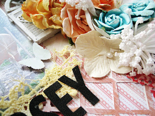
I was also playing with stuff I had sitting on my desk last weekend, wanted to make something with a summer feel, this is the result. No colour combos or any sketch used, just me having some fun - "Horsey In The Country";
Papers used on this one are all Kaiser Craft.
Photo by my favest Finnish photographer.
A left over piece from a chipboard chain from Blue Fern Studios.
Thanks a bunch for taking a peek!
I'll be back on Thursday, 13 June with my take on the OUAS June challenge. See you then if you want to!
Toodelipip! xoxo Eila
Subscribe to:
Post Comments (Atom)


Oh wow! I simply adore both of your lay-outs. They look so romantic and pretty. I especially love the second one with the lovely grid pattern on it.
ReplyDeleteAmazing layouts! Love them!
ReplyDeletegorgeous layouts...they will miss you there :)
ReplyDeleteSo very beautiful, soft and pretty. Love the double photos. xx
ReplyDeleteStunning layouts. The first one is so dreamy. The photo is beautiful and love the embellies around it. The second lo is fantastic and its is cool that you created it only with things on your desk. I'm sure many opportunities will come your way even if this is your last month with BF. you've already had two new open doors.
ReplyDeleteWOW WOW WOW WOW WOW... These layouts of yours are so my fave!!! So sweet!!! Love them both to bits!.... hugs...x
ReplyDeleteLove the way you mix and match different brands and collections to come up with masterpieces like these!
ReplyDeleteBoth stunning page love the first one with that sweet birdcage - on the second one i just love the mask should use it more often ...have a great day xo
ReplyDelete