Wednesday, 10 August 2011

TCR #70 My iToy and another page for Les Papiers de Pandore

Gosh! this Wednesday is far from fair and summery, the rain just chucks it down and my new pink suede ballerinas look like .... my own fault for not checking the wather forecast this morning.

I am back at work again, feels so nice to meet friends and co-workers after my long a glorious summer hols. Lots of catching up to do, which means lots of coffee has to be drunk and perhaps something sweet gets dunked as well ;))

Will soon have caught up with my visits and commenting.

A new beautiful girly palette, #70, was released over at TCR last Friday. The colours are really so yummie again, thanks Lydell! We are looking at Deep Rose Pink, Celery Green, Bright White and Pine Floorboard. I think the celery and the pine were really tricky!


I've already moaned and groaned enough about the ruined LO in my previous post, it was meant for this palette. I made a substitute with papers from Danish Tilda. Here it is:

#70_My iToy 800px-main

This is of course DH with his precious toy. The photos were taken a few weeks ago in the gardens of the museum where we saw the fabulous exhibition with couture dresses. As soon as we stopped for a while, he immediately took out his iPhone and started checking on this and that *sigh*

#70_My iToy 4000px-2

A cluster of Prima blooms mixed with stuff from my stash. The silver Sultan flower centre and the two crystals really sparkle in the sun. The chippie alpha "B" is the first letter of my hubby's name; Bengt.

Have a stamp with something that looks like random mirrored figures and letters, just like something cut out from a string of programming commands. Used that around the page to mimic iPhone-ish and as my DH is an IT-nerd by profession.

#70_My iToy 4000px-3

I love the Tilda papers, such pretty double-sided ones in all of their collections!

#70_My iToy 4000px-4

I stitched on a muslin heart on top of one of the paper ones.

Now to something more autumnal as I've been playing with the autumn collection over at Les Papiers de Pandore (LPdP). HERE'S   the link to Julie's post from earlier this morning.

Going Home 4000px-main

My dear friend K lives on the Swedish country side in a little red-painted house with white gables, a very typical old fashioned Swedish house. It is surrounded by vast fields and woods where wild animal can be seen. Miss K very recently tragically lost her husband and as they didn't have any children either, their two dogs Doris and Buster are great company for my friend. Those of you who a regulars at TCR, have seen Buster in my LO #55A called It's a Dog's Life. There he sits on the porch doing what dogs do.

In this layout I have used photos of Doris (to the left) and Buster (to the right) when they are out on a walk-about with their mummy, my friend K. I think they are just so cute there side by side on the little bridge, almost as if they are saying "come on, let's go home".

My friend has also photographed the wonderful butterfly on the bloom that I've used as well.

Going Home 4000px-3

On this layout I have used 4 layers that I have stitched together. The bottom one is from the new line, then a raspberry pink Bazzill Swiss dot cardstock topped by anoter cardstock in pink before the wonderful wood grained paper also from the new line. The leaf punch is from Martha Stewart and the vinyl alphas are American Craft.

Going Home 4000px-4

I made the accordion bloom from one of the new papers and topped it with a Prima bloom. The orange brads next to "home" are My Mind's Eye Stella & Rose. The ribbons are a gift from my colourful scrappy friend Rebekah in Florida. Thanks again for your generosity Mrs K!

Going Home 4000px-2

The leaves/birdhouse I cut out from one of the new papers, the brown tag under it is also from the new line. I used Tim Holz distress ink in Walnut Stain to stamp "en pleine nature" (roughly translates to outdoors/in the wilderness/in nature) on canvas and added a tiny pink brad from Basic Grey. The bird sitting on top of the bird house is from K&Company.

Going Home 4000px-5

I also cut-out the words "promenons-nous" (roughly translated it means let's go for a stroll"),and the producer tag "Les Papiers de Pandore" from one of the papers. Mounted the strips on coloured paper and used as extra sentiments.

Et voilà! there's a whiff of France for you! Regretfully Julie's papers are currently only sold by French online stores, but if you bombard her with requests for re-sellers in the English speaking world, who knows what might happen! You can contact Julie over at TCR, she can be found under the member section under her name Julie.

Of course CCG released a gorgeous gorgeous palette last Friday as well, just my colours so I am really so sorry I don't have time to play this week either. Totally stunning pages created by the DT! go have a peek if you haven't already!

Also UOAS recently announced the DT's unanimous winner of the 15 July challenge: Gayle Price whose entry was a total stunner. Just look at her fabulous page and be prepared for a truly amazing page:


And so I've come to the end of this post. Thank you sweet ladies for taking a peek and for perhaps leaving a comment! I always always treasure each word you write, thank you once more.

xoxoxox Eila

Wednesday, 3 August 2011

Les Papiers de Pandore's new autumn collection "Promenons Nous"

Bonjour tout le monde! or hello everybody!

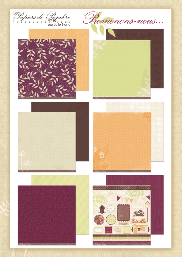
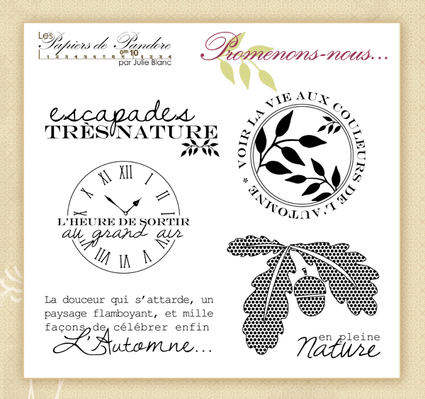
On 1 August the new autumn collection "Promenons Nous" or "Let's Take a Stroll" was released over at Les Papier de Pandore (LPdP). Here are the wonderful papers and the stamps for you to drool over:


Here's the link that takes you directly to LPdP's website where you can see examples of Julie's own work and my page introduced today:  click HERE

LPdP also has a web magazine, or as they call it; webzine, published on the first day of each months. It's really easy to subscribe to, you just click on the link HERE, which will take you directly to the Webzine. On the right look for "Recevoir nouveautés et webzine" and add your email address in the larger box. Remember to tick both smaller boxes before pressing the OK. Mind you it is French, but the photos speak to any nationality! The followers are called "Pandorettes" - isn't that just so cute!

You can of course also click there directly from the header of the main website if you are a subscriber.

The papers are only sold through French stores, but if you're interested in buying them, you will find a list of suppliers on the main website, under the heading "Revendeurs" HERE

Now to close-ups of my page for LPdP which I called "Autumn Leaves". 

Autumn Leaves 4000px-main

This is Miss T whom you've seen in several pages before, she's the daughter of my DH's cousin. The photo was taken on a beautifully sunny and crisp day in the autumn of 2010 in Skåne (or Skania in English) which is in the south of Sweden where they live. A perfect day to go exploring the forest and tree climbing together with her best friend and their respective families. You can see how the leaves have turned yellow and orange. What a coincidence that her knitted mittens are a perfect match for the papers!

The brown splatter is Nescafé (I lifted the idea straight away from TCR DT Naomi Capps) and I think it looks even better than ink or splotches of mist. At least it smells very good :))

Autumn Leaves 4000px-2

All flowers and leaves are Prima. I like to cut off snippets from branches and vines to make them last longer. The doily from KaiserCraft is cut in half and placed on either side of the photo.

I named my page after the little tag with "les feuilles d'automne" - directly translated it means just that; "autumn leaves".

The acorns and the oak leaf are from my stash, I think they are from K & Company. The floral ribbon is a gift from my colourful scrappy friend Rebekah in Florida, thanks a bunch Bekah!
Autumn Leaves 4000px-3

The alphas are cut out from the new papers and mounted on tiny squares of sticky pad.

Autumn Leaves 4000px-4

A chippie flourish peeking out from the cluster. I chalked it brown and then used Stickles in different autumnal colours.

Autumn Leaves 4000px-5

The large brown alphas were originally craft coloured and bought from Maxine's Melange. My alltime favourite chalk is Cat's Eye Chestnut Roan, here I have used Tim Holz Crackle Paint in clear Rock Candy for a finishing touch. Just love how beautiful the crackle turns out each time!

My summer hols are coming to its end and work starts on Monday but before I call high summer the quits, here are two invites for summer dinner that I would like to share with you. All materials used are from Danish designer Tilda.

Tilda middag 1-main 4000px

It was the adorable asparagus that had me!

Tilda middag 1-2 4000px

and the other:

Tilda middag 2-main 4000px

I think the veggies are just the cutest!

Tilda middag 2-2 4000px


Absolutely wonderful to have had you for a peek and thank you so so much for any comment you may want to leave! My next post will be on Friday when the new TCR palette is released. Take care!

xoxoxox Eila

Sunday, 31 July 2011

TCR #69 Pastoral Beauty and a couple of cards

Coming to the end of my summer hols and this Sunday.  As usual weekends are far too short don't you think?

Had a temporary dip to my good spirits at the end of last week when I had left a just finished layout on my work table for a short while and heard a frightful crash boom bang ... had a bad feeling in my tummy that I wouldn't like what I was going to see and sure almost started bawling my eyes out when I saw the disaster. My own fault for having left a mug of half-drunk coffee next to my page. Curiousity didn't kill our cat Elsa for having unleashed all that liquid, felt like everything was practically soaked in the coffee ...

Ripped and cut away the little bit that could be saved and then put it aside waiting for my mojo to come back from its hike. Best remedy in such circumstances, is to create something just for for your own pleasure, so that's what I did. Had found several different packs of unopened paper at the bottom of my piles when purging for the move to my itty nook. That's the plight of the hoarder, forgotten treasures ...

Here's what I made with K&Co Flora&Fauna:

So happy the sun was out of the clouds when I photographed it. The sparkly silver print is just lovely IRL.

Card K&Co 31jul2011 4000px-2

Am trying to use up as much as possible of my stash to make space for the new CHA releases so here is a little something from the K&Co ephemera pack and a Melissa Frances mini envelope. A chippie corner from Imaginarium Designs.

Card K&Co 31jul2011 4000px-3

A Prima silk bloom and pearl swirl, and really thick and luscious brown silk ribbon from my stash.

Card K&Co 31jul2011 4000px-4

Now I was feeling a lot happier and thought I'd make another card:

Card prickig 31jul2011 4000px-main

The dotted pale blue and lime green paper is Prima Sparkling Spring.

Card prickig 31jul2011 4000px-3

The Australian online Maxine's Mélange store has the most gorgeous German Scrap, here I've used Victorian Lace.

Card prickig 31jul2011 4000px-4

The yellow bloom and the lime cabochon rose are from Prima. The tiny yellow paper roses are from my stash. The white Anette silk bloom is from Prima but I pulled out the stamens and replaced them with a flower centre from Maxine's Mélange. The teal fabric circle is from Webster's Pages, as are the creamy sticker alphas. A couple of grey pins from my colourful scrappy friend Rebekah in Florida. Thanks Mrs K!

TCR released a new palette #69 on Friday. We are looking at Stucco, Rusted Orange, Pool Blue and Bright White. Hmmmm .... orange but hey presto, one of the unopened paper packs I found was KaiserCraft's Devonshire. Perfetto! Just made for fussy cutting!


And here is the page I made:

#69_Pastoral Beauty 800px-main

The chippie gates are from Dusty Attic and the little key hole is from Melissa Frances. I painted, misted and chalked to my heart's content on the gates and then touched up everything with a bit of Stickles in Gold to remind a bit of scuffed splendour of old.

#69_Pastoral Beauty 800px-2 (2)

England has a very special place in my heart. Some years ago hubbs and I toured the Cotswolds which is about an hour's drive to the west of Heathrow Airport in London. Just to give you a hunch of where on the map it is.

We stayed at an adorable inn/hotel in Stratford Upon Avon and made day-trips from there. This is what the inn looked like.


#69_Pastoral Beauty 4000px-2

I thought these grazing woolly little friends looked so picturesque that I wanted to take a close-up of them. Oh no, not another tourist! they must have thought as the whole heard of them turned around and showed me their butts as soon as I stepped any closer. Cheeky little chaps! Well, I still think the scenery is really so peaceful and pastoral.

And while on peaceful and pastoral, here's a close up of the little bird and its nest. I tore out strands from really rough Hessian and used as grass/nest. The bird is from K&Co Flora&Fauna and the flowers are Prima.

#69_Pastoral Beauty 4000px-3

So happy you could come for a visit, thank you very very much! I will be back on Wednesday with some photos of my next layout over at Les Papiers de Pandore.

Now hubbs and I are off to see that last Harry Potter film! xoxoxox Eila

Wednesday, 27 July 2011

GDT at French Les Papiers de Pandore and CCG 201 in a combo with UOAS

Bonjour à toutes!

I have some very exciting news from France to share with you this Wednesday!

A short while ago I was asked by the lovely and super talented Julie Blanc, owner of Les Papiers de Pandore, or LPdP in short, if I would be interested in guest designing for them.

Those of you who visit The Color Room (TCR) know that DT Julie's signature style is very strikingly elegant with a unique flair. All collections from LPdP bear the same trademarks as Julie's work. Not only are they very beautiful, but they are also produced from recycled paper and printed in Provence, France. Visitors to Bente Fagerberg's blog Paper and Glue Heaven will have seen what gems the papers are and what gorgeous pages Bente has created with them.

My reply to Julie's question? of course I said YES!!

 HERE  is the link to LPdP's website with the announcement of my GDT assignment and below are some close-ups of the first LO that I've created mainly with their current collection "Garden Party".

Garden Party 4000px-main

If you've visited my blog before, you know that DH and I live in the town centre and take every opportunity possible to drive out on little excursions on the country side. Visiting manor houses, drinking coffee, having lunch and just enjoying beautiful sceneries. I have always thought that cows grazing are so peaceful, and watching them do what cows do in nature, gives me a real feeling of harmony.

This photo was taken a couple of weeks ago at a large country estate about 2 hours drive south from Stockholm. The estate is situated on a very luscious island in the same lake Mälaren that I wrote about in my post titled "Guresome Murder ...." The title for the LO came by itself - the cows are enjoying their garden party!

Garden Party 4000px-2

I made the fuchsia pink flowers from one of the papers in the collection. Misted what was to be the inside of the punched-out petals in TA Vintage Pink and plopped a large pearl into all of them.

Garden Party 4000px-3

To nobody's surprise, I'm all hooked on chippies now. This fence is from Australian online store Maxine's Melange. I painted it first in TH crackle paint in Picket Fence. Then touched it up with chalk in Chestnut Roan before putting some TH crackle paint in Rock Candy as finishing layer. The little birdie is cut out from an old WP paper.

Garden Party 4000px-4

Some more peones made from the fuchsia papers and a teeeny sneak from the new collection to be relased on 3 August.

Garden Party 4000px-5

Garden Party 4000px-6

TCR DT Naomi Capps makes the most brilliant brown splatter with NESCAFÉ! smells good too! Here's a close-up of the banner; punched out green Martha Stewart doily topped by an orange scallopped circle one and then alphas from the collection.

Love those cows so I had to give you a close-up of them as well.

Garden Party 4000px-7

Next Wednesday, 3 August, sees the launch of LPdP's new autumn collection, which is every bit as fantastic as all the previous ones. If you would like to visit me then, I will have some new photos to share with you of a layout that I made with the fantabulous papers.

And now to CCG palette 201 - isn't it just fantastic to have reached over 200 combos!! amazing is the word! and here's the yummie scrummie palette itself:


For this challenge, we are asked to include polka dots, metal, leaves, 3 circles, and fabric. Well, I'm a colour and paper girl and don't get much inspired by this kind of prompts, it's stressing me out instead of firing up my mojo.

Over at Once Upon A Sketch (UOAS) the 15 July challenge has accumulated almost 60 contributions at the time I'm writing this. Absolutely amazing layouts and the work of the DT always have the highest drool factor.

Here's the sketch and the journalling criteria : your journalling has to be a quote (handwritten, printed, rub on etc. ). As an option you can include journalling in the lines on sketch but this is not necessary.

Read more about the challenge and check out the work submitted HERE


Even if the CCG's designer challenge with metals etc doesn't appeal to me, I still think the colours are divine. The teal and the pink made me think of the new Scrap Cake papers designed by Karola Witczak, and as they were waiting for me on my desk to be scrapped, I decided to try them out even if the pink is off by several notches, I've at least got the dots!

I know that the Scrap Cake papers sold out in 24 hours in the Australian online store Anne's Crafting Cupboard, but you see, I bought mine online in Poland! the lovely lovely shopowner Anna even updated her store and made it possible for Swedes to order directly from it! Eventhough everything reads in Polish, I managed to press the right buttons and after a short email conversation with Anna, I settled my order through PayPal - easy peasy as that!

HERE IS A LINK DIRECTLY TO THE PAGE WITH THE PAPERS FROM SCRAP CAKE

Enough talk, here's my layout that I have called "Love and Cherish". I know, I know, it's a cheesy title but hey, it's rather tricky to come up with brill titles.

My quote is a very short one; "A kiss is a rosy dot over the "i" of loving" by Cyrano de Bergerac and the journalling says; "When I met you, my heart was broken and my soul in ashes. Your love has made my heart whole again, and swept clean my soul of cobwebs". I was a sad middle-aged divorcee when I met Bengt, and also he had had his fair share of sorrow. Together we have found happiness again in our lives.

201_Love and Cherish 4000px-main

The photos of my DH were taken last week in the museum gardens of the place where we saw the fantastic exhibition of haute couture dresses.

201_Love and Cherish 4000px-2

It being the ice cream month over at CCG, I decided to go for some icicle feel to my title chippies. I first chalked them in Chestnut Roan, then coated them thickly in Shimmerz Blingz in Choc-o-lot and finally doused everything in Glaze. May I say it looks rather yummylicious, just like dark Belgian chocolate!

201_Love and Cherish 4000px-3

The Scrap Cake collection has tags as well, gorgeous gorgeous tags so totally desirable. The brown WP sparkler is placed on a letter "o" from an old BG chippie collection and then again on top of a round, old adhesion sticker from my stash. White liquid pearls.

201_Love and Cherish 4000px-4


201_Love and Cherish 4000px-5


201_Love and Cherish 4000px-6


201_Love and Cherish 4000px-7


After a long post and many photos, it's time to say merci kind visitor, hope you have enjoyed browsing just a little bit. I so love reading every single comment that you leave, they really mean the world to me. Thank you!!

Please do come again if you have the time! xoxoxox Eila

Friday, 22 July 2011

TCR #68 Precious and a Card to a special friend in Brisbane

Cannot believe how fast time flies, it's Friday again! This week has been a combo of working on scrappy things that I cannot share with you yet, and the outings in summer Stockholm that I so love.

It's time for the release of palette #68 over at The Color Room, a pretty pretty palette of Raspberry Pink, Beige Bisque, Bubble Gum Pink and Bamboo Blind.


As I've been working on purging my stash since last week (my mini nook taking shape slowly but rather nicely), I've found many long since forgotten treasures but also lots of stuff I cannot understand I ever bought in the first place. The backing papers for my layout are from DCWV Lace and Linen. The resin guarland is from Melissa Frances and the chippie title is from a sheet of words that I found at an online store called The Craftz Boutique in the UK. You will find the link to their online store further down in my post.

#68_Precious 800px-main

*giggle* as you can see, I was into the pink mood already last week when I made the birthday card for my MIL.

#68_Precious 4000px-2

The photos are of little Miss M whose acquaintance you have already made in previous layouts. The pics were taken on midsummer 2010, I just love her facial expression so full of excitement and concentration. The kids and adults were having an egg race and M is working hard on keeping her egg in the spoon.

The raspberry pink cut-out flowers are from Danish Tilda and the pink&white stripey matting is from Inkido. No handstitching this time, instead I used black faux stitching around the photo.

#68_Precious 4000px-4

The cluster is full of Prima goodies. I brushed some TA Glimmer Glaze in Pink Lady on the petals of the big beige flower. The creamy pinkish "leaves" at the bottom, are cut-out from the DCWV stack Lace and Linen, I added some Liquid Pearls in White Opaque. The tiny green sprig is cut-out from Anna Griffin Francesca. A Maya Road trinket leaf pin and a birdie from K&Company Flora & Fauna.

The chippie ferns have very quickly become one of my faves, I first bought them from Australian company Maxine's Mélange, you can find them if you click HERE. Unfortunately it seems they are sold out at the moment but they normally renew their stock in a while. I have also found them in the UK at The Craftz Boutique, you will get to their online store if you click  HERE

Stuck in at the top of the cluster is also a white crackle painted chippie frame that I cut into half, the other one I chalked in Chestnut Roan and put at the very top of the page above the title. Thanks Nat Mae over at Imaginarium Designs for the tip on how to make chippies last!! You can find their gorgeous chippies in their online store Seriously Scrapbooking if you click HERE. Beware, shopping there is seriously addictive! cannot live without my chippies now, even if buying them and paying import tax and customs fee make a substantial impact on my bank account  :))

#68_Precious 4000px-3

Here you can see another absolutely gorgeous chippie frame from Imaginarium Designs. I painted it first in white acrylic paint before touching it up heavily in Shimmerz Blingz Bubble Gum. I just love this pretty frame with its flourishes and the birdies.

#68_Precious 4000px-5

Love the romantic and soft papers from DCWV. I matted them in two different shades of brown cardstock. Both are misted in DA Creme de Rouge + Tattered Rose + Sand + Suede. The rub-on quote is from KaiserCraft and the buttons are from DoodleBug and BG.

#68_Precious 4000px-6

#68_Precious 4000px-7

On 3 August my very dear scrappy friend Lindy in Brisbane has a very special birthday. As she has confirmed that the postman has delivered the card I made for her, I can share it with you already now even if we are foregoing the proper date. Considering the fickle post service, I wanted to make absolutely sure the card would reach her in time and sent it rather early.

Card for Lindy 3AUG2011

The teal/blue papers are from Inkido, the little maiden is from Melissa Frances and the rest is either Prima or from my stash. I won't say Happy Birthday yet though!

Card for Lindy 3AUG2011- 2

And so we've come to the end of this post. Thank you dearly for having a peek! I would love reading any comment you might want to leave me.

Wishing you all a glorious weekend, take care! xoxoxox Eila