Monday 27 February 2012

Happy News and UOAS 15FEB2012 Letters in the Sand

Woohoo! there is cause for celebration in the Sandberg house as I have some really wonderful news to share with you.

Yesterday Meg's Garden announced the names of its new DT member, and what a list of names it is!!

26 February, 2012

New Design team members announced

Hi

It was an extremely difficult task to select the new members of the Design Team. Thank you so much to the many applicants.

The new members who are joining the existing team are:

Eila Sandberg  
http://dollopsofscrap.blogspot.com     Can you believe it - that's me!!

Heather Jacob from Australia

Yuka Hino from Japan


Gabrielle Pollacco from Canada


Vickie Alberto from Canada


Cathy Cafun from Australia

These applicants have their work cut out for them - the current DT have done some fabulous projects & have left a hard road for them.

Please have a look at their blogs, become a follower & cheer them on.

Welcome ladies to Meg's Garden Design Team - the garden of papercraft delights

Bye for now

Meg

Oh my oh my, me working alongside all these famous people and the existing DT. Wow! this is so huge to me,  I just want to kiss everybody that I meet and shout from the roof toop. Life is good, life is very good! THANK YOU Meg!!


Today I also would like to share a page that I've made for the UOAS 15FEB2012 challenge.

Journalling criteria/theme: HOLIDAYS/VACATION 
Have you printed out all those photos from your last holiday/vacation or most favourite holiday/vacation? We would LOVE to see them and hear all about it. With the theme of holidays/vacation for this challenge, we would love to hear about: your favourite holiday/vacation of all time or a favourite place you would LOVE to take a holiday in . Or how about the last holiday/vacation you went to?  Maybe you have not travelled yet? Then tell us about your DREAM HOLIDAY /VACATION destination. 

Remember that you are allowed to also create a card or altered project based on this sketch and theme and instead of the journalling criteria you need to use a quote. 

You must combine our journalling criteria/theme with this sketch.


15FEB2012 4000px-main

All the papers are from the huge DT pack that Marie of Maja Design donated for her sponsorship month over at TCR. I have oodles of gorgeous papers left and will definitely be using them for many pages to come. The papers are all so beautiful that I don't want to cover them up in layers and embellishments, which makes my Maja layouts a bit less decorated than usually.

15FEB2012 Letters in the Sand -2

The title of my page is Letters in the Sand and yes, the pun is intended though now it sounds rather silly when I say it out loud ;)) The alphas that I tucked into the sand in the glass bottle, very quickly got swallowed by the sand so I stuck a couple more outside the bottle to make the hint a teeny bit clearer.

15FEB2012 Letters in the Sand - 3

The journalling is on that little tag that can barely be seen. More of it further down in my post.

15FEB2012 Letters in the Sand - 4

The metal trinket is from Meg's Garden and the little raindrops were a gift from colourful Rebekah Krueger in the US. The misting on the butterfly doesn't photograph particularly well, sorry about that. I have used 3 different shades of sublte green and yellow before spraying it a bit in black for added definition.

A semi circle of white and red liquid pearl, almost like a daisy chain.

15FEB2012 Letters in the Sand - 5

Green lace is from Webster's Pages. German scrap is from Meg's Garden as is the string of pearls. I misted the chippie word Memories in several hues of pale pink before chalking it in two different tones of reds. That doesn't photograph well either - bummer!

15FEB2012 Letters in the Sand - 6

and the other side

15FEB2012 Letters in the Sand - 7

Other people's handwriting is often difficult to read, so here it is typed as well:

Living in a country with 4 months of snow, makes us long for the sun and warmth. When summer finally arrives, we get crazy with happiness and worship everything Mother Nature offers. The best vacation is summer in Sweden, the midnight sun, the balmy nights, the blue special skies over Stockholm, the archipelago and time to just enjoy a glass of wine on our balcony, and sunburned shoulders.


15FEB2012 Letters in the Sand - 8

I first masked/chalked the grass in white/lime/pale green before adding the other elements on top.

The sun is shining in Stockholm today and it is about -6C. Very good for the kids who have winter school holidays this week.

Back to handling invoices and writing expense reports, but first-  lunch!

Toodelipip! xoxoxo Eila

Saturday 25 February 2012

TCR "99 Life by the sea - a double-pager

Happy glorious weekend to you all!

Yesterday I sent off my boss to Barcelona, Spain where THE major event of the year in our industry takes place next week. The week leading to her departure was insane, so many details to coordinate and to have confirmed before she left the office. Have only begun to breathe normally again and can actually eat a meal in a longer time than 4 minutes flat.

Today I am taking hubby out for lunch and later in the week we are both having a day off from work, just the two of us spending the day together without mobile phones or emails.

Am also so happy to say that my jury speech at the Office Professionals Award gala dinner last Monday went really so well. It was a magical evening with some top rate Swedish artists performing. I cried when one of the guys fell down on his knees before the winner and starting singing "Unforgettable" - the wonderful wonderful song that Nat King Cole used to sing. I just say GOOSEBUMPS!

Now on to the release over at The Color Room where we have reached our 99th palette! so next Friday is a milestone for sure.

It is the last week of Swedish Maja Design's sponsor month, and once again Marie has incredibly generously donated fabulous papers for the DT work with. The palette is based on the collection called "Life by the Sea.

We are working with yummie colours like Caramel Sand (pale orange), Sky Blue, Burgandy Beach Hut, Deep Sea Blue.

And here's the inspo photo and sweet sketch by Lydell Quin:


There is something deeply ingrained in the Nordic soul that makes us love and yearn for wide open space, for moments of solitude away from the crowds, watching the ever changing water of the sea and feeling the soft rounded cliffs of our shores.

Mother Nature has her firm grip on us so no wonder the papers of the collection really spoke to my Swedish-Finnish self and this is what I came up with.

#99_Life By The Sea 4000px double

First the left page, and then the right page separately.

#99_Life By The Sea left-main 4000px

I fussy cut the fish from a paper from KaiserCraft Hunt & Gather before mounting them on acrylic. The muslin was misted in 3 different blue colours and my hands were a colourful testimony for 3 whole days.

#99_Life By The Sea left - 2

These photos were taken by my friend K last summer and are from Sweden's east coast up north. The name of the fishing village is called "Rönnskär" which can also been seen above the pics.

#99_Life By The Sea left-3

Shabby weatherbeaten banners, a very typical sight in the archipelago. The small compass is from Australian online store Meg's Garden.

I cut out triangles from linen fabric and then stapled the paper banners on top before sandpapering them and picking threads from the linen. 

#99_Life By The Sea left -4


#99_Life By The Sea left-5


#99_Life By The Sea left-6

And then the right page:

#99_Life By the Sea right-main 4000px

The photos were taken by my friend K and show the harbour of Rönnskär.

#99_Life By The Sea right-2


#99_Life By The Sea right-3


#99_Life By The Sea right-4


#99_Life By The Sea right-5

A generous blob of stone glue and then finegrained sand poured on top. Let it dry completely before giving it a squirt of TA glimmermist in Sand.

#99_Life By The Sea right-6


#99_Life By The Sea right-7

There's to give you a feeling of Swedish summer in the archipelago! many months to go before we can sit and drink our coffee to the sound of lapping water, seagulls soaring and the tug tug of fishing boats.

Lots of mundane things to be done today but somehow feeding the dish washer and going grocery shopping actually feel soothing this particular weekend, just normal every day stuff.

Enjoy your weekend wherever you are! take care of yourself and your loved ones. Toodelipip!

xoxox Eila

Wednesday 22 February 2012

CSI #7 Nature

After the previous very long post, this one is going to be comparatively short.

CSI released it's 7th palette on Saturday our time.

Just like the produce in our February images celebrating Exotic Vegetables and Starfruit Month, CSI is growing and growing! We're so excited by the enthusiastic participation of all our members! Our gallery has been rocking with gorgeous work!

Boys Rule Scrapbook Kits is our generous sponsor this month, and to celebrate that, several of our members have used inspiration from the Boys Rule kit and blog as jumping off points for our layouts. You'll read about that when we post our layouts in the gallery.

We are thrilled to announce that we have a new Detective: Michele Singh has joined the CSI design team. Michele's creativity and magical work caught our attention from the very first layout she added to our gallery, and we just had to have her on the team. We are certain Michele's designs and creative journaling will inspire you!

This week's Case File is a very challenging one, but we're sure you'll enjoy the process and end up with a beautiful layout. That's what challenges are all about--pushing ourselves to try something new!

So with that said, CSI Members, grab your forensics kits and get ready for some sleuthing as we reveal Case File No. 7 . . .


COLOR DETAILS & RGB CODES

You must use all 5 colors (plus neutrals, if you like).

turnip - 229.188.230 - light violet highlights on the turnips
carrot greens - 178.207.176 - light green part of the carrot tops
pink - 247.152.185 - highlights on radishes
dark gray - 116.114.111 - table
red - 203.31.43 - darker parts of radishes

EVIDENCE DETAILS

Choose two (or more)of the following elements to include on your layout:

distressing
wood or wodgrain (could be paper or embellishments)
metals
an element to hold things, like an envelope or pocket
stripes (as inspired by the watermelon)
cluster similar items together
combine straight lines with organic shapes (i.e., shapes with curves)

JOURNALING DETAILS (TESTIMONY)

Choose one (or more) of the following to inspire your journaling:


3-2-1: 3 most important things, 2 questions you have, 1 word to sum up the story.
Use all your senses in your journaling.
Grocery list: Journal in the form of a list.
The roots: What is the origin of the picture or what's underneath the story?
Inspiration Words: natural, vital, root.

We trust we've left enough clues for you to solve the case!

The deadline for completing Case File No. 7 is Sunday, February 26, 11:59 p.m. EST.
Thus, you have a week plus the two weekends to complete your layout.

We can't wait to see what you create!

And here is my page:

7_Nature 4000px-main - Kopia

It was the photo of the veggies that set me going on the theme for my layout this week; nature. Immediately came to think more of the feeling, rather than a specific photo, of when we had our garden allotment and that is also what my journalling is about. The joy of seeing the seeds transform into seedlings and then into actual plants. Tucking into that very first young carrot pulled out straight from the soil. Mmmmm ...

I have used papers from Swedish Pion Design's collection To Father and from their 2011 Christmas collection.

The chippie butterfly is from Imaginarium Design and I have chalked it in three different hues of purple and pink.

7_Nature - 2

The chippie title is from Dusty Attic and I chalked it in 4 different shimmering blue and green shades before touching up the edges in brown. I also made the little bird nest from muslin and coco nut fibre, the eggs are simply mini muslin squares that were rolled into little balls with the help of glue.

7_Nature - 3

The little gloves are cut out from a Tilda paper. Reading my own journalling, I really remember what it was like; both the hard manual labour but also the blissful moments of harvesting our little gems.

7_Nature - 4

Well, I didn't have any photos of radishes per se so I cut out these from a Tilda paper. The frame as well as the florals under the cluster, are cut out from some KaiserCraft Chanteuse papers.

7_Nature - 5

Punching and distressing of the edges.

7_Nature - 6

Do you see the mini clogs there in the cluster? I used to wear clogs when working on our allotment, and these remind me of all the endless completative hours of weeding and breaking up the soil. To get the dirty brown look, I misted the originally pine coloured clogs in Tattered Angels Sand and Suede before chalking them.

The organza bloom is from Australian Meg's Garden. The berries are cut off from a Petaloo flower vine.

7_Nature - 7

Splatter and misting with Tattered Angels Sand, Coffee, Gold and Suede as well as chalking of the edges in Tim Holtz Black Soot and Cat's Eye chalk in Chestnut Roan.

Et voilà! we've come to the end of this post. Thank you dearly for taking the time to look at my page!

Have a lovely rest of the week! take care! xoxox Eila

Sunday 19 February 2012

Snivel and cough + TCR #98 Always Time For a Coffee and special love from Latvia and US

FIRST OF ALL I WANT TO WARN YOU - THIS IS GOING TO BE A VERY LONG POST! so if you're not interested in seeing pics or reading about my recent trip to London, or Liebster Awards, you might want to scroll down to my TCR #98 double-pager "Always Time For A Coffee".

Got home from London a week ago and was thrown into the hurly burly of my office work the second I stepped in through the door. I had actually been missed! *giggle* good to know the work I do is actually noticed :))

Seems I had a crowd of stowaways with me home too. No wonder as half of my group actually visibly developed different stages of flu while we were having dinner one of the evenings. Scary stuff! Well, I didn't exactly have time to be off sick again so thank you Sudafed (non-prescripted miracle pills) for coming to my rescue. Don't want to know what's in them but they certainly unblocked my congested nose,  took away sinus ache, head ache, fever, and allt he aches and pains so typical of a flu. Only thing is, one HAS TO sleep once the effect of the pills has subsided. So that's what I've been doing this whole week, fallen asleep at 08.00 p.m. every single evening.

As promised, here are some more photos from my trip. I finally got to do what I've been wanting to do for so many years, but with hubby in tow, never got around to doing it; going to the fabulous museums of London!

Among other things, I had pre-booked tickets for the Cecial Beaton photo exhibition at the Victoria & Albert. Cecial Beaton used to photograph for glitzy magz like Vogue so his photos of the Royal Family and particularly Princess and then later Queen Elizabeth II, are utterly dreamy. What a stunning beauty she was when young!

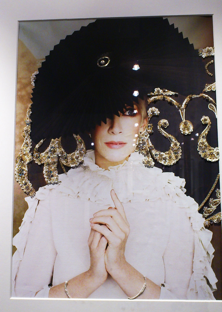
Also discovered a fab exhibittion by and on Annie Lennox (yes, the one from Eurythmics) at the V&A. One of the large photos of her was so cool, check this out. They had inserted lace onto the photo, and embroidered the bracelets on her wrists, her hat had a beautiful bling button/brad. Totally liftable for a scrappy page! Sorry the photo is kind of wonky, I had to take it with my mobile phone when the guard wasn't in sight. Naughty me, I know ...

Annie Lennox V&A FEB2012

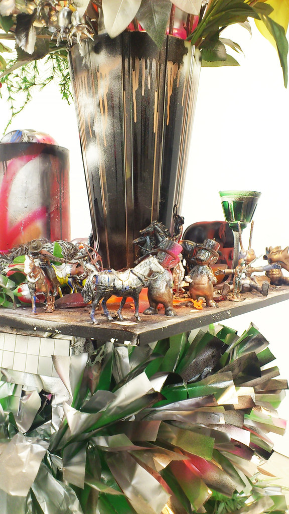
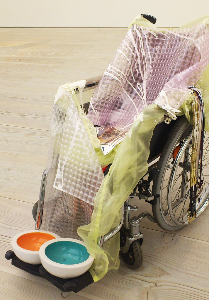
I find it very difficult to appreciate modern art, but this time I really tried to give the whole concept a fair shot. Have to admit these installations did not make me change my mind, so sorry Saatchi Gallery and Tate Modern, you won't be seeing me again!

Saatchi 1 Gallery FEB2012

Saatch 2 Gallery FEB2012

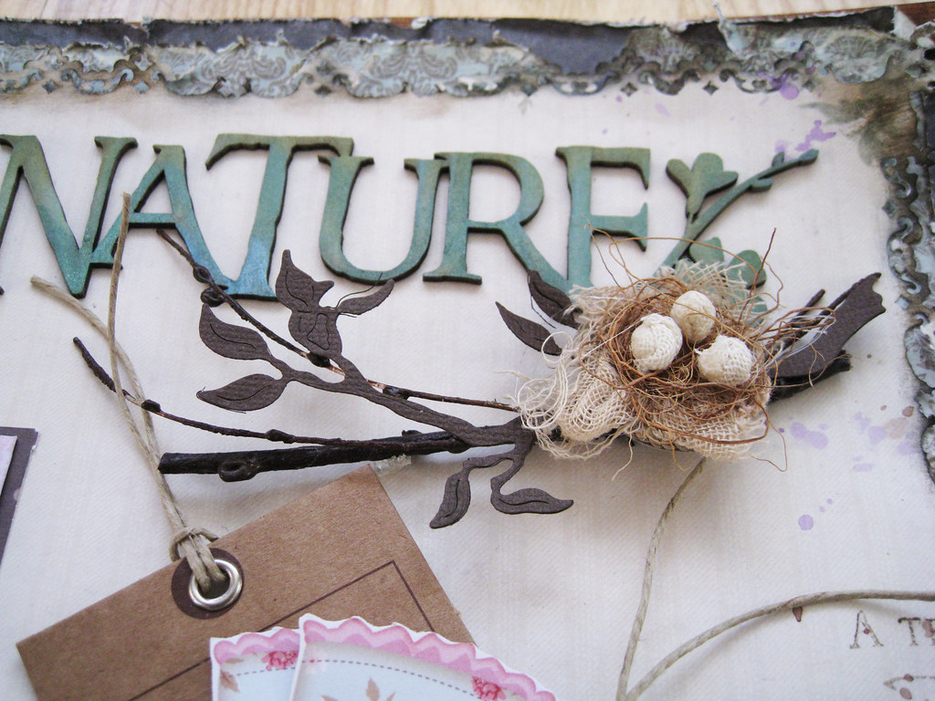
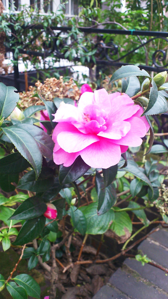
I am always amazed at how Mother Nature does her thing no matter what. It was snowing in London but still these flowers had it ingrained in them to bloom in February. Does anybody know what they are, know for sure that they are not roses:

Flower in Chelsea FEB2012

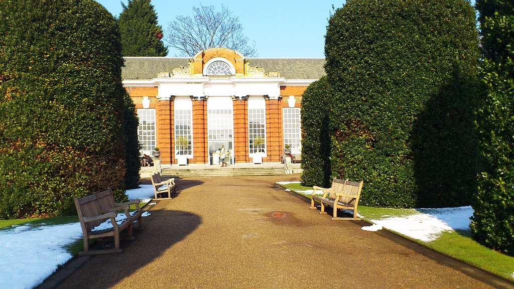
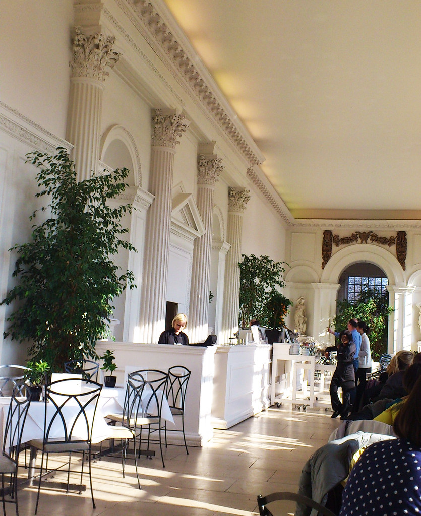
I also had a stroll through Hyde Park which is huuuuge. On its left side is Kensington Gardens with Kensington Palace where Princess Diana used to live. It is being renovated at the moment, but the beautiful Orangery it its garden was open. There was a photo crew taking shots for their new brochure and website. All of us sitting there were asked for permission to be photographed, so whaddya know, I might end up slurping soup in their new brochure! :))

Kensington Palace Orangery FEB2012

Inside the Orangery Kensington Palace FEB2012

I had the loveliest of surprises posted on my blog both while I was a way and only this morning as well; two  2 sweet kind scrappy friends have nominated me for the Liebster Award! Liva Kalnina in Latvia and Kristie Taylor in the US. I am absolutely amazed and so very grateful for the love that you peeps are awarding me!

Liebster is German and means 'dearest' or 'beloved' but it can also mean 'favourite'. The idea of the Liebster Award is to bring attention to blogs with less than 200 followers. So, in the spirit of good fun i am passing this award on to five other bloggers. Please stop by and visit them.

Here are "The Rules"

1. show your thanks to the blogger who gave you the award by linking back to them.
2. reveal your five picks for the award and let them know.
3. post the award on your blog.
4. bask in the love from the most supportive people on the blogshare-other bloggers.
5. finally and the best rule of all,have fun and spread the love!

First, go check out Liva's blog. She lives in a country where scrapbooking is practically unknown and supplies have to be found and invented from everyday objects unless imported at exorbitant cost from abroad. Liva's creativity is fantastic and the warmth and sense of humour that she exudes is utterly beguiling:

CLICK HERE FOR LIVA'S BLOG

Kristie is an amazing lady with the energy of two. Not only does she work as a nurse and has 4 boisterous children, she also finds the time to create bold and vibrant projects in addition to being on several DTs. Her experiments with colour, mediums and texture can make anyone green with envy. Wish I could have 1/4 of your energy sweetie!

CLICK HERE FOR KRISTIE'S BLOG

After having agonized for what seemed like an eternity, HOW on earth could I choose only 5 people among ALL of the fantastic and amazing friends out there, the list could easily have amounted to 50 names, I finally picked the following 5 fabulous ladies:

1) LINDY GILLESPIE my numero uno Aussie team mate over at The Color Room. Through thick and thin, through sickness and heath, Lindy has always been there as a pillar of strenght, comfort and joy for me. Words cannot describe what I feel about this gorgeous, beautifully talented and infinitely graceful lady, simply don't have enough words Lindy! I dream of meeting you IRL one of these days, Brisbane is on top of my list when the day comes for my Australian trip and then comes Brisbane and Brisbane again. Life would be very empty without you Mrs G!

CLICK HERE FOR LINDY'S BLOG JUST ANOTHER DAY

2)   Gobsmackingly talented and versatile MARIANNE in Norway. She is just plain out of this world! Not only is she a scrapping goddess, she is the most wonderful and sweet person you can imagine. Love you to bits Marianne!

CLICK HERE FOR MARIANNE'S BLOG "SKORPIONENS REDE"

3)   Wonderful, cheerful always encouraging and so so sweet PEARL LIU in Singapore. Pearl gave me the final push that made me start my blog and I am eternally grateful to her for doing it! I always visit her blog if I need happy inspiration, she is an awesome cardmaker too! her sense of humour always sends me into hysterical giggles!

CLICK HERE FOR PEARL'S BLOG "PEARLS PAPERFCTIONS"

4)   JASMINE SHEA in Australia has been visiting me even when I myself didn't think anybody knew I existed. From the first moment she has spread her kindness and shared her wonderful scrappy journey with us. This beautiful lady certainly deserves a bath tub full of love!

CLICK HERE FOR JAS' BLOG "JASMINE'S SCRAPVINE

5)   HELEN TILBURY in South Africa. I have never met a person like Helen who has that special knack of treating each individual that she meets in such a personal and kind way. Even if I know she is having a hard time herself with different aspects of life and health, nothing of it ever shows in the love she leaves. Having said that, I haven't even begun to describe what a huge impact she has had on my scrapping!

Just as I went to copy the link to her blog, I saw her own post about Liebster and gosh! she had me on too! Cross my heart, we have not made a joint decision to award each other, promise! nor have we decided on the same names! it's simply the old saying of "great minds" and the miracle of love. I firmly believe that what you give out definitely comes back and a little love has never ever cost anything!

CLICK HERE FOR HELEN'S BLOG


Well, Helen Tilbury decided to enter 10 names instead of 5 so I've simply decided to copy her and continue with 5 more names!

6)  DEBBI TEHRANI must be the kindest soul on this planet! and what an amazing scrapper she is! I would so love to sit silent as a mouse next to her when she does her magic on her 8 x 8 layouts, simply stunning attention to detail! I think this gorgeous lady was sent from heavens to make our lives a better place and all of us touched by her words, so so much better scrappers and human beings. Debbi, you know how I love and admire you!

CLICK HERE FOR DEBBI'S BLOG "LITTLE SCRAPS OF MAGIC"


7) TINA WALKER oooooh oooooh fabulous faboulous Tina, what would I do without you? Mr Moose and Miss Flikka, your stellar pages shooting stars into my eyes and your friendship bring so much joy into my life. Thank you sweetie for being you and for your unbelievable inspiration! Mwah!

CLICK HERE FOR TINA'S BLOG A DOG'S LIFE

8)  BELINDA SPENCER my fellow Aussie DT mate at The Color Room. We couldn't live more separately lives, she in faraway Australia and me in the northern outpost of the map but Belinda's heart has no boundaries and knows of no distances. I am so incredibly happy to have this fantastic lady in my scrappy life, everything she puts her dainty little hands on turns out magical. I adore her gentleness and stunning inspiration. So incredibly happy to be working with you Belinda! xoxoxo

CLICK HERE FOR BELINDA'S BLOG MY HAPPY SCRAP PLACE

9)  BENTE FAGERBERG my pal who lives in Sweden and who brings so much joy and fun into my life. It was abolutely fabulous meeting with her on a couple of occasions last year. Mrs F has a true artistic flair and spirit winning the hearts of each and one that she touches with her vibrant personality and fantastic talent. This lady has been featured I don't know how many times on Two Peas and even scraplifted by the famous Karola Witczak herself. Despite her worldwinning tours, Bente is a down-to-earth person and one simply has to adore her!

CLICK HERE FOR BENTE'S BLOG PAPER AND GLUE HEAVEN

10) is for all of you fantastic, unique, shining, loving people out there!! I have put you as number 10, but the truth is you are all number 1 for me. Thank you for lightening up my day, for making me love scrapbooking and for just being who you are, all of you!

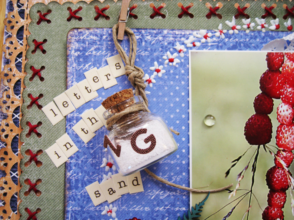
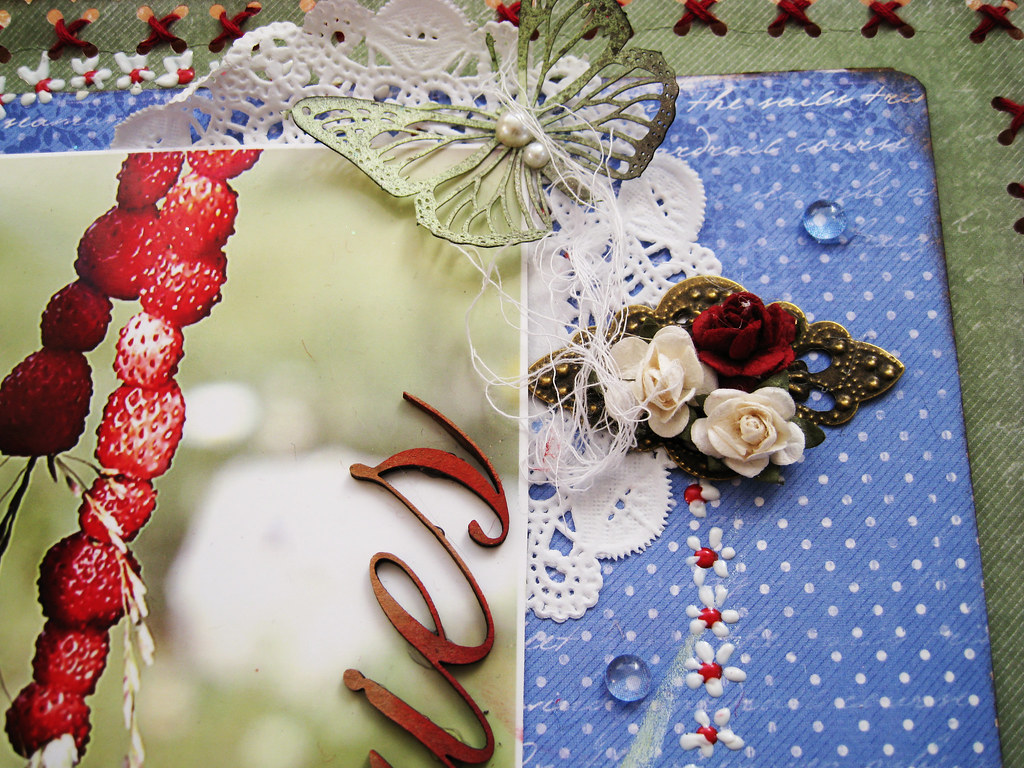
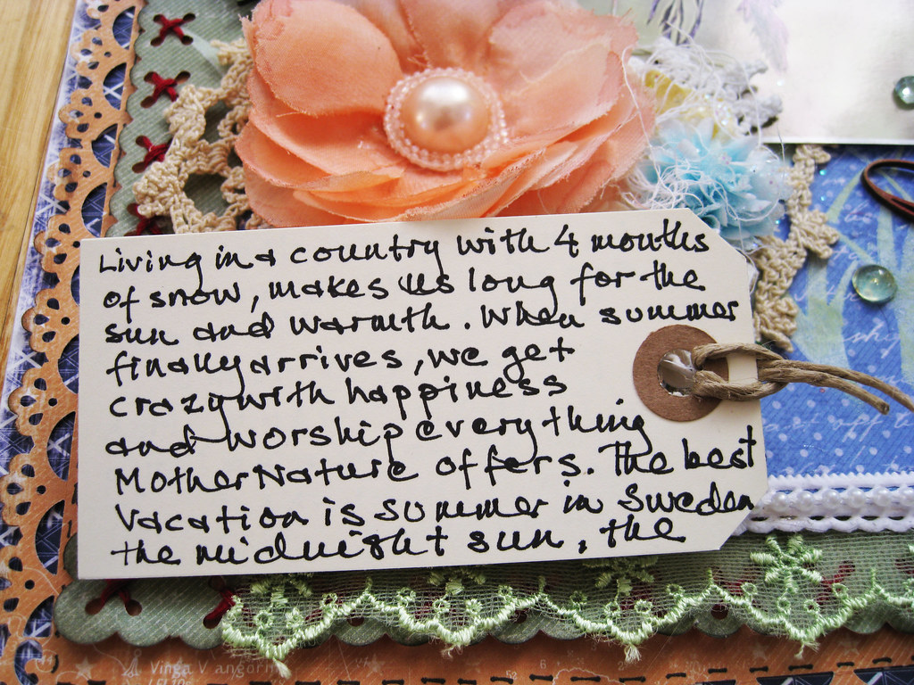
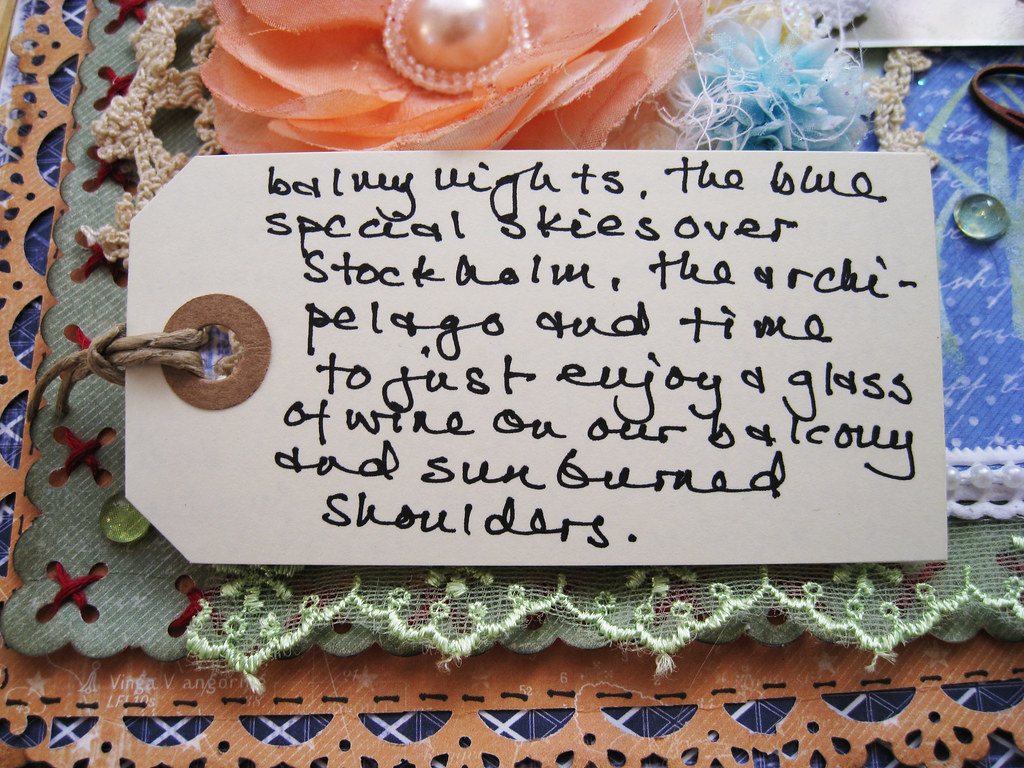
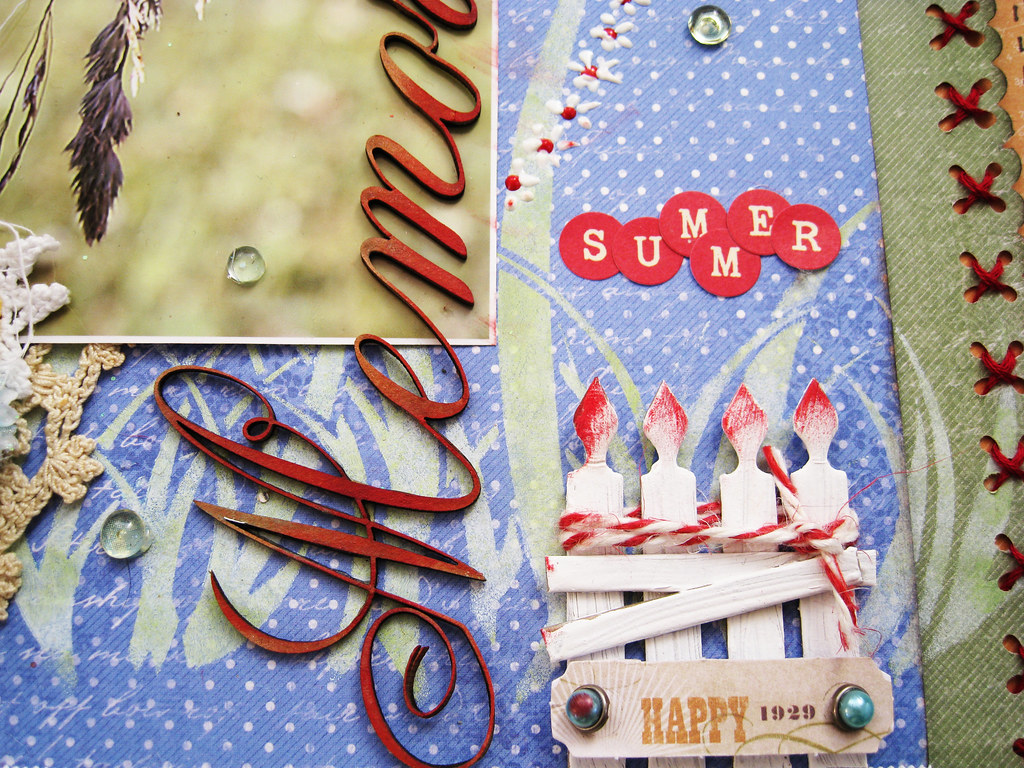
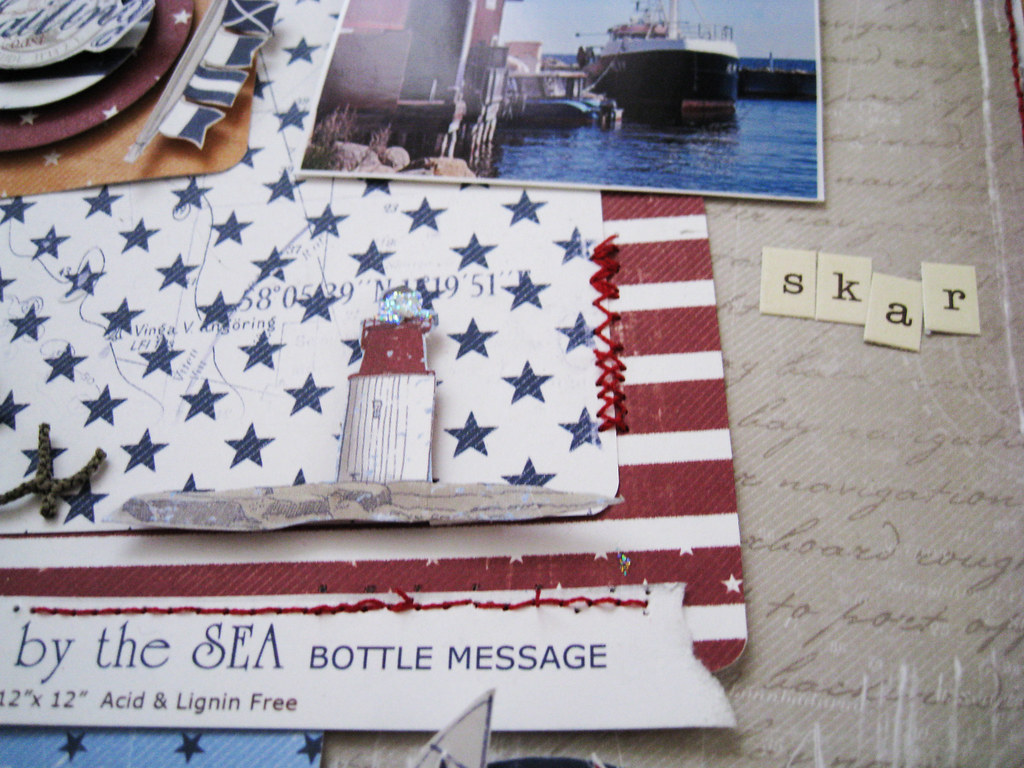
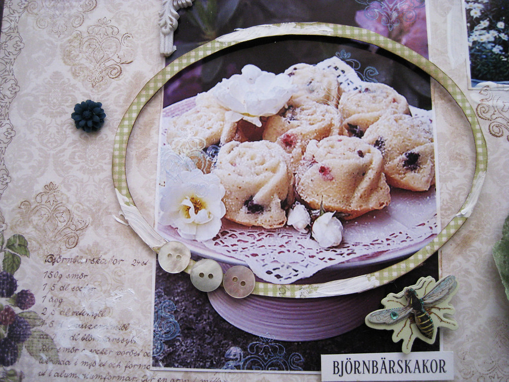
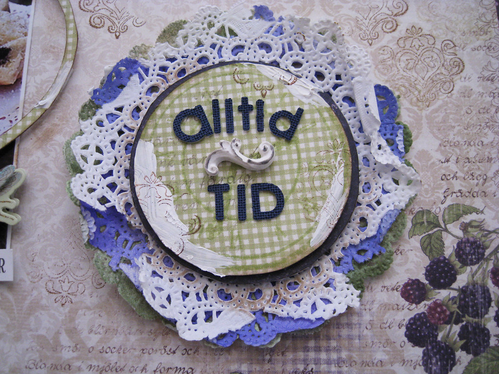
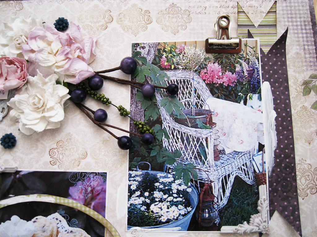
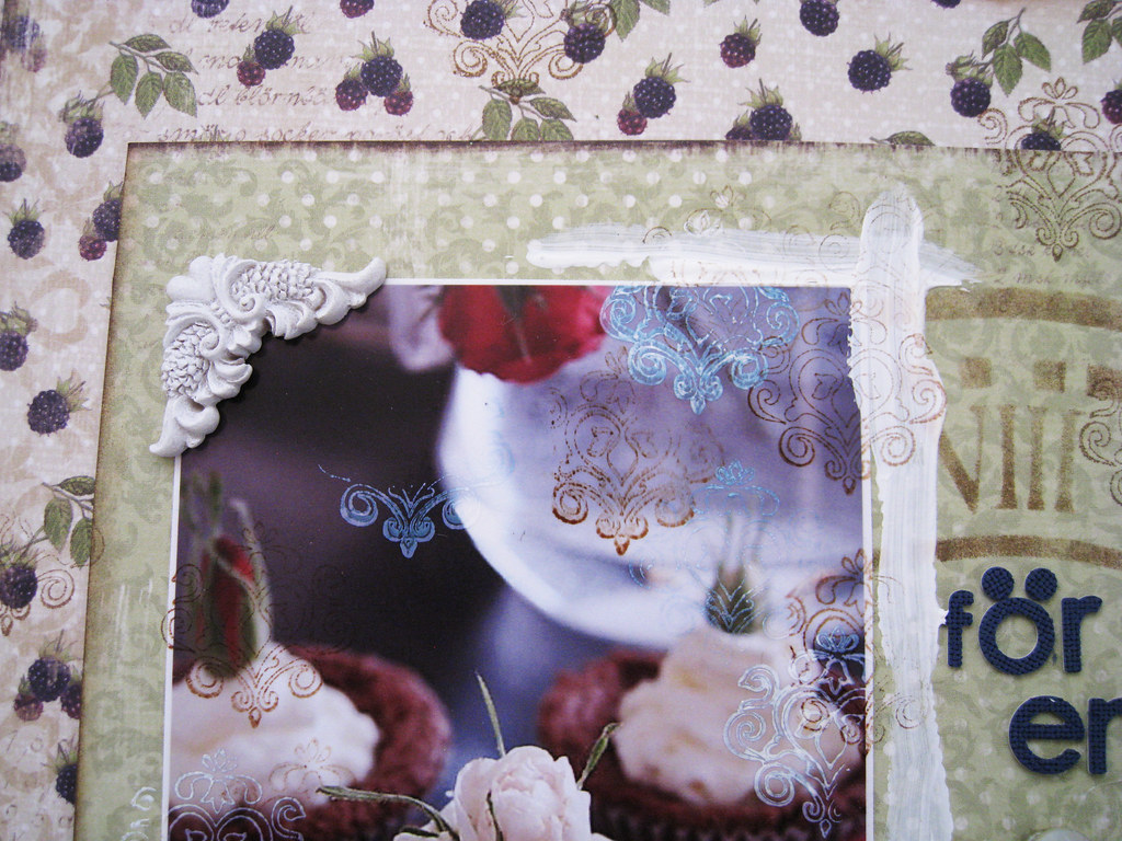
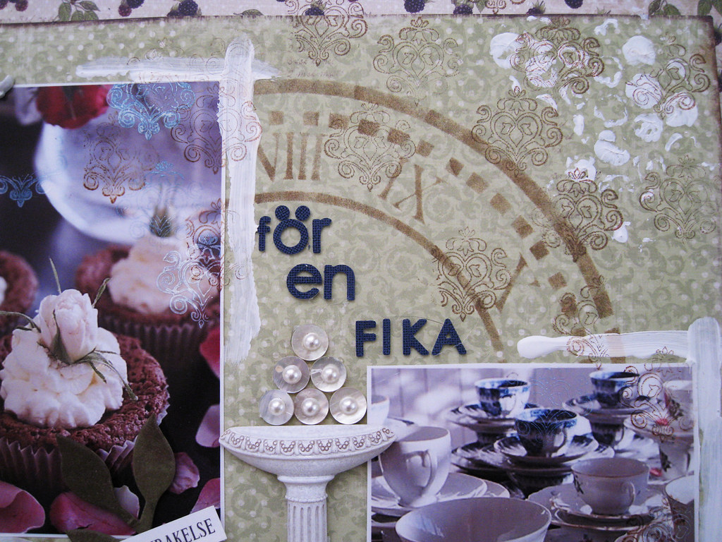
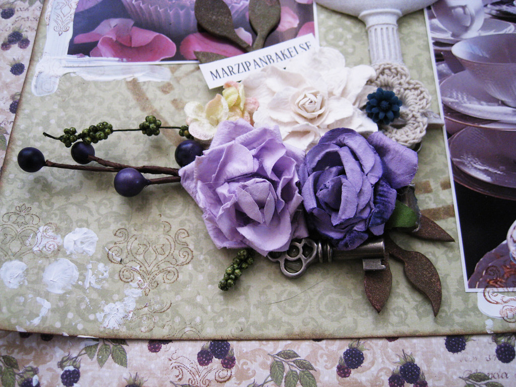
NOW I've finally come to the double-pager I made for TCR #98.

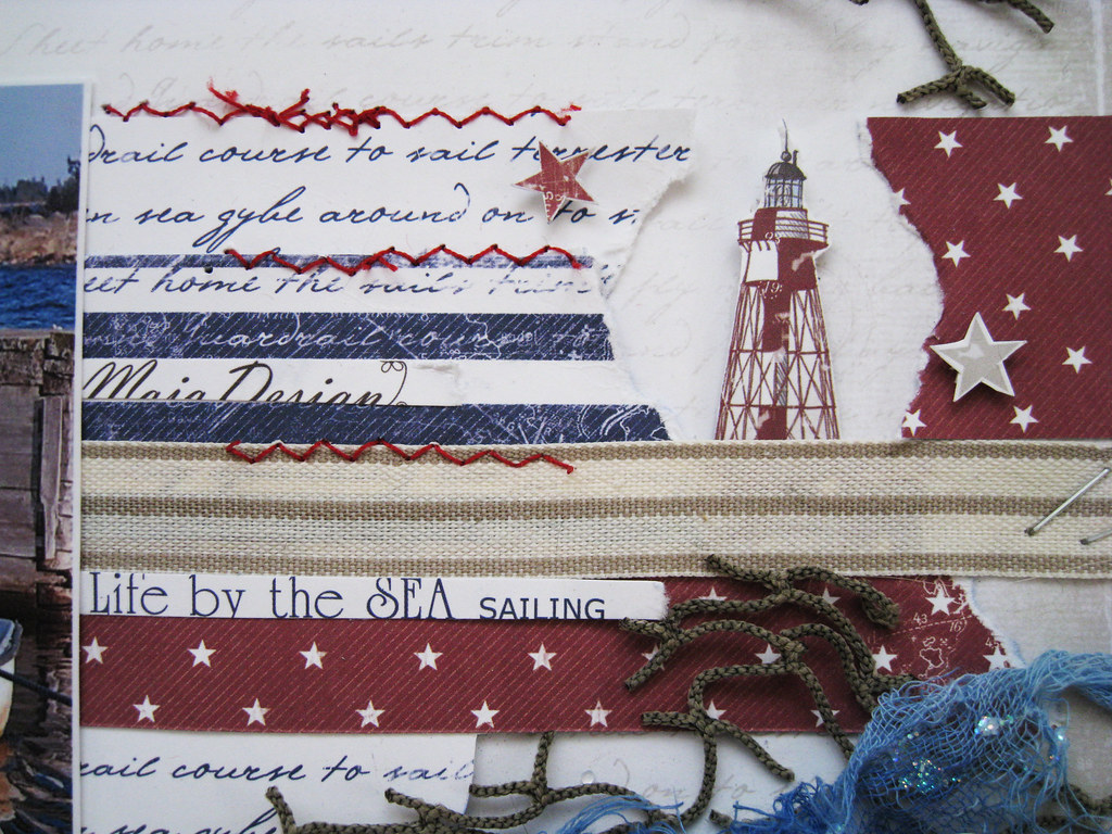
Swedish Maja Design is our sponsor for the third week and boy has Marie, the owner, given us in the DT, absolutely paradisiac papers to work with. How about the colours; Lovely Lilac, Sage Green, Very Violet and Darkest Navy.

The Maja papers can be bought from numerous Scandinavian online stores. For a list of resellers in other parts of the world, please go to their website that you  will find IF YOU CLICK HERE


They also have an official blog that you will find IF YOU CLICK HERE

Just look at the stunning mini album that Lydell Quin made for her nana's 90th birthday!! it serves as the inspirational photo and rightfully so!


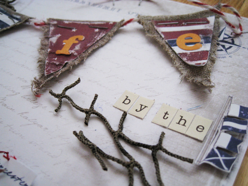
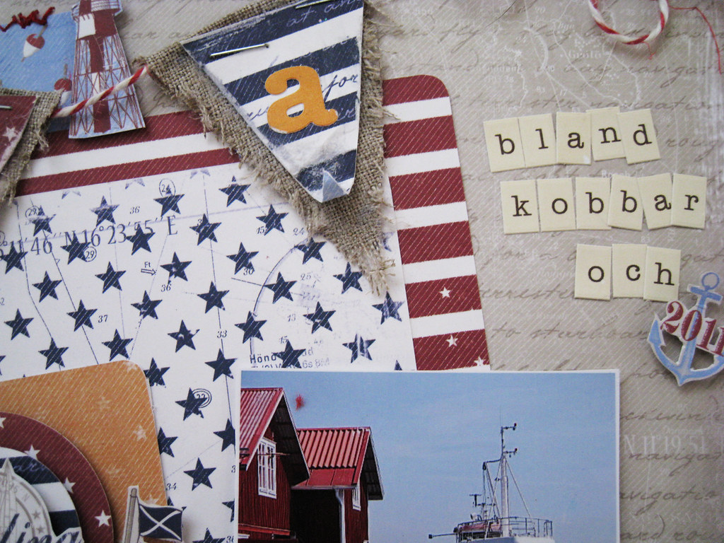
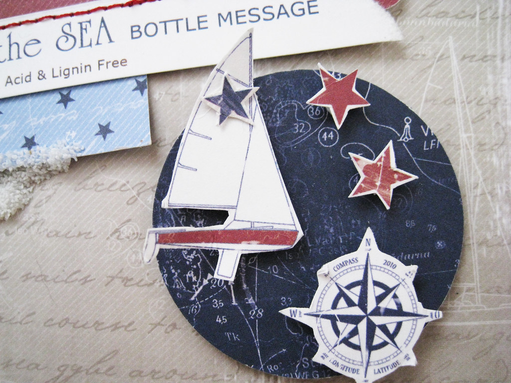
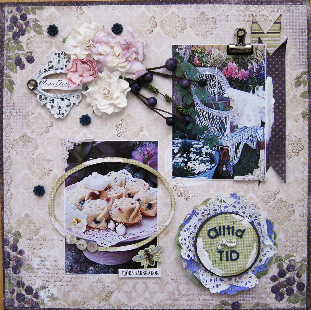
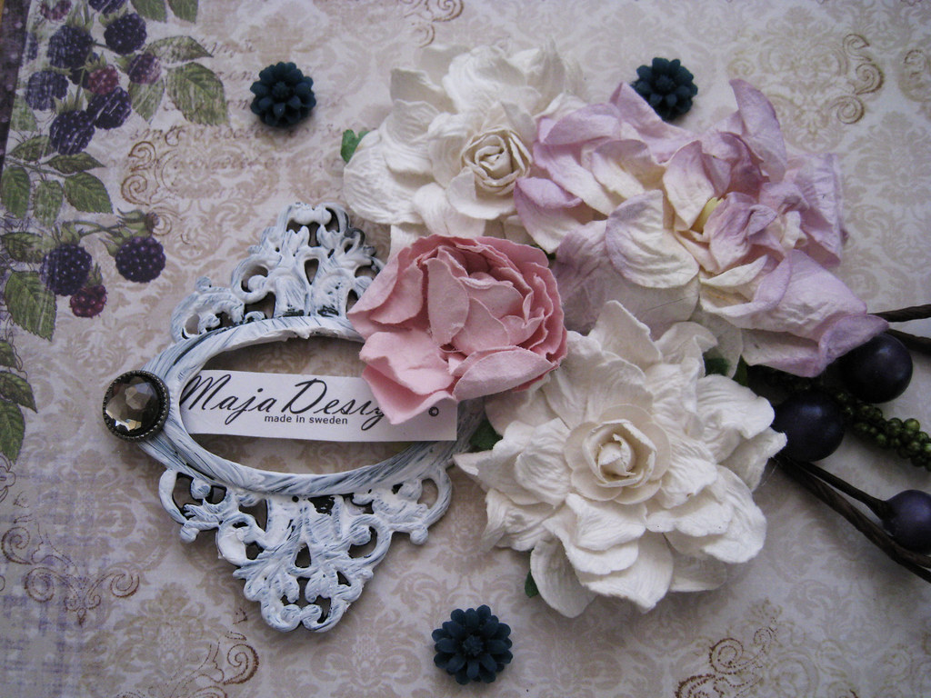
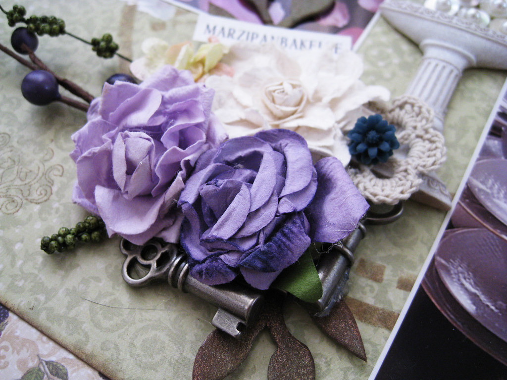
I made a double-pager for the #98 palette and could easily have created 5 more given time off from my day-time work. This collection is called "Ska vi ta en fika?" means "Shall we have a coffee?" and consists of 16 double-sided heavenly thick papers. They have motives of berries, cake recipes, coffe cups, tea pots, stripes and Prince of Wales checks as well as soft flourishes and elegant swirls.

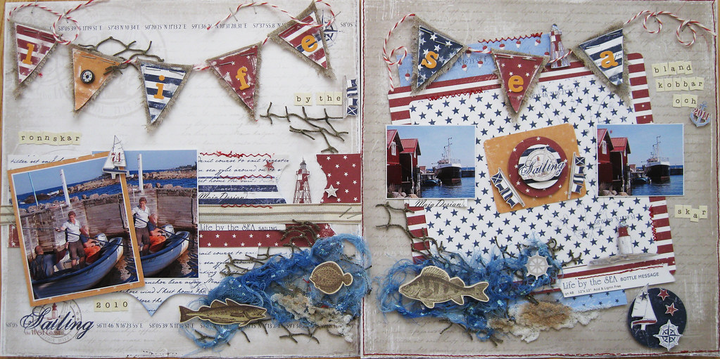
First a photo of both pages side by side and then I will show left and right as well. I am really sorry but the photo of both pages has a funny size when posted here, pls click on it so that you can see it properly on Flickr instead! thanks!

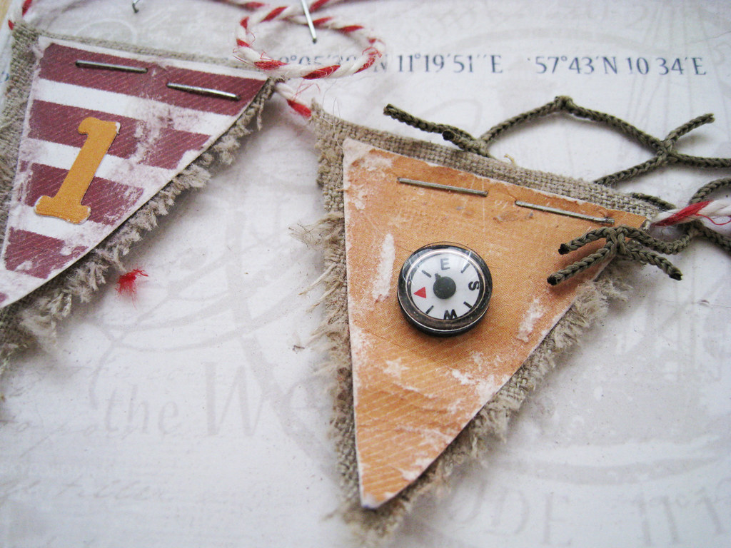
As this is a very long post, I am leaving out all the descriptions and lists of products used. Please just ask if there is anything you want to know about the pages.
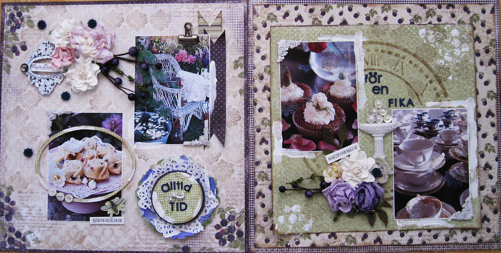
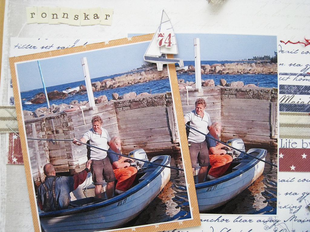
#98_Always Time for a Coffee 400px-main

LEFT PAGE.

#98_Always Time for a Coffee Left -main


#98_Always Time for a Coffee left-2


#98_Always Time for a Coffee left-3

#98_Always time for a Coffee left-4

#98_Always Time for a Coffee left-5

#98_Always Time for a Coffee left-6

AND THEN THE RIGHT PAGE.

#98_Always Time for a Coffee 4000px right-main

#98_Alway time for a Coffee right-2

#98_Always Time for a Coffee right-3

#98_Always Time for a Coffee right-4

#98_Always Time for a Coffee right-5

#98_Always time for a Coffee right-6

THE END

... I promise you!

Brave, brave gals who actually made it through the whole post! Thanks a million times for bearing with me and for your visit!

Have a wonderful wonderful week! I'll be sitting in the jury for the Swedish Office Professionals Award on Monday evening and have to make a speech brrrr!

Cheerio! xoxoxo Eila